Problem
Cyber-ITL is a nonprofit aiming to be the Consumer Reports of software security. Trying to create a (currently lacking) standard for measuring and testing safety, they needed help presenting their data in a consumable format. Motivated by consumer activism, they needed a new brand that was smart but approachable to provide clout for their mission and a website to house all their reports.
01Discovery
Speaking with Sarah Zatko (Chief Scientist) and Tim Carstens (Acting Director), we learned how CITL uses funding from the Ford Foundation to independently measure and compare risks of various types of software to address lacking industry standards for metrics, lack of studies to produce data, and huge gaps in testing overall. They had a lot of data but were struggling with how to present it. While a leading industry expert may be able to decipher and analyze their complex reports, CITL wanted their studies to help average users make smarter choices about security. Starting with browsers (they were the most accessible and the easiest sell to partners), we outlined a strategy for new report formats and a website integrating those reports for varying user goals, while also promoting their mission of educating the public.
progressive complexity
At first glance, information should be scannable and not overwhelming, but users should be able to delve in to get rich data as desired. Cater to differing levels of expertise.
scientific integrity
CITL wanted to convey their commitment to honest and transparent reporting of research. They want people to trust their information because it’s based on facts
nutritional facts
Provide people with information in a format like food labels where the scoring is broken down into categorized ratings that are easy to scan, allowing people to make smarter choices.
02User Research
Starting with proto-personas for the average consumer, IT director, and industry expert, we ran a series of user interviews with questions tailored to each persona to collect real data and validate our presumptions. We found that the “average” person was mostly indifferent or at most just going straight to Consumer Reports for (normally) IOT devices. Consumers that were more informed tended to care more about security and would be interested in learning from CITL. IT Directors needed to be bought into the concept first with something they could sell back to their organization. Industry professionals were very supportive of CITL’s mission and eager, since most recommendations are currently made based on what feels safest rather than hard facts, and CITL would provide very powerful resources for them.

Kevin: informed consumer
Kevin works a developer at a tech firm and always has security at the back of his mind for technology he uses at home. Concerned about the safety of his own privacy, he currently relies on Google searches for information. He wants to compare different browsers and get a general sense for which is the safest to use, to protect himself from cyber threats.

David: it director
David is in charge of the software environment installed on company devices, typically making decisions based on intuition. Accessing risks, he’s looking to minimize soft targets and wants to feel confident in pitching changes. Looking to see if a new program is safe for employees to download, he’s interested in general scores and basic explanations for those scores.

Mel: industry professional
Mel is a “hacker” at a large cyber security firm, in charge of research that leads to new product features. She exchanges insights with industry peers, but would love a consistent source for knowledge and trends to keep updated on software security. Not blindly trusting results, she wants detailed data for each score, down to binaries, so she can analyze it herself.
takeaways on reports
During our interviews, we tested CITL’s current report formats to see the range of comprehension and find out what information (and degree of complexity) each persona was looking for:
- Kevin relies on trusted brands and professional opinions
- Kevin is most interested in basic ranking tables and may click on articles from trusted sources like Consumer Reports
- David wants at-a-glance practical takeaways that quantify risk
- David doesn’t neccessarily understand the percentile charts but appreciates that CITL has done rigourous testing (useful to present with pitches)
- Kevin and David glean more when the labels and purpose are clarified
- David and Mel don’t have the time to figure out confusing charts
- Mel understands the complex charts but wants to know which binaries are contributing to where
- Mel has a lot of questions about how the data is collected, including code size, sample sizes, testing environments, and types of crashes
- Mel is looking for interesting crashes so she can repro and study it herself
- David and Mel are interested in low-hanging fruit, since that’s what hackers are going to exploit
From a security P.O.V. I care about insecure functions. What are they and can I turn them off?
—David03Information Architecture
Starting with insights we learned from the user interviews, I mapped flows for different tasks. Operating systems, browsers (or other programs), and IOT devices were the main areas of interest, and users either had a specific one in mind to check the safety of or they wanted to get a sense of the environment as a whole.
User Flows (Program)

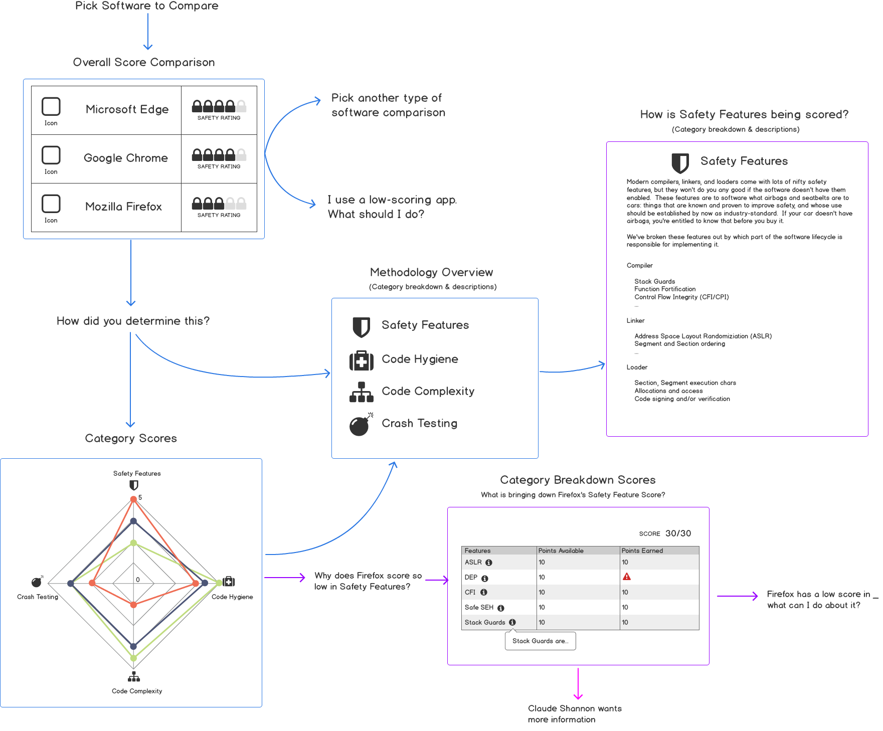
Applying some of their data and scoring metrics, we also mapped more detailed flows for components users would be interacting with and types of graphs that might be useful at different stages.
User Flow (Report)
Our final site map utilized a very simple navigation for the 3 types of user goals: exploring reports, learning about the organization, and keeping up to date with the industry. We knew that the report pages would have to be complex and data-heavy, but a progressively granular breakdown would help discoverability.
Site Map

04Wireframes
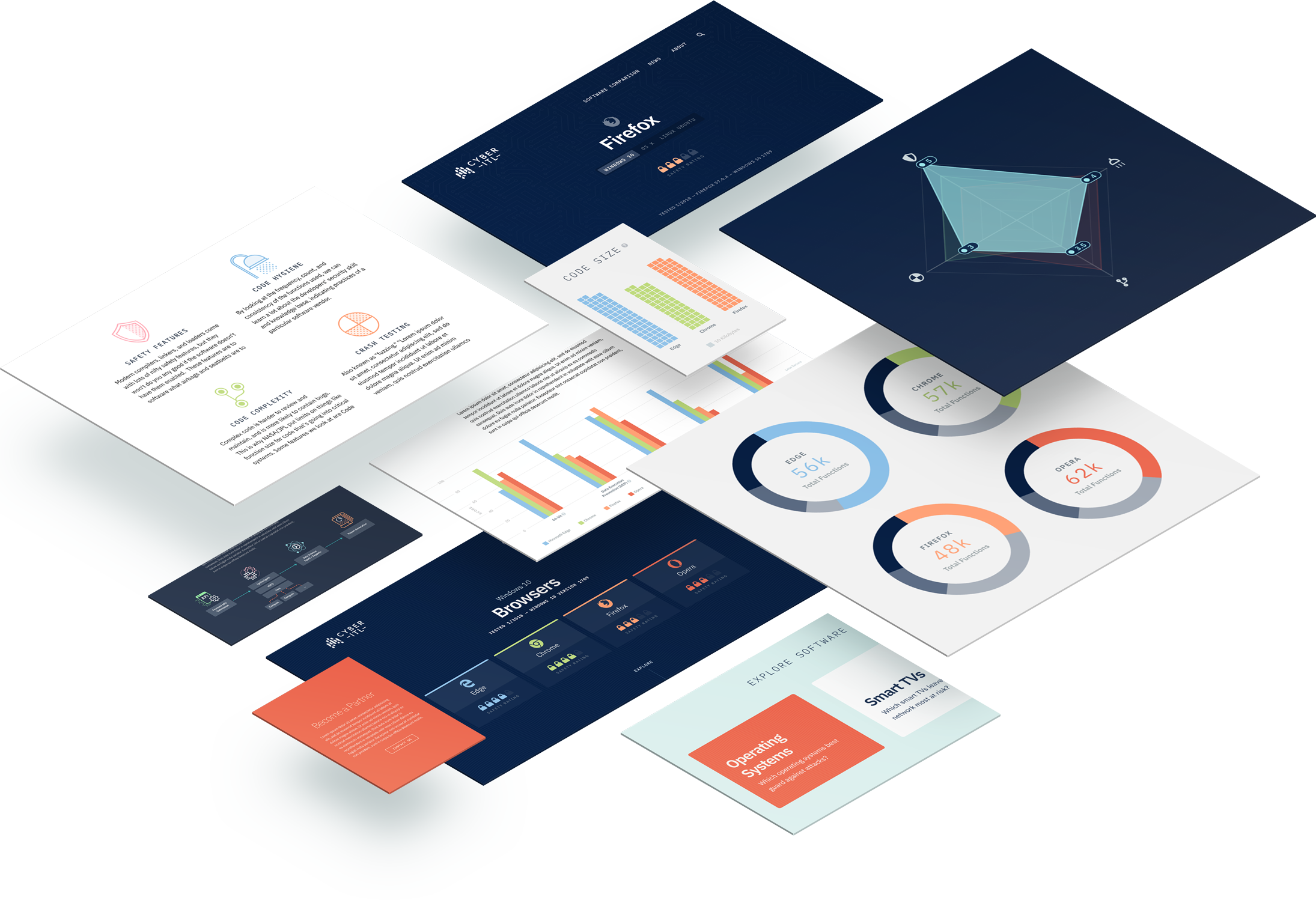
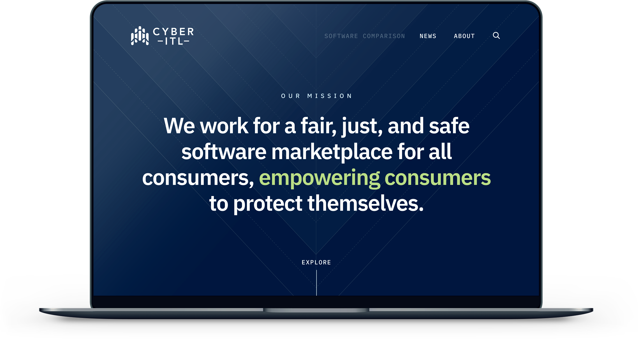
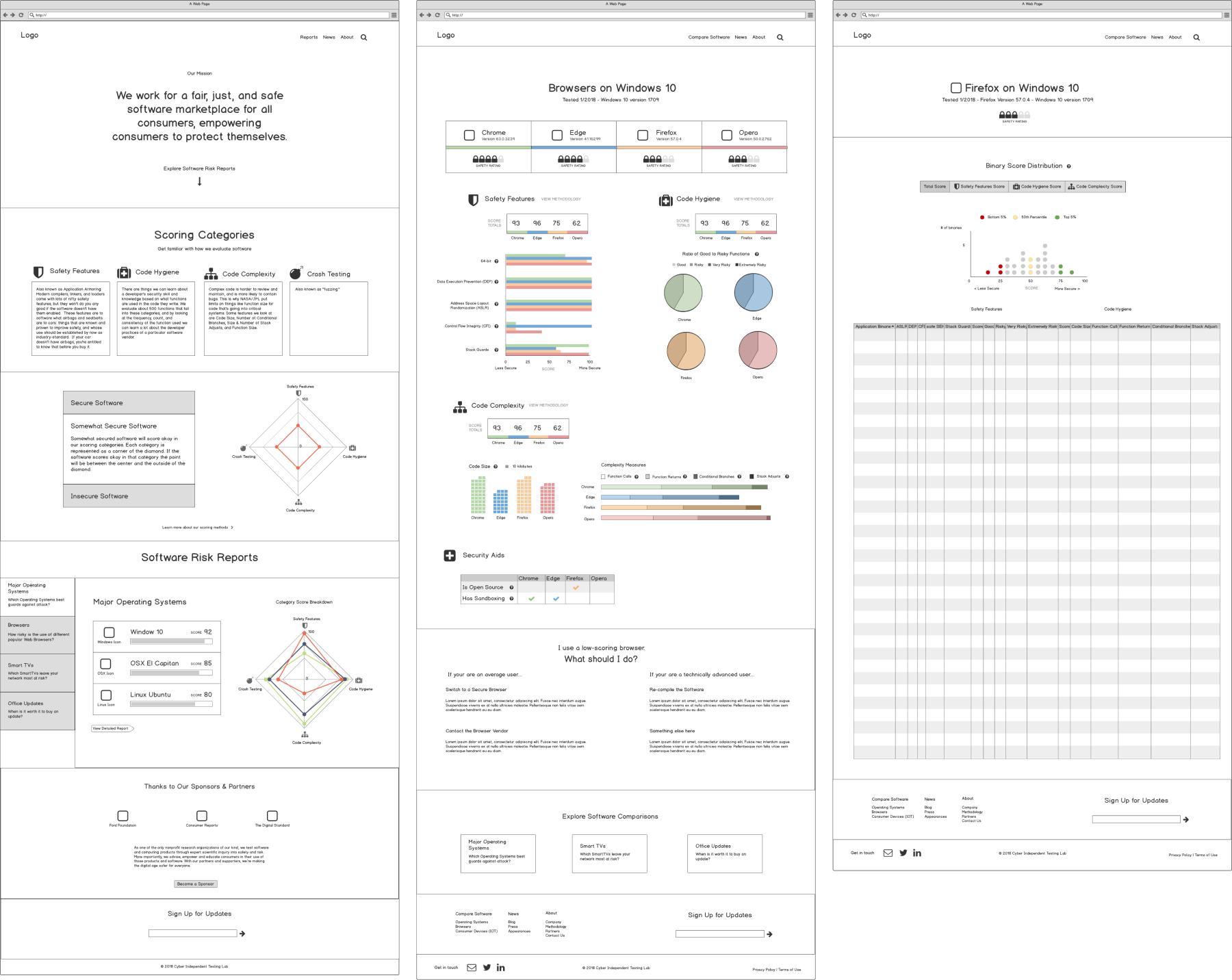
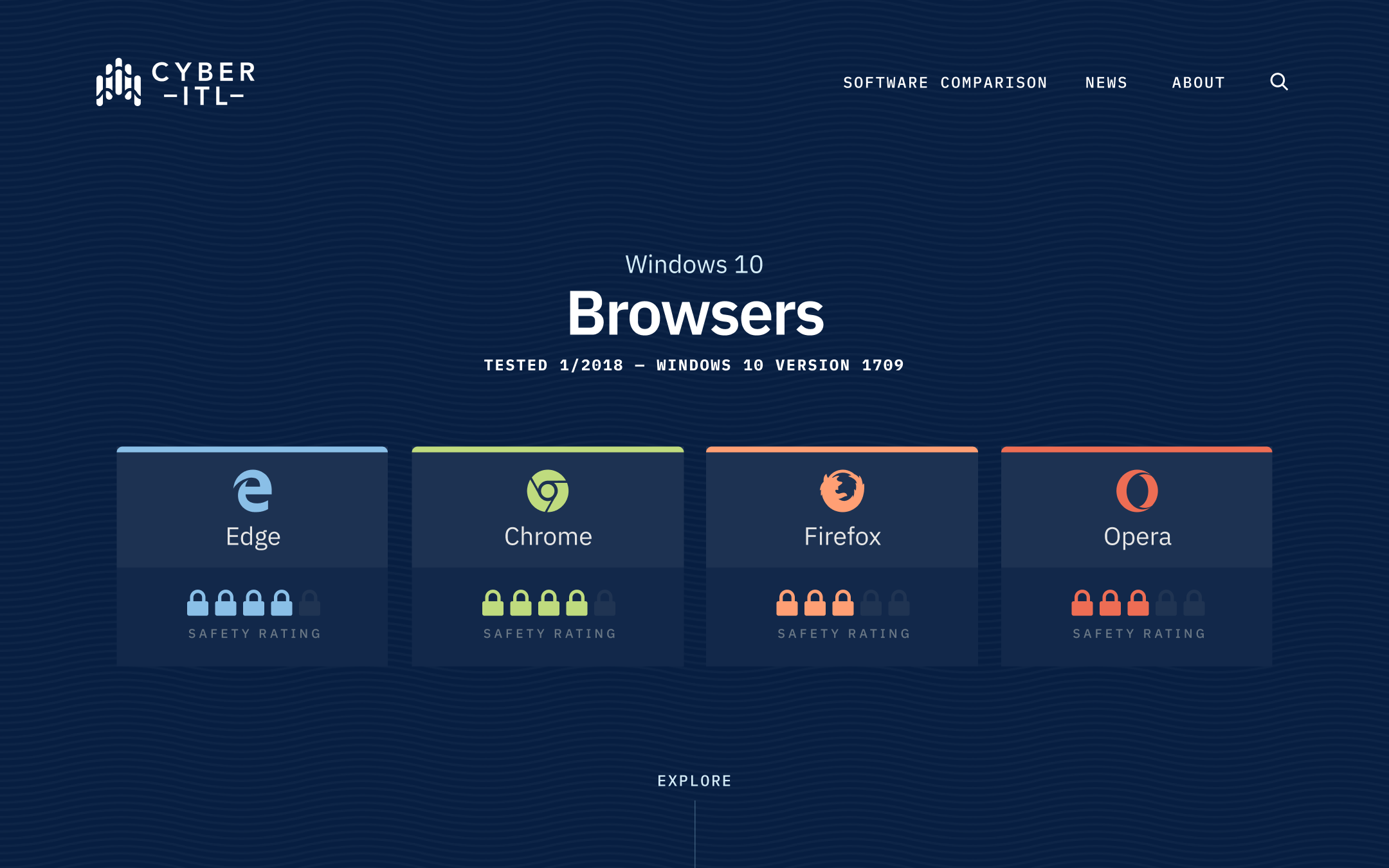
Since most people were coming to CITL for reports, we decided to make that the landing page for the site. Working through how much detail was needed to introduce reports at the highest level, we wanted to present an overview of each report category (browsers, IOT, operating systems, etc.) with links to the respective reports for more detail. We opted to use radar charts for each category to illustrate how each item scored in each of the four scoring metrics. For those unfamiliar with scoring, we first defined the metrics used in evaluation and added a section explaining the radar charts to clarify the comparisons.
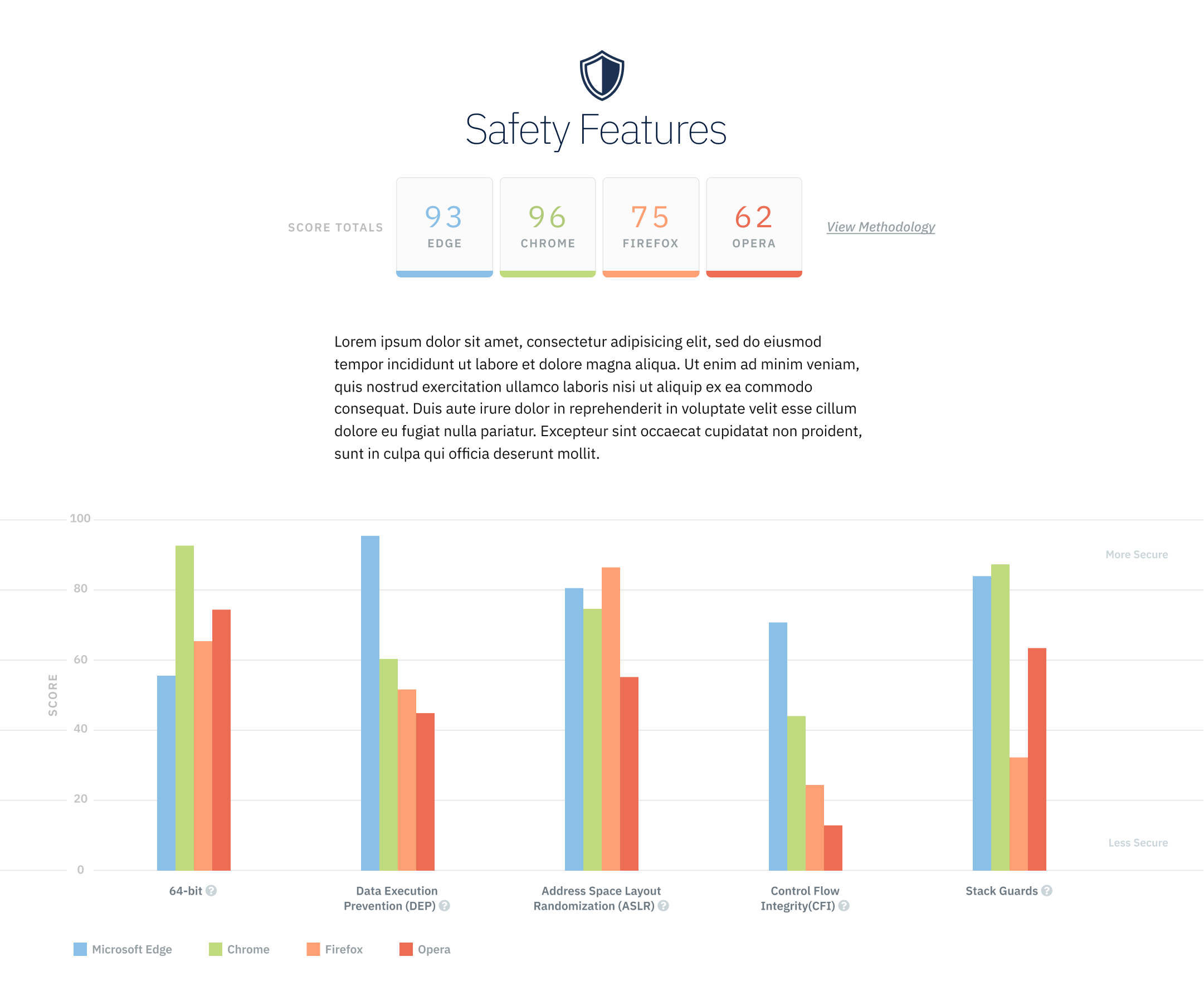
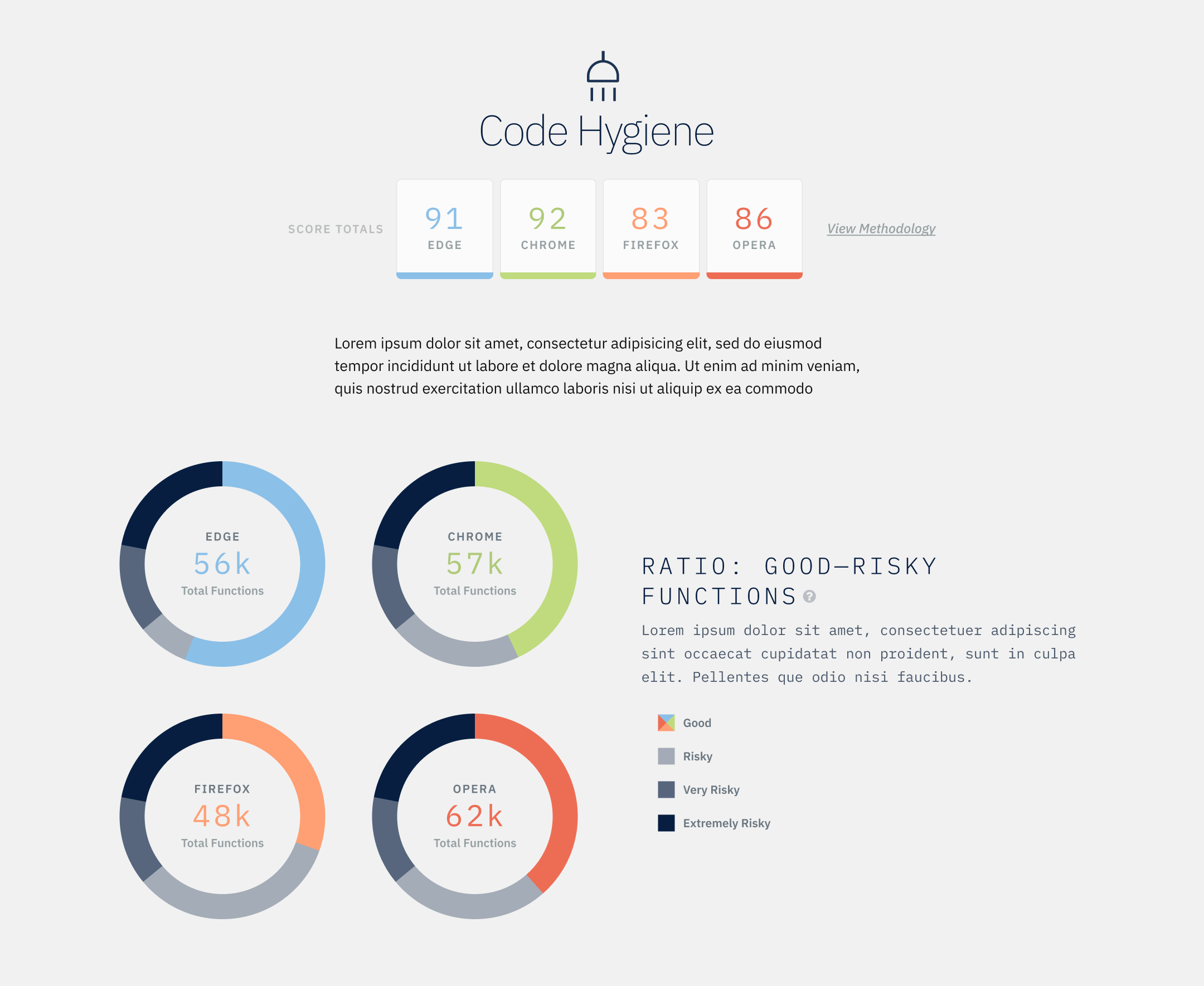
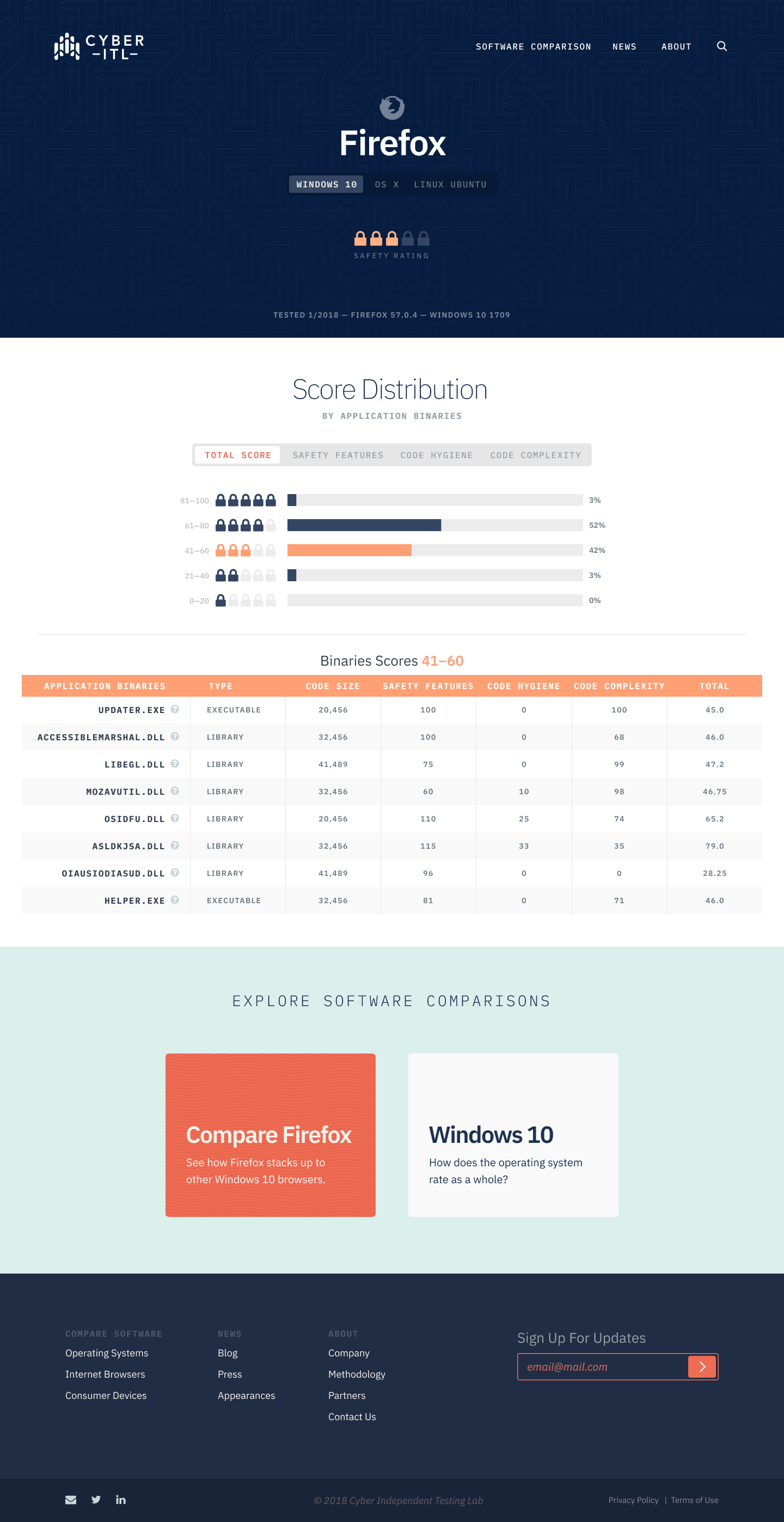
While the home page provided overall scores that enabled users to quickly scan and compare, the individual report pages provided a second level of score breakdowns. Within each metric, we used graphs and charts to compare each item (different browsers for example) to show how they achieved their respective scores. For even more detail, the browser pages would then list all the scores for a sample set of binaries, allowing users to view results by overall score and scores for each metric.
Home Page Variations
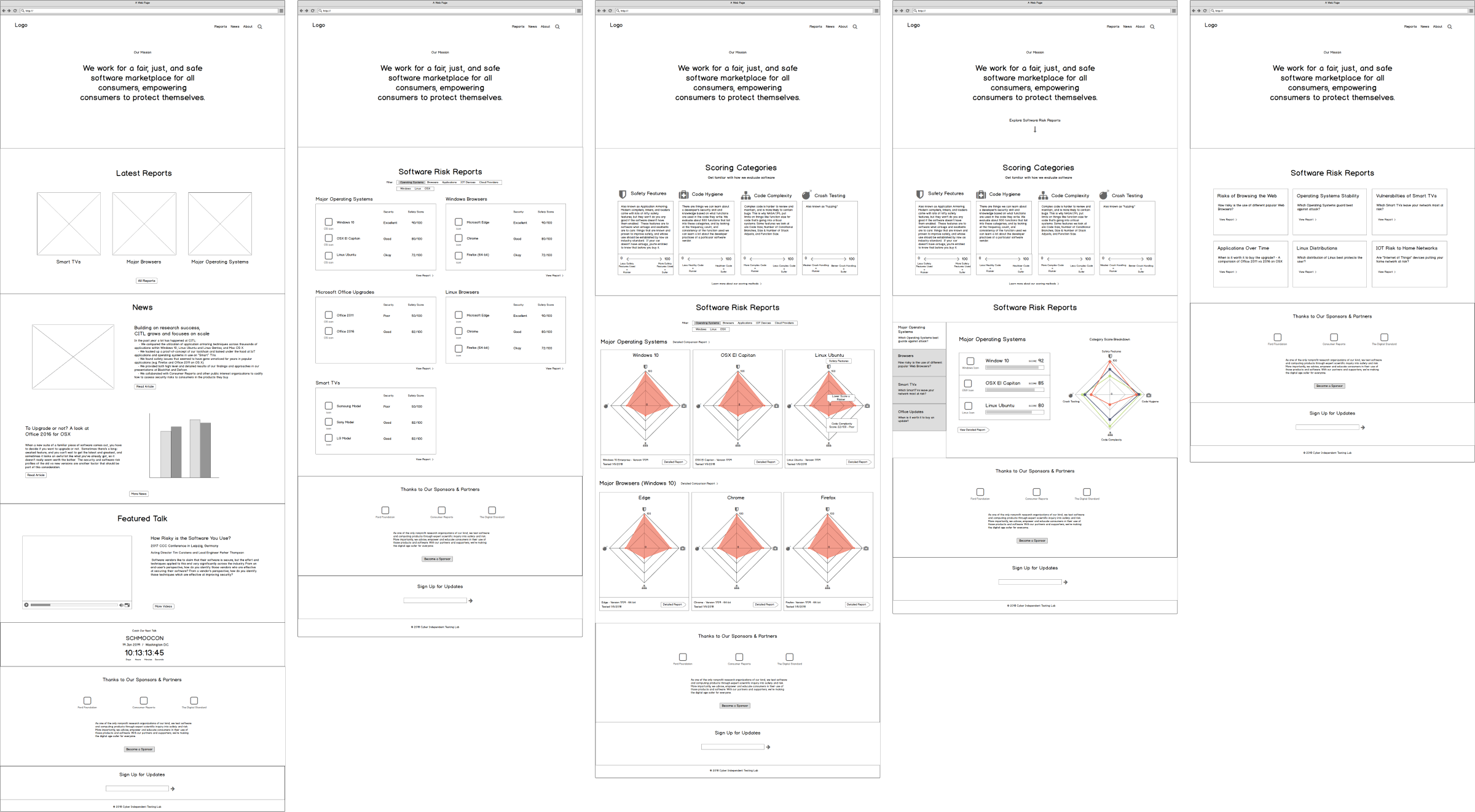
Exploring a Report
05Branding Research
Talking with CITL, we first aimed to define our goals for the new brand by pinpointing the answers to the following:
purpose
- Consumer activism
- Truth defined by measurements
- Better accountability (software vendors)
core values
- Trustworthiness
- Comfort (quiet fears), demystification, safe
- Scientific Integrity
personality
- Smart but approachable
- Effortless Effort
- Helpful, down-to-earth nerd
moodboards
I presented CITL with 5 design directions targeting the corners from an opposite diagram. The first aimed for a government/stately vibe (standards and measures) that would exude strength and protection through protocol and numbers. The moodboard used an americana color palette with a heavy focus on navy that felt fortified and authoritative.
The second concept aimed for a scientific research, data-focused comfort and also used navy but with a more robust color palette using pastels.
The third was for educational nonprofit that should feel helpful and trustworthy (like ConsumerReports), and it used a black/grey and green monotone palette for a clean, approachable, consumer-oriented feel.
The fourth direction was the hacker/nerdy feel of strength, smarts, and proactive protection. Initially, I provided a moodboard using a high contrast theme focusing on blacks and reds to exude the “confident fortress” that many cybersecurity firms use. However, since they wanted to differentiate themselves, I added a fifth moodboard that used a high contrast purple theme to lean towards technological, forward-thinking, and clever.
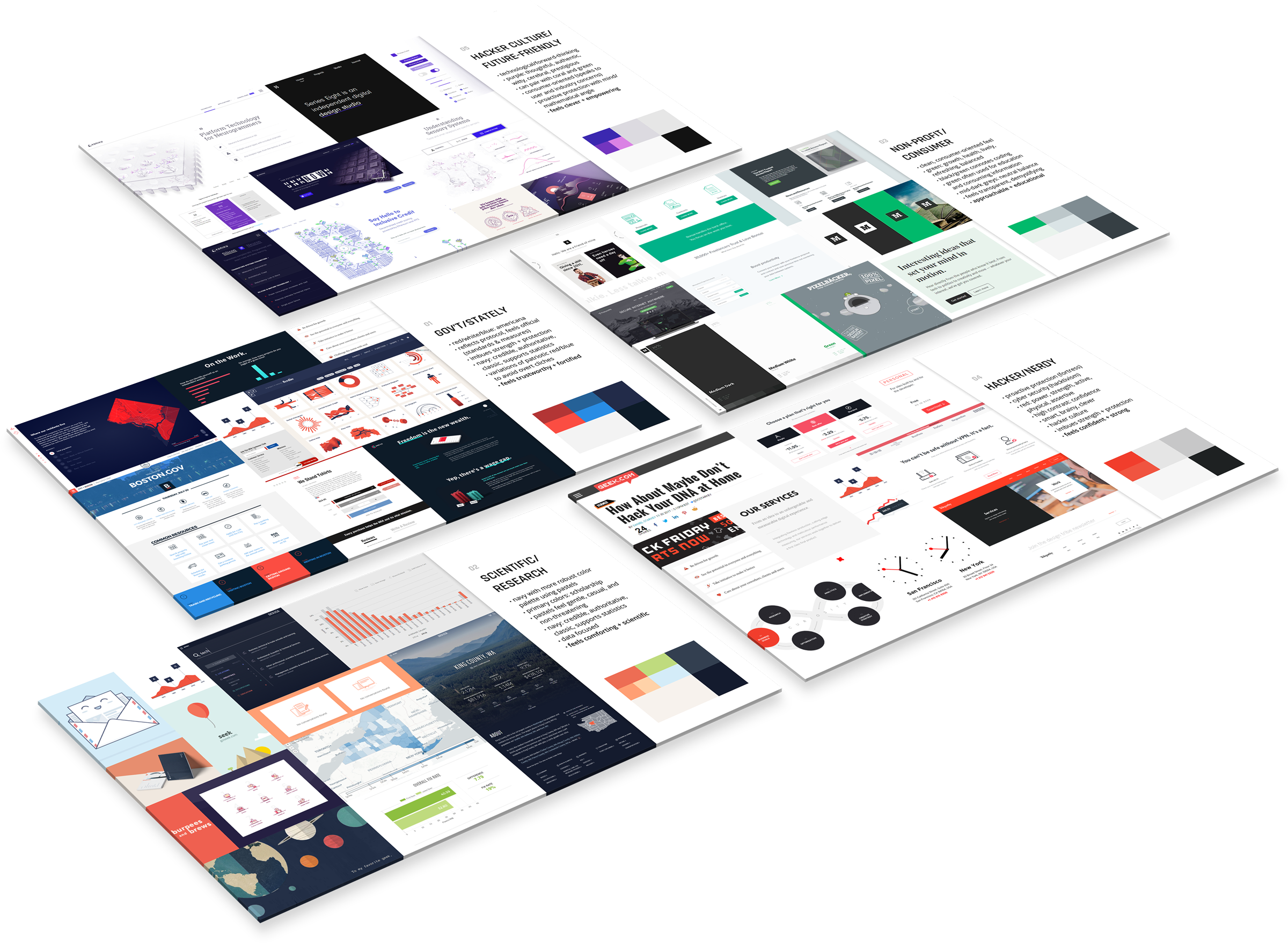
We narrowed it down between the second and fifth options, so I mocked up a sample page for how each would translate into a website. CITL liked how calming #2 felt to them and worried that the limited color scheme in #5 wouldn’t pair well with the different charts they needed. Going with option #2, our final design direction aimed to be comforting and scientific, invoking the idea that the data speaks for them. Narrowing down the typography, I found that IBM Plex, a quirky geometric grotesk typeface, was an excellent choice. Its blocky, engineered shapes with natural gestures from handwriting conveys the relationship between man and machine that was appropriate for the brand.
06Visual Design
07Results
Our work was a central part of the narrative in Cyber ITL’s annual report to their primary benefactor, the Ford Foundation. The feedback they got was (verbatim):
- Ford Foundation thinks the site is excellent, both visually and as a communication tool
- Consumer Reports is jealous of how cool it looks
- An executive at Facebook saw the visualizations and now has his team using them in their reporting
- Our security peers respect its unique combo of utility and vibe
revisiting scoring metrics
Now that CITL can visualize their own data better, they are having an easier time seeing how accurate their metrics are at scoring data. They’re able to see patterns that suggest fixes and are now tweaking how they score risks.
stronger partner networks
The new site and data visualizations have helped secure more funding from partners and added legitimacy to their mission. Consumer Reports and the Ford Foundation have both signed on for continued partnership.