Problem
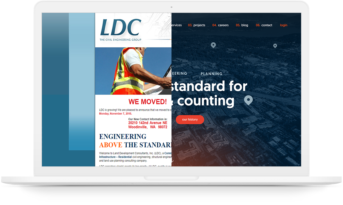
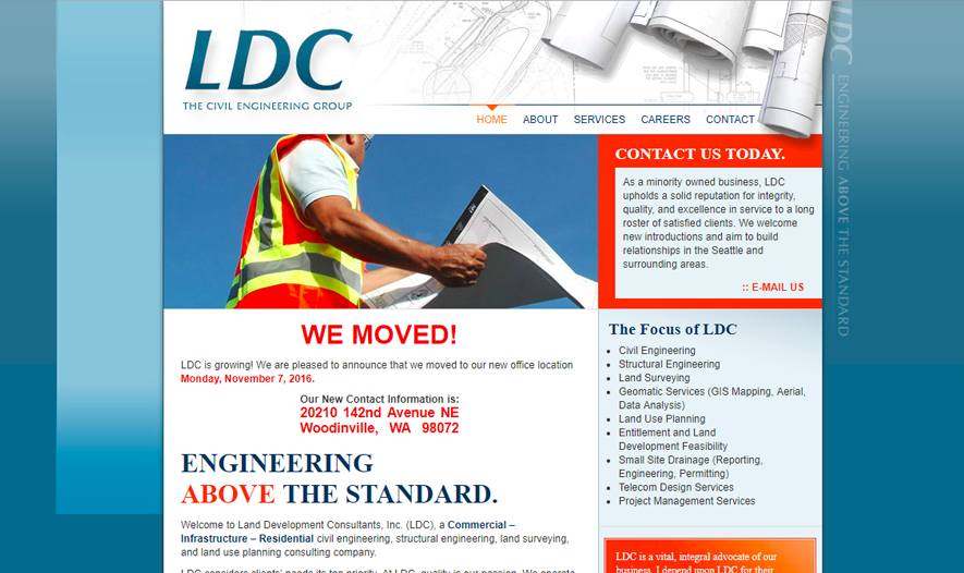
LDC’s success (as a civil engineering firm in the Seattle area) had deprioritized their website so that it hadn’t been updated in years, looking like a relic from the 90s. The experience of using it was so bad it was acting as a barrier for hiring. They needed to rebrand with a new site that reflects their size and success as a business as well as their team-oriented culture, so they could attract the top talent they greatly needed.
01Discovery
We had the opportunity to speak directly with the key stakeholders of LDC Inc. I began with conducting a Q&A exercise to understand their company, challenges, and outline some goals for the project. LDC’s business model values client relationships over new clients, providing the best service that goes “above the standard” for select large-scale clients. They wanted to encapsulate this in their visual brand, while also embracing their “servant’s heart” culture. Their biggest pain point was that people weren’t finding or applying to jobs through their website, which was a strain on the business as they had more work than people and were turning down clients.
warm but professional
Emphasizing LDC’s strong reputation, success, and growth was important, but they wanted to balance formal with friendly to show that the company isn’t just a bunch of stuffy engineers.
focus on recruits
LDC wanted to add 20 new employees a year, with a priority on senior-level people. The job application section should be intuitive and the site should be compelling to potential recruits.
value over commodity
With an interest in client relationships over new clients, LDC takes on client projects as their own. Their due diligence creates efficiency making it cheaper in the long run.
02User Research
When we asked LDC about their company culture, they told us it was not about barbeques but how you are treated as an employee; they invest in each other like a band of brothers, committed to each others’ success. When it came to hiring, they were looking for the right people, self-driven for success and team players that could mentor as well as learn. We found that the recruit persona complimented the client, since they were the foundation of what clients look for.

Brian: the recruit
Brian has 15 years of experience as a civil engineer developing housing communities. He knows he is valuable and looking for career path options with room to grow in a reputable company. A good team dynamic is pivotal, as he wants to work with people that support each other. With kids in the suburbs, he would love a suburban location with a good commute and time for family.

Jennifer: potential client
Jennifer is a mid-level manager at a large housing development firm, whose role is to secure the permits, consultants, and other resources. She has a budget for each project and reports to upper management with her choices, and will ask for more money if she feels that a particular choice has good value. With volatility in costs and future variables, she values efficiency and foresight.
I’m looking for peers that invest in each other to do quality work.
— Brian03Use Cases & Site Map
Analyzing our personas, I wrote out use cases for each and developed a content strategy that would drive recruits to open positions and clients to start a project. Recruits are looking to find out if LDC is somewhere they’d like to work and (hopefully) apply for a position. Potential clients have a project in mind, looking for the right firm for the job, then information to confirm the value of their selection. While mapping user flows, I took note that most of the overlap was on services and projects, and certain features like the company reputation were crucial to both.
User Flows

After going over out insights with LDC and hearing their feedback, we went through several revisions of the site structure to work through their concerns. While our original navigation included descriptive titles like “Who We Are” and “What We Do,” we decided it would be better to be straightforward and succint with the verbiage. And while I initially pushed for simplifying the navigation to funnel out from “Work” and “Team,” thinking one area for each persona, I found that having more top-level options in a longer nav was preferable, especially considering the overlap in user flows. Our final site map was a good balance of simple and accessible.
Site Map

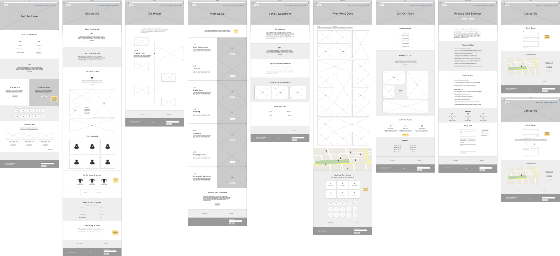
04Wireframes
While laying out the content, some things got moved around to other pages as we saw how everything fit together. We asked questions like whether their approach was unique to each service or an all-encompassing one that should be on the main services page. And while they initially didn’t show interest in detailed leader profiles, we found there was enough content to warrant individual pages.
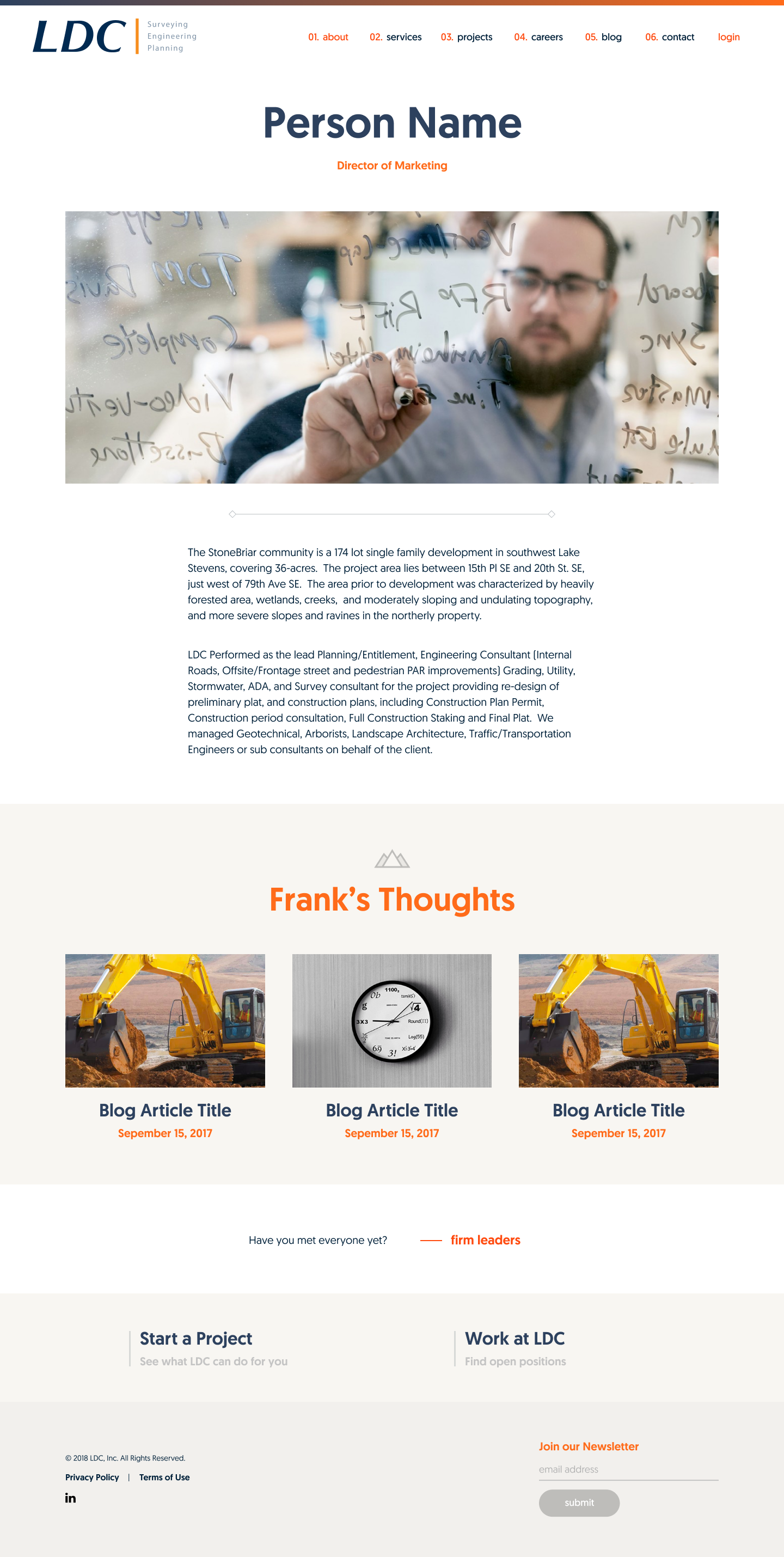
A prevailing concern was the very real threat of poaching from competing agencies and though showcasing their employees and culture was vital to both personas, they didn’t want to list out individuals. So we decided to highlight the firm leaders and include a collage of action shots and fun statistics and quotes from employees sprinkled throughout the site. Keeping in mind which persona(s) each page was geared to, photos on the About page would be more location/work specific while Careers include more culture-based and personal shots.
05Branding Research
20 second gut test
Going through 10 websites with all the key stakeholders in the room, we identified several insights to use as a starting point:
- Preferred monotone color palettes over multi-color ones
- Photographic imagery over icons
- No “Times New Roman” looking font
- Don’t over-animate (use controlled subtle interactions)
- Focus on usability: should be obvious what they do
- Need context: provide enough info to make decisions
moodboards
I presented LDC with 3 design directions. The first was a super high contrast monotone palette focusing on orange accents and using greyscale imagery, feeling professional and very bold yet amicable. The second option had a structured feel stemming from a navy blue base, using red sparingly for distinctive interest, and possible hand-drawn imagery for a subtle blueprint effect. The last option was the safest one, using a monotone palette with a variation of blues, focusing on midtones and bright photography.
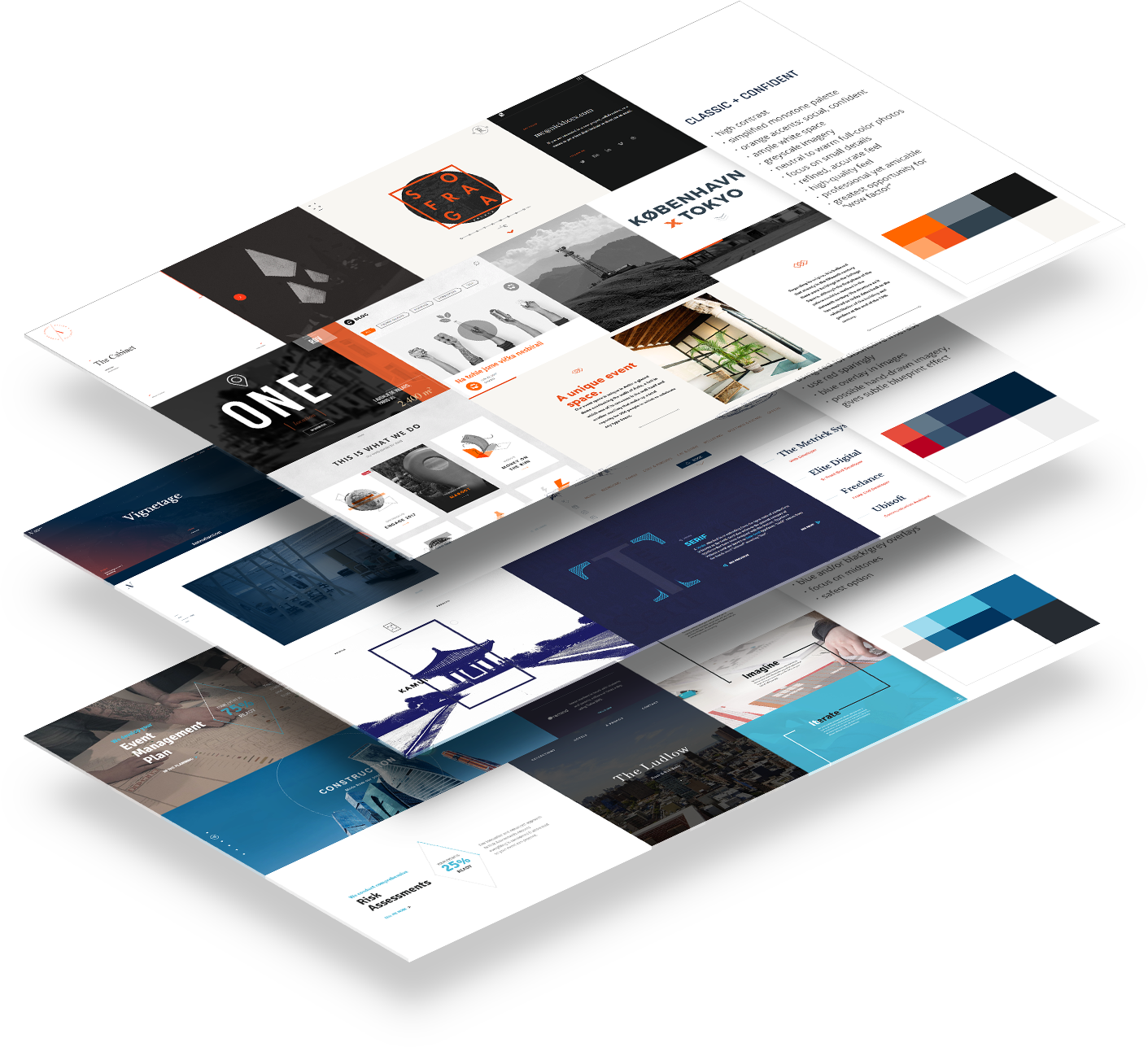
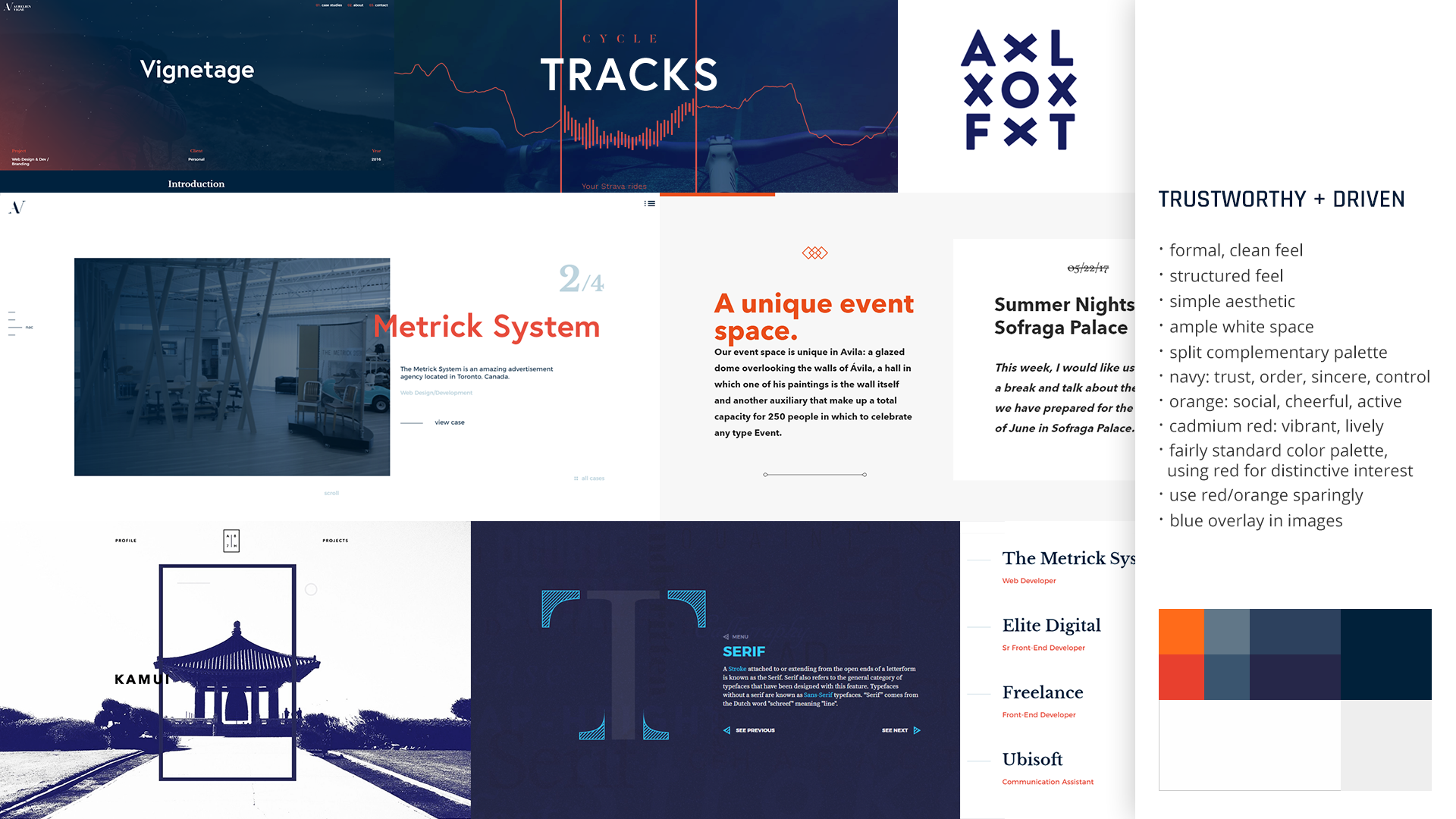
LDC preferred the second option the most overall but liked the confidence and typography from the first, as well as the orange, so I revised the second moodboard to include some of those aspects. Our final design direction used a split complimentary palette with orange and red for accents, replacing illustrations with photography and using blue overlays to address concerns with maintaining quality with lower resolution photos. I pinpointed our main key words for the brand to be trust, reliability, and ambition.
06Visual Design
My goal was to convey a high-quality status, professional but amicable demeanor, and trustworthy discipline. The color palette from the final moodboard met those goals, but we needed to refine the typography. Looking for a geometric typeface with humanist qualities, I found Geomanist by Atipo® was the perfect choice to reflect both mathematical precision and friendliness. With additional stylistic treatments, I was able to achieve a formal, structured feel that was also cheerful and confident. And keeping maintainability in mind, I created a design system with modular components for the type of content LDC wanted to update.
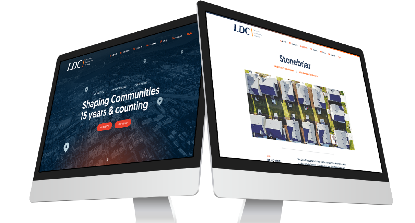
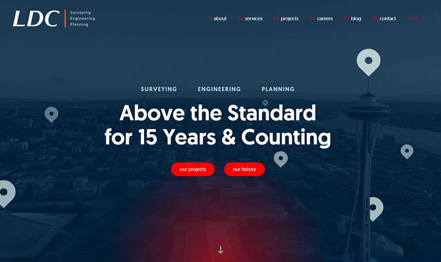
LDC also wanted a “splashier” home page to capture the interest of recruits, so I created the custom hero background video which superimposed location markers over panning drone shots to indicate their impact on the local landscape.
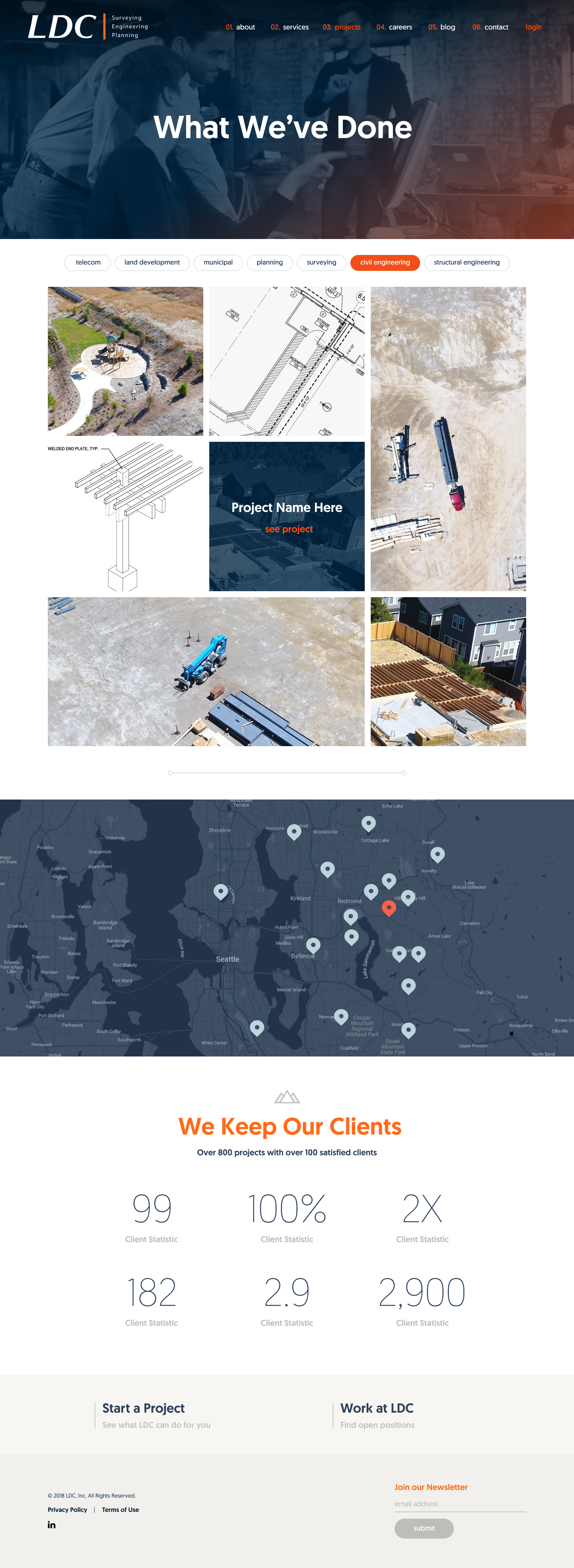
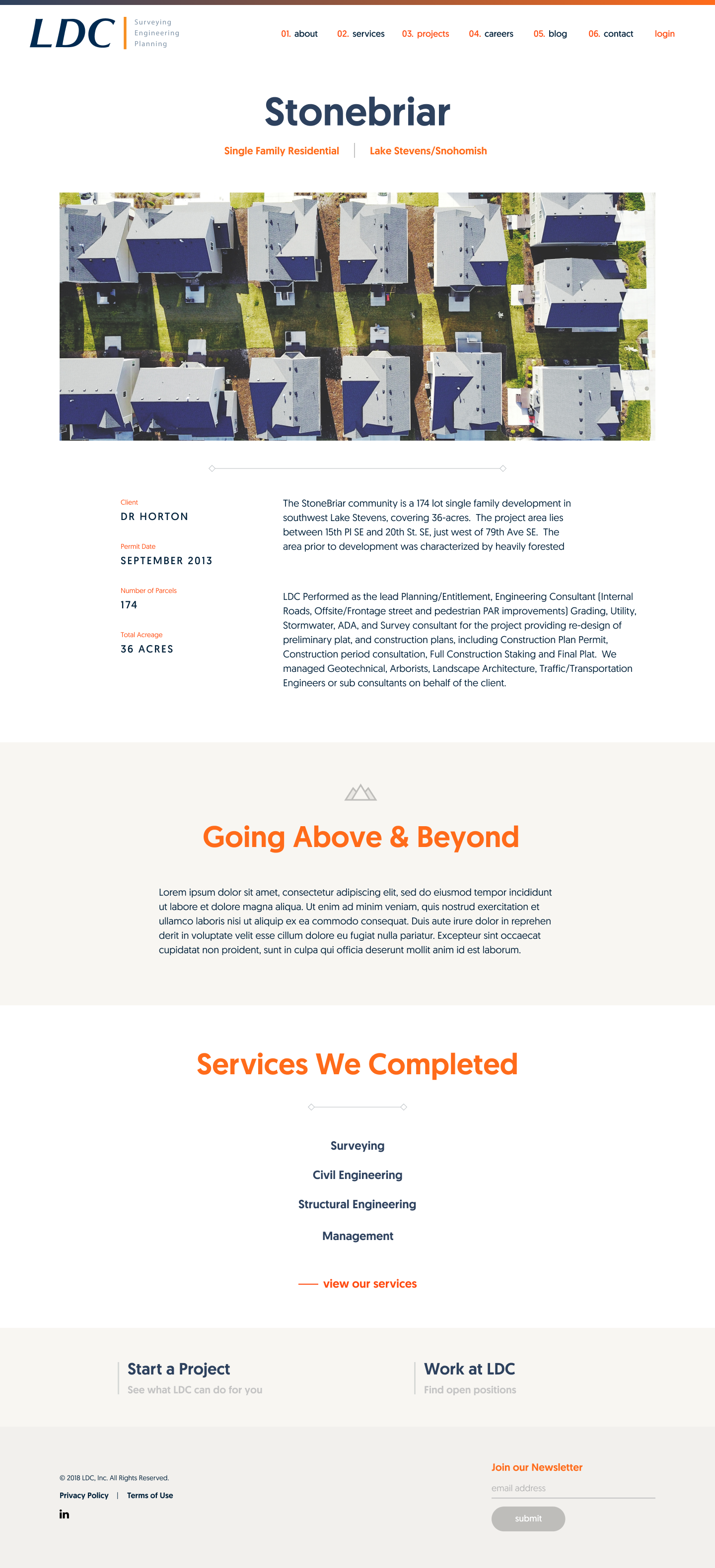
Projects was probably the area with the most overlap for the personas, and they had struggled previously with how to elaborate on them. While they were initally concerned about the type of imagery they would be able to provide, they liked my mixed grid format for the main page and more typographic focus for the details.
We identified two primary use cases for the services page: either the user had a specific service in mind and was looking for details on it, or they were browsing and looking for the breadth of services offered. For the former we included the list at the top that would link directly to the detail page for each service. Otherwise the main page offered the browsing experience with a parallax scrolling split-screen slider that gave focus to each service individually.
LDC was preparing for their 15th year anniversary and asked us to incorporate that somehow, so I concepted a history page to tell their story and celebrate their success. I designed a timeline where they could highlight important milestones, taking the user from their launch through ups and downs while they scroll the page.
07Results
We received a lot of positive feedback from the client about the site once it launched, and LDC has shared some of their analytics confirming success.
Page Views on Glassdoor
Visits to New Site
I can send candidates to the site and 10 times out of 10, whether they end up working here or not, they tell us it looks from our site like we're doing very cool work. We’re just looked at differently and the culture of the company really comes through.
— Brian Kelleher, Lead Recruiter @LDC