Problem
Filling in timesheets sucks, and getting employees to do it regularly is especially challenging when your timesheet management tool is from the dark ages. Palador, a software consulting agency, relies on employees to log their hours in order to bill clients, but timesheet compliance was really low. They wanted to fix the UX issues plaguing the software so that employees would be more inclined to use it.
Client
Palador, Potential Clients (Sales Product)
Role
Information Architecture, UI/UX, Visual, Creative Direction
01Discovery
Interviewing a dozen employees, I aimed to find out why people weren’t logging their hours, looking for their biggest obstacles and paint points. We found there was a lot of commonality in people’s answers, and used an affinity diagram with sticky notes on a whiteboard to help organize our insights. We found that while we can’t make timesheets inherently enjoyable, we could address some of the major reasons for tardiness for a very achievable solution.
oops, have to run
Many of our employees take the bus, and at the end of the day it can be easy to lose track of time and realize you have to run to catch the bus. Aaaand don’t have time to log hours.
cycle of procrastination
You forget to log your time and keep telling yourself you’ll do it later. The longer you put it off, the harder it is to remember what you did, and the more you procrastinate.
technical issues
The web app itself was a major handicap, partly because the UI was so clunky, but also because the loading times were sometimes so long that it would time out or become unresponsive.
02User Research
Users could be broken into two basic groups: the punctual ones with occasional slipups and the habitual delinquents. We found that most of the emails sent out for reminders were being sent to the same people. Oh no, Steve, you did it again. Getting Steve to use our new app became one of the main goals. We also included a persona for the managers/team leads using the reports to analyze performance trends.

Steve: repeat offender
Steve normally works on one or two larger projects at any given time and prefers to fill in his timesheet at the end of every week. He often forgets to do it until he gets a reminder at the end of the month that he is a couple weeks behind. Steve then finds himself doing some computer forensics (looking through emails and time stamps on files) to figure out what he did so he can log it.

Jackie: daily logger
Jackie typically juggles a handful of tasks on many different projects and finds it easier to log her time at the end of every day. She’s pretty good at keeping up to date with her timesheet, but occasionally misses a day and has to go back several weeks to figure out where she’s missing hours. Jackie would also really appreciate a mobile app that she can use on the bus.

Ann: project manager
Ann uses the current app to gauge the health of projects she manages. She tracks cumulative hours logged per project along different roles, looking to see projects hitting their budget without going over. Ann would love to be able to analyze historical trends for different roles to better estimate the scope on future projects, as well as have better data for post mortem project evaluations.
I don’t remember the last time I updated my timesheet and at this point I’m too afraid to look.
—Steve03Information Architecture
Our initial explorations tried to incorporate the concept of nested or grouped tasks with additional features like a stopwatch timer and sequential entries. Instead of relying on descriptions to provide context for time entries, organized tasks that could be shared among team members and grouped into checklists would allow for the app to become more of a personal time management tool. However, this went above the scope and purpose of the project from an ROI perspective, and project stakeholders wanted to move forward with a v1 version focused solely on basic time entry and tracking, saving more complex task management for a future release.
Initial Sketches
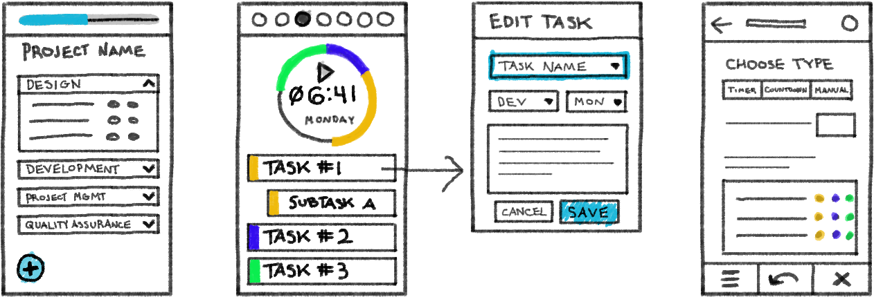
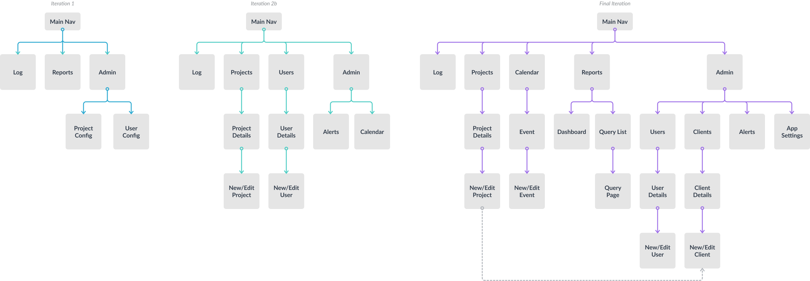
Restructuring the application for the simplified description-based tasks, we went through several revisions of the app structure. Our first rendition organized the nav into top-level areas based on core functions: logging new hours, tracking cumulative hours, and administrative updates for project/user details. As we wireframed the pages and added new features, we found enough use cases to promote projects and users to the main nav and dropped Reports since it was then redundant. Further iterations added/promoted a calendar feature, added Clients and moved Users back to Admin, and brought back Reports for saving popular queries.
04Wireframes
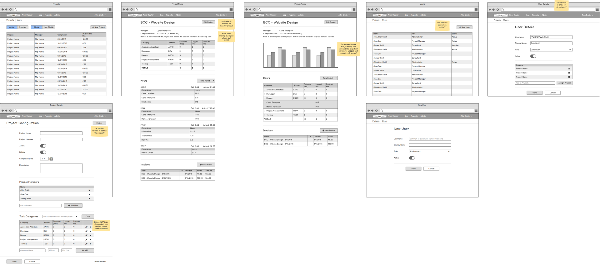
We went through four iterations of wireframes, each time building on the feedback from the previous iteration testing and review. While expanding on features, we realized that while we initially prioritized the hour-logging personas, the project manager persona created so much potential for this to be more of a project management app than basic time tracking. After outlining more use cases for how Ann wanted to track consultants and their logged hours, we beefed up the analytical aspects of the app to facilitate the ultimate goal which was accurately invoicing clients for hours worked.
Iteration 2.3
Iteration 4.1
05Final Comps
Following our company style guide, I created a monotone palette that could be easily modified to different color schemes for other brands. While initially this was for internal use, our design had to accomodate selling the product to other companies.
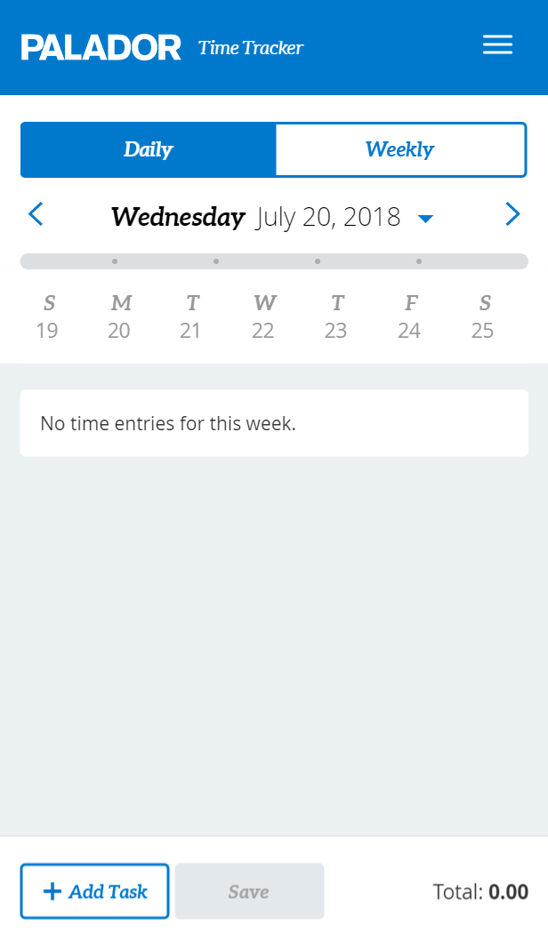
On the log screen, we have a toggle for daily and weekly input, with the preferred selection cached for each user. One concern after the initial launch was that the Daily tab lacked enough context for the rest of the current week, so if you missed a day it was easy to forget. My solution was a weekly progress bar in the header that not only served as a visual cue for cummulative hours but felt satisfying to watch it grow as you added a task.
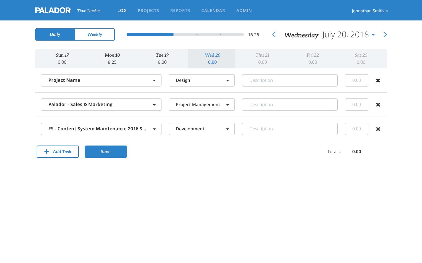
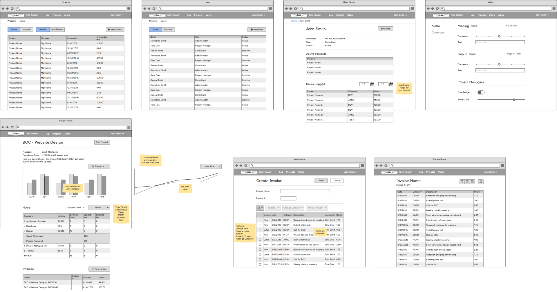
We used similar formats for each page type to create familiarity across the app. The detail page, for example, had high-level details followed by a graph tracking the most important items based on use cases defined for each page, followed by tables of relevant data.
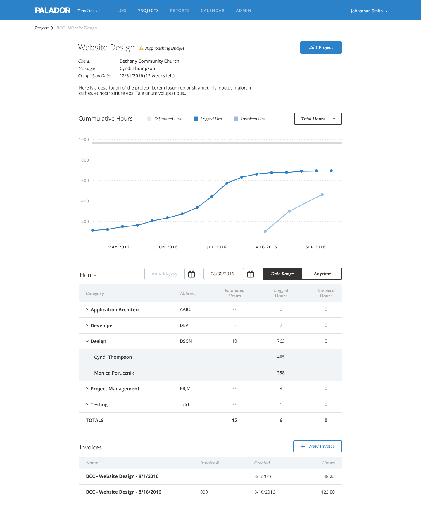
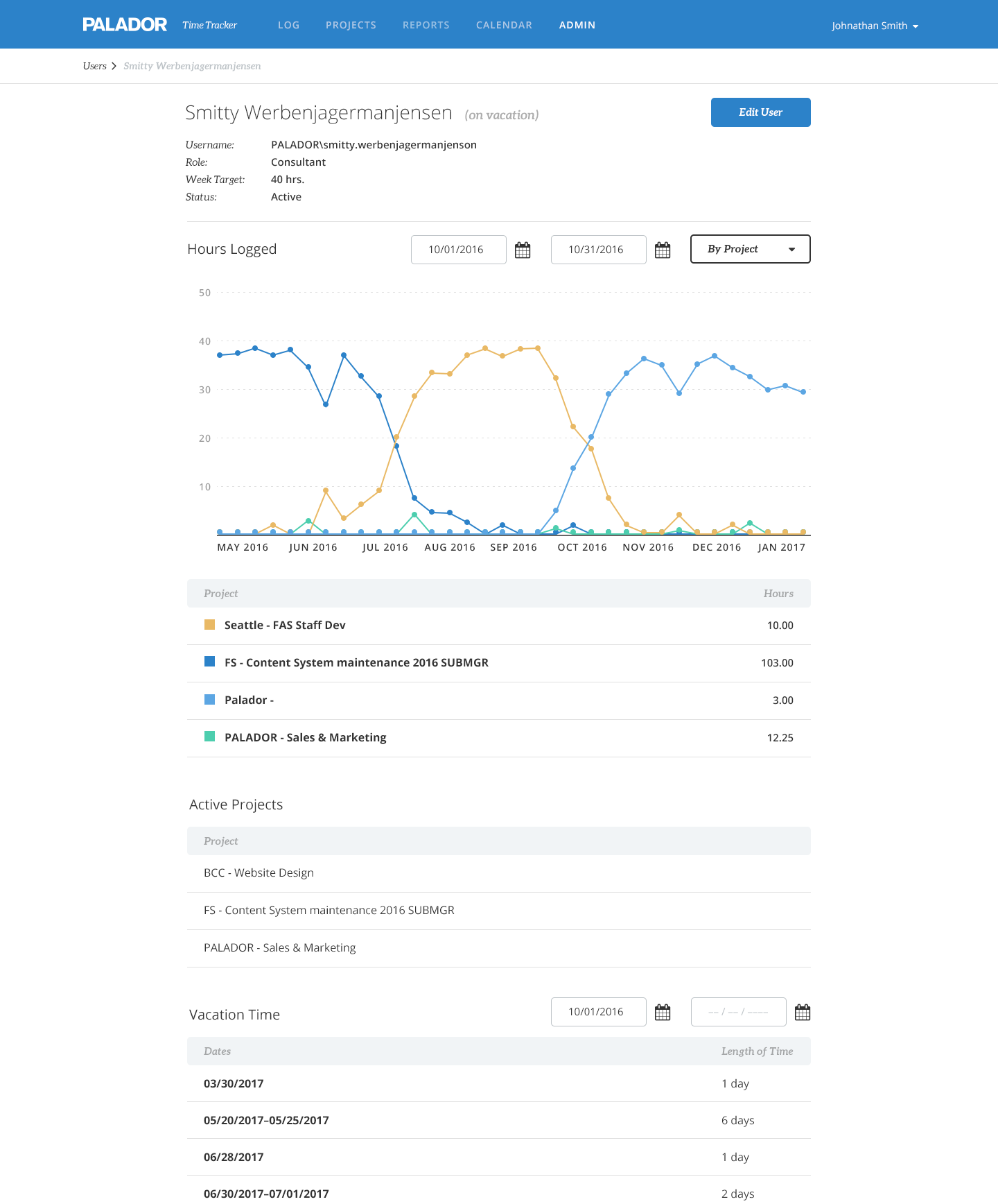
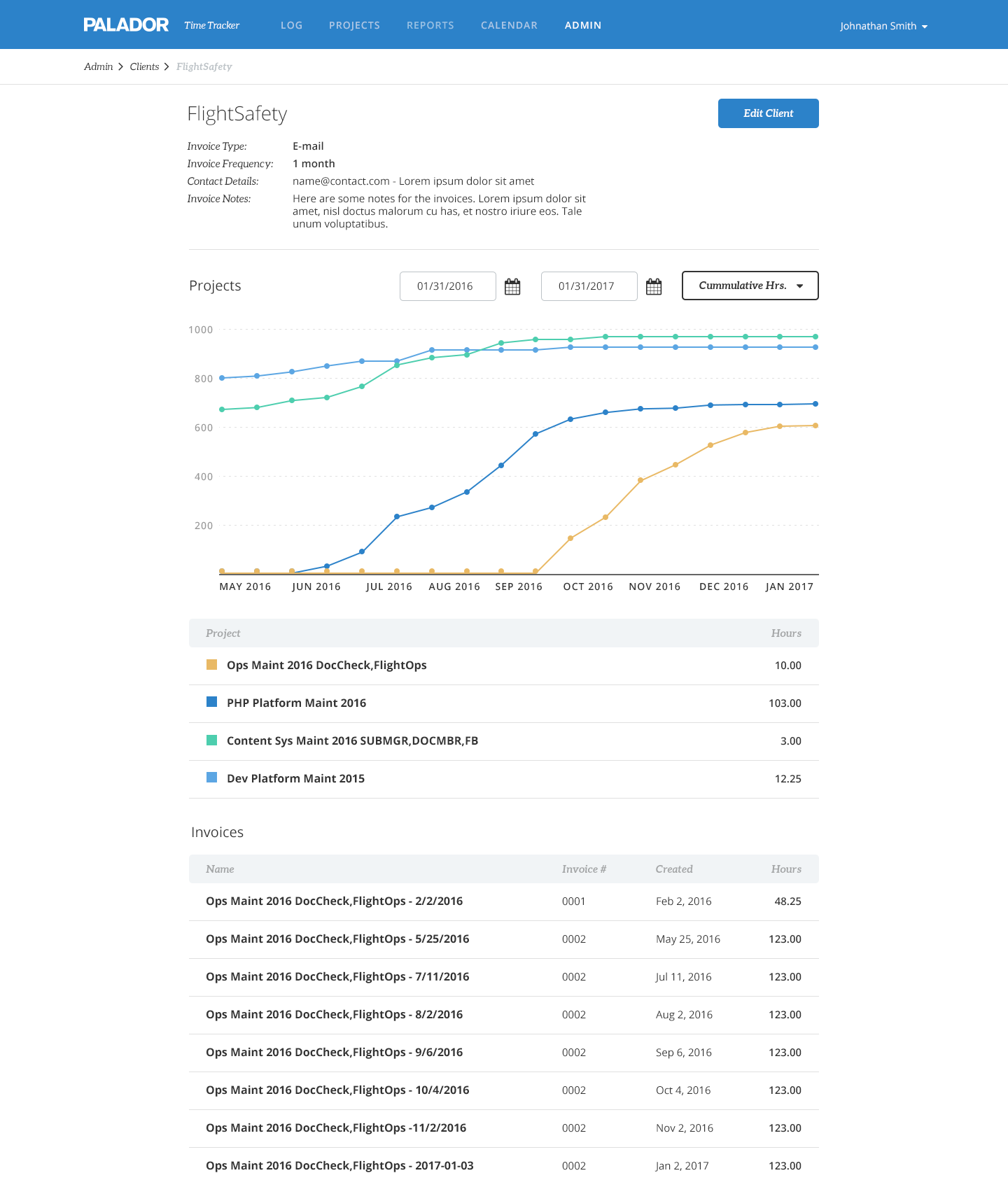
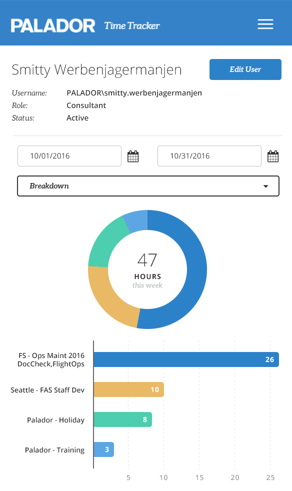
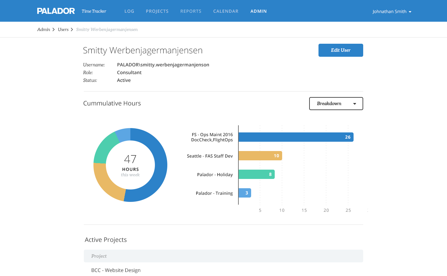
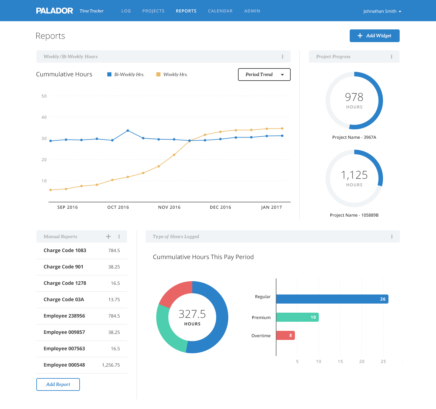
Graph visualizations included line graphs, bar charts, and pie graphs based on the data. We asked users what they were tracking for projects, users, and clients and defaulted each page to the most popular graph type with a dropdown to select other options. On the User page, for example, project velocity was the most commonly requested feature, so I used a line graph to show the trend of cummulative weekly hours logged per project. To show a breakdown of their current project workload, I used a combination of a donut chart for an overview of part to whole comparison and a bar chart for accurate value representation. For daily and weekly totals, I used line graphs to show the rhythm of work, which made it really easy to identify missing time through a sudden drop in the line or misplaced time through a jump.
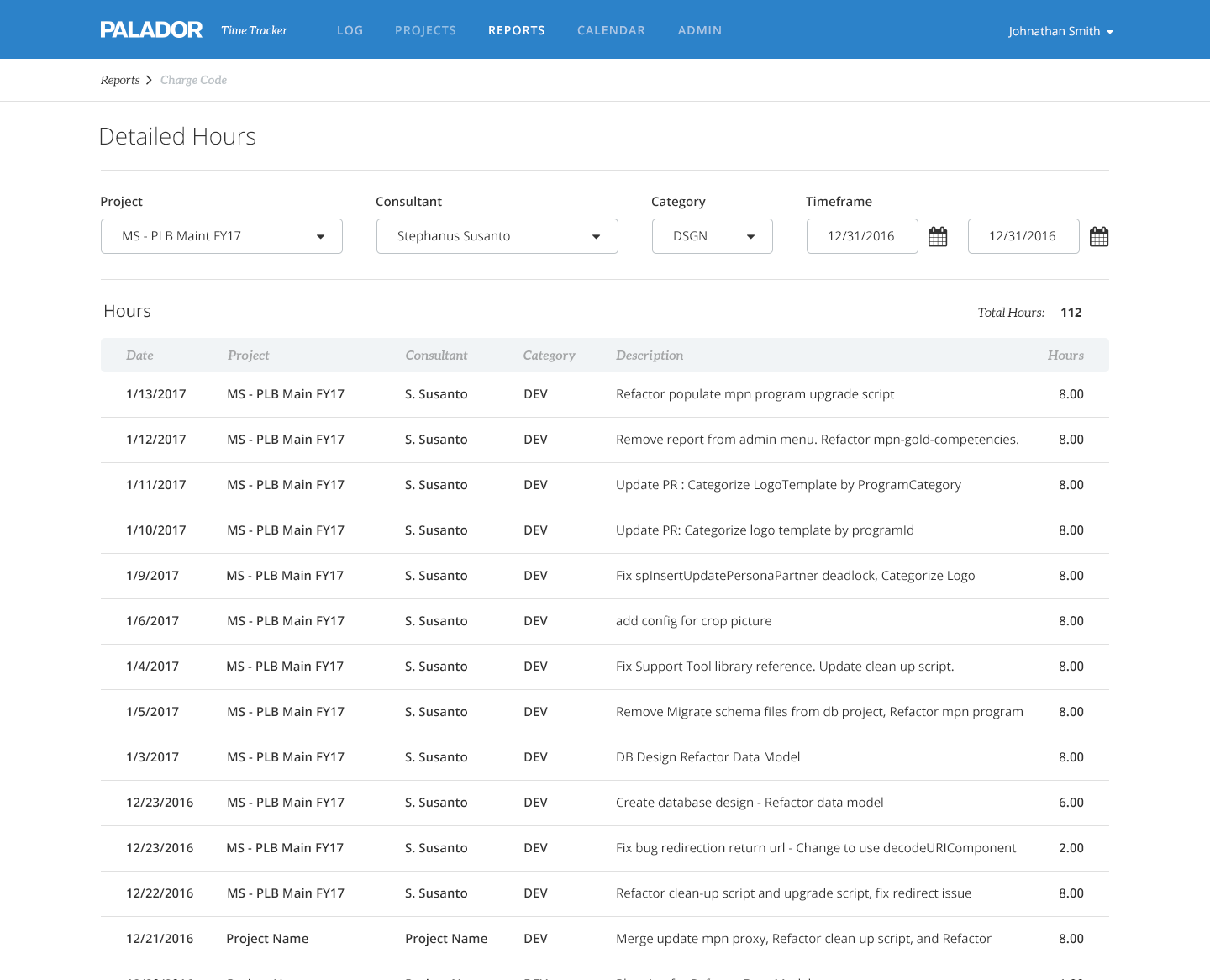
The Reports area consists of a dashboard experience and detailed custom reports. For the dashboard I came up with examples of high-level summary information blocks, keeping in mind that this page was going to be used by a select few with admin-level access, such as the CEO and department heads. The custom reports launched with a detailed hours report where users could save filter sets. Future launches will include additional types of reports as well as customizable widgets per user for the dashboard.
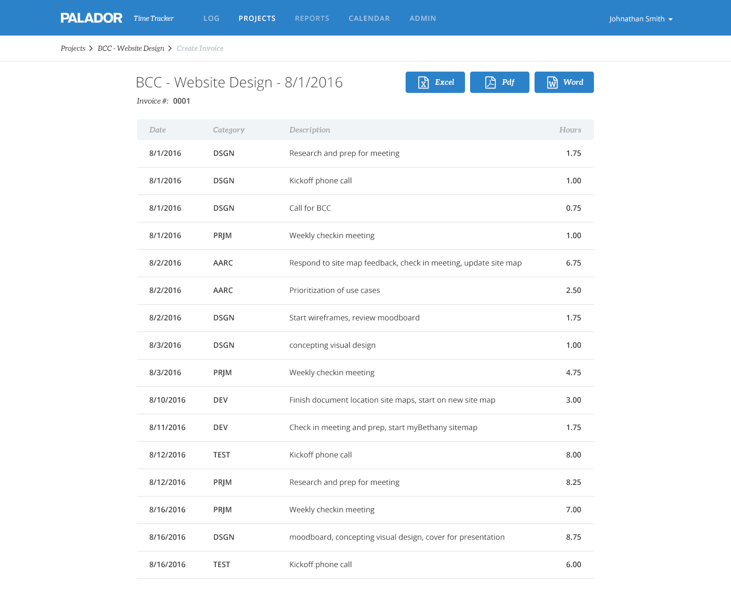
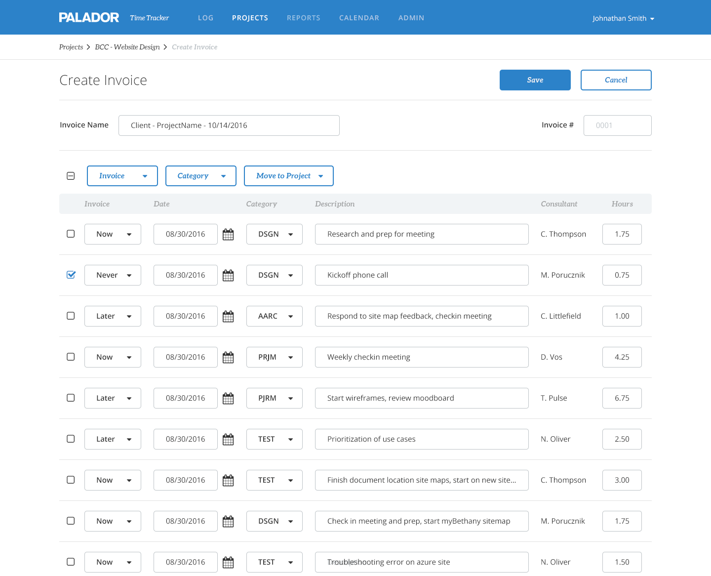
Invoicing
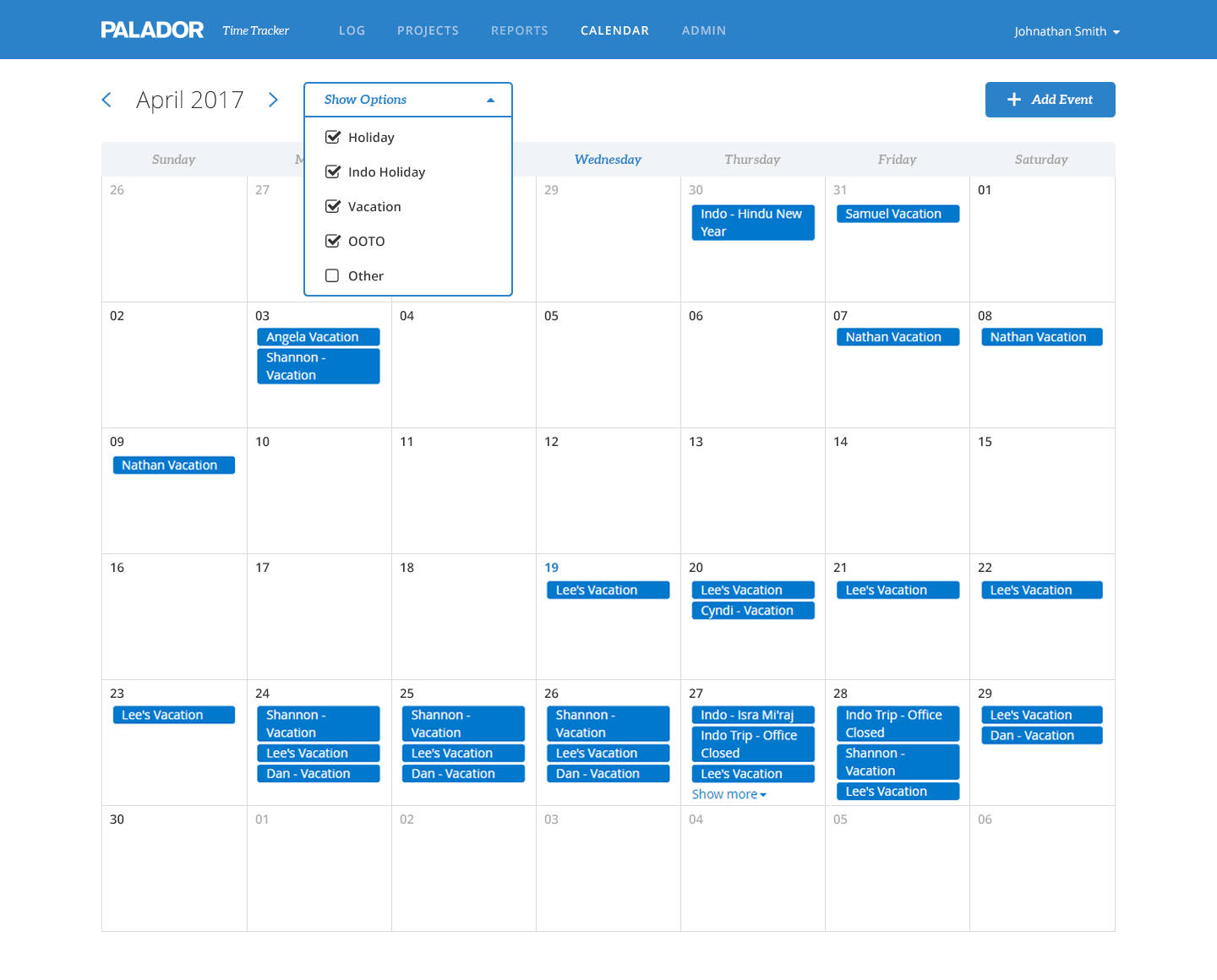
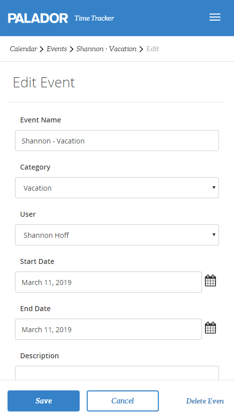
The calendar feature wasn’t initially in scope but was added since there was some overlap in use cases and stakeholders were excited to get rid of the calendar in Outlook. While most of the reporting features were used almost exclusively on desktop, the calendar, like the Log screen, was often used on mobile.
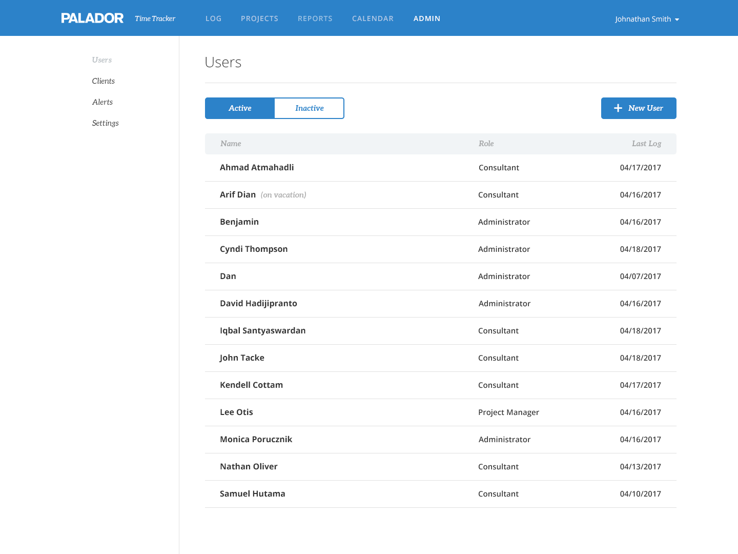
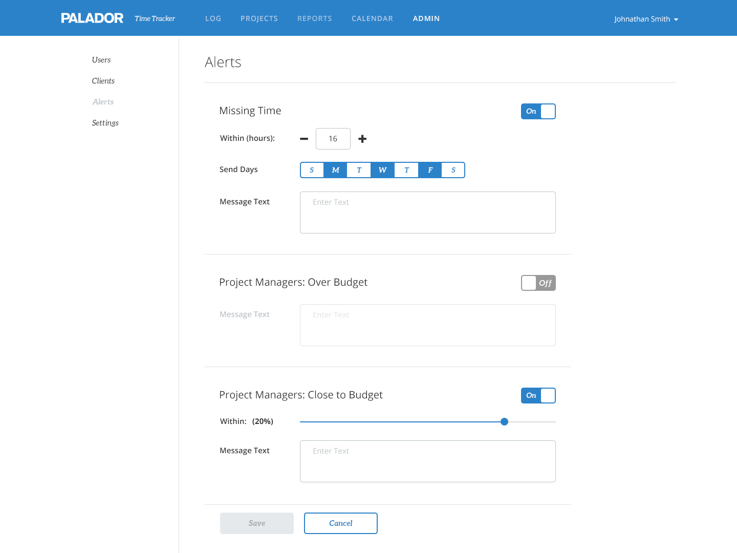
There were a lot of changes to the Admin portion of the app through the design process, but we landed on a side navigation menu for Users, Clients, Alerts, and (system) Settings which would also accomodate a flexible number of additions for future releases. All these sections would only be accessible to users with admin-level privileges, thus we could just turn on/off the tab for different users.
06Results
We had a very positive reception immediately after our initial launch of the app and found that simply making it mobile was huge but everyone loved all the new features. After collecting feedback for the next 3–4 months we made some minor changes like adding date ranges to the graphs and expanding on the types of alerts project managers would receive, and added major components like the calendar. About 3 months after the second major release we won a contract to build a time tracking app for a WA state government department, using our TimeTracker app as the base and tailoring it for them.
Improved timesheet compliance
Lower consecutive discrepancies
Government org appeal
Looking forward to future releases, our next steps will include adding more features to the app as well as thinking about the changes we need to make to accomodate larger organizations. There will need to be many minor changes like dropdowns for selections like projects or clients may need to be changed to text fields with auto complete, since the lists will probably exceed reasonable lengths. And of course when we have time for larger scope changes, I’m personally excited to incorporate the concept of nested tasks into time entry as well as other personal time management features.