Problem
Guidacent, a Seattle-based consulting firm, was looking to refresh its website to attract new clients and hires. Having standards for high end results, their site didn’t align with marketing goals or reflect the quality of their services. They wanted to find a fresh point of view with the right message so they could appear forward-thinking but modest, and they needed layouts that could accomodate easy updates.
01Discovery
Speaking with key stakeholders, I first aimed to understand Guidacent’s goals, services, culture, and elevator pitch, while elaborating on specific issues they had with their current site and brand. A major concern was that the boiler-plate content and generic visual design left people coming to the site questioning what Guidacent even did. They wanted to be more personal, showcasing their uniqueness, while being specific and clear when presenting their services and value proposition. They also wanted to rebrand and were open to ideas on communicating their message.
cool & tech-edgy"
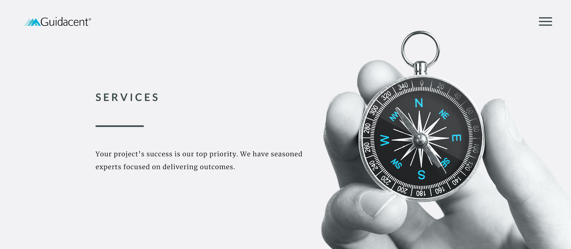
The brand should feel clean, crisp, modern, and professional. Convey a world-class technology group but remain modest, employing UX trends that inspire awe without being too flashy.
leading the way
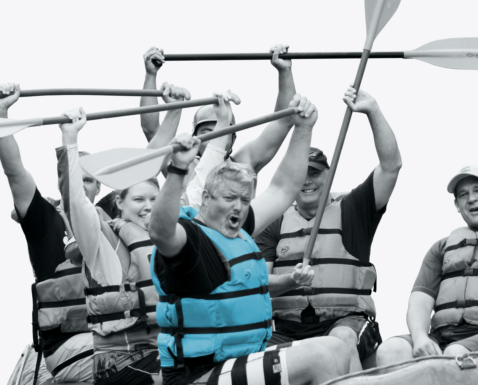
“Good as done” is their motto, as they’re about execution, not strategy. Clients should trust that Guidacent can lead them to success, imbuing a sense of moving forward.
"pacific northwest"
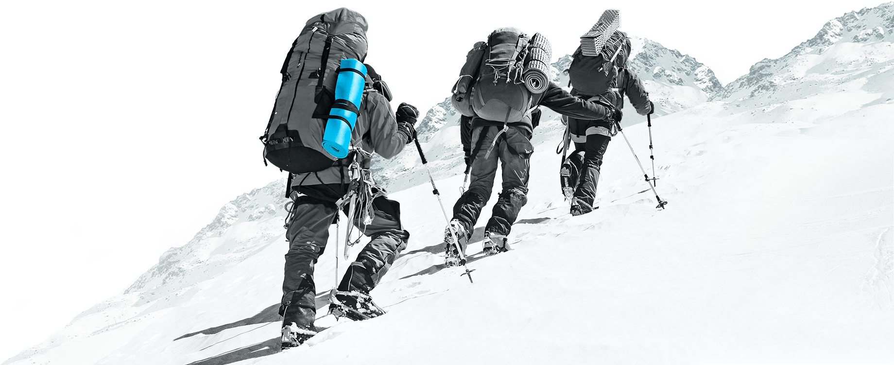
Tied to a motif of climbing mountains and wanting to put emphasis on their regional relationships, Guidacent wants to convey a Pacific NW vibe and incorporate mountains.
02User Research
While Guidacent wants the site to also be a resource for current clients and consultants, the main personas were for acquiring new clients and hires. Users generally come to the site through a referral or as a result of a meeting or consultation with Guidacent, but we wanted to improve organic search as well.
Betty: potential client
Betty is the CTO of a Seattle-based accounting firm and her team got in way over their head restructuring their database network. Currently frustrated and unsure how to sort the mess, she needs help navigating through bureaucracy and obstacles. Looking for peace of mind, Betty desires strong leadership with proven experience of success in similar ventures.

Steve: potential consultant
Steve has 12 years of experience as an IT consultant and has managed projects for startups to Fortune 500s. He is collegiate, peer-supportive, and has a work-hard, play-hard attitude. With a vast network of connections, he was referred to Guidacent through a colleague. He’s interested in the company culture, types of roles and experience he’d have, and testimonials.
Help us navigate through corporate obstacles so we can reach our goal.
—Betty03Information Architecture
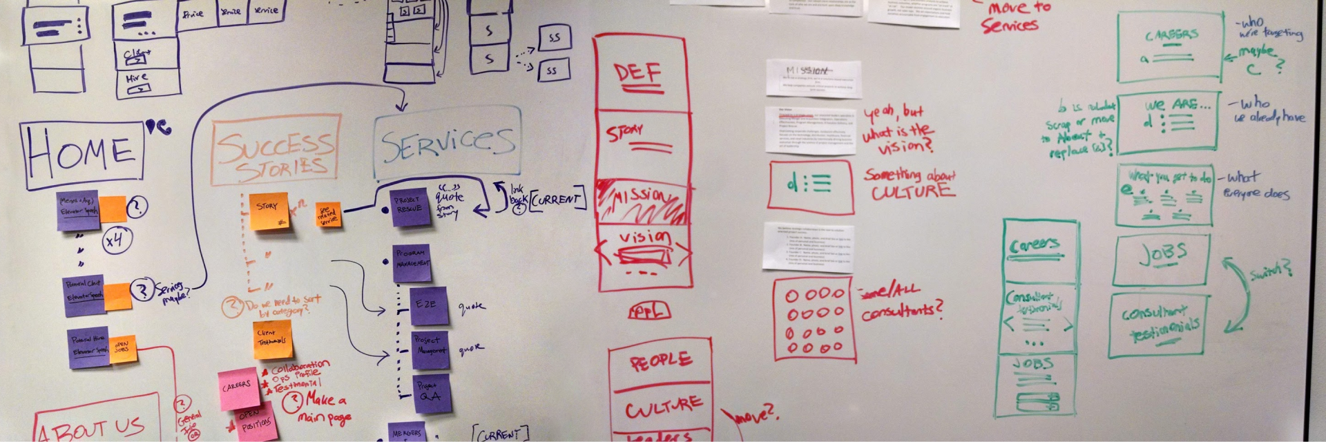
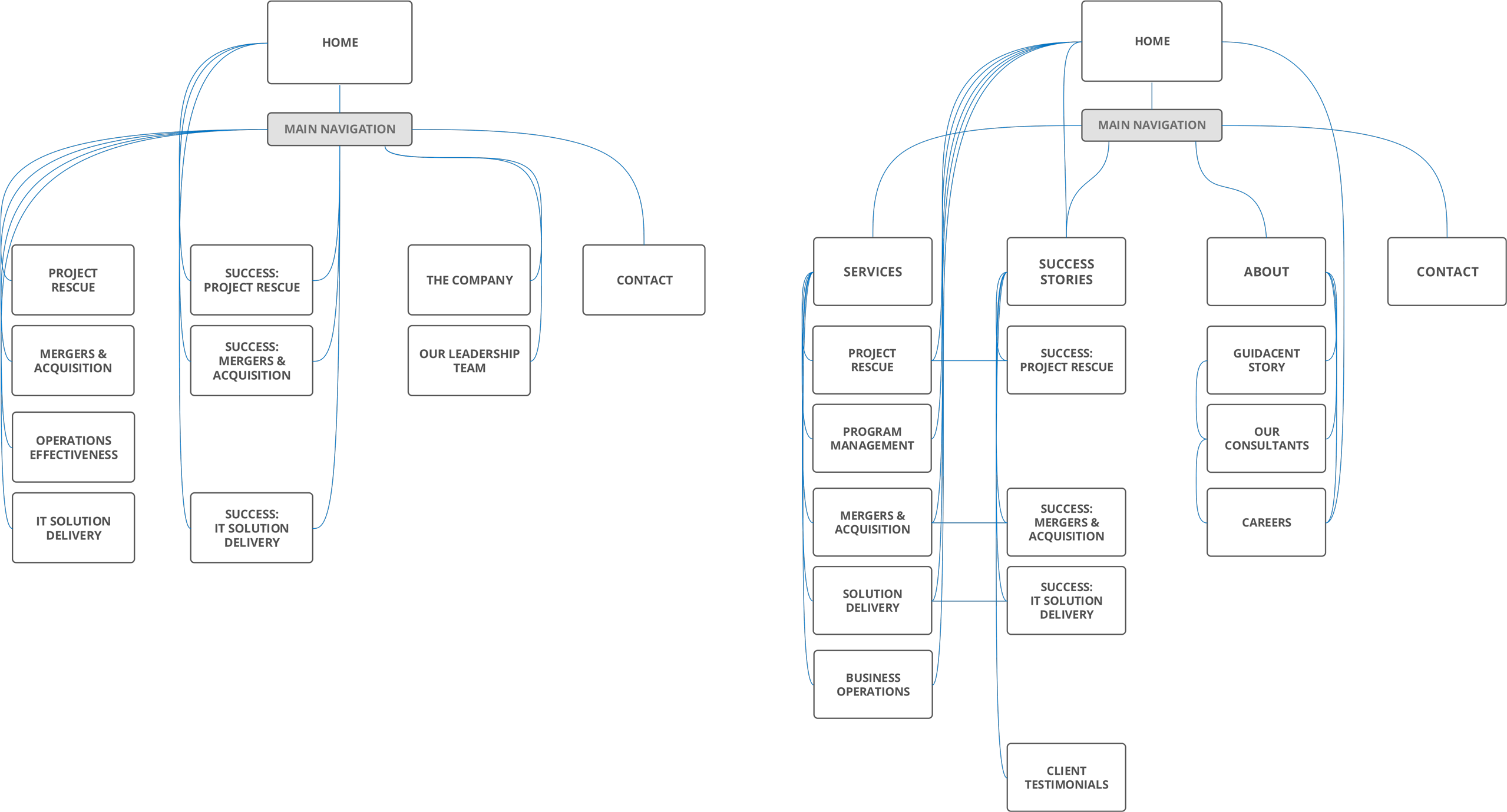
The original architecture was very linear, forcing users to navigate solely through the top navigation dropdowns. While reorganizing their content, I added links between pages for users to explore content more naturally and to improve SEO. The new site map grouped content logically and where users would expect to find it.
Site Map
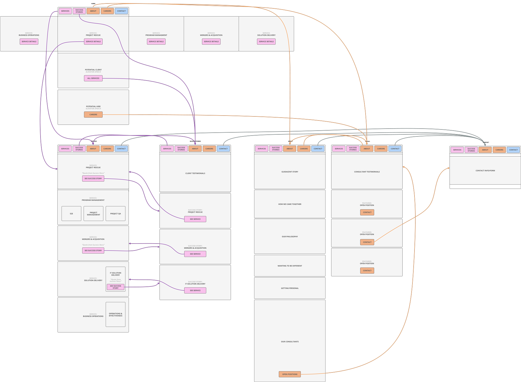
I color coded a user flow map so that Guidacent stakeholders could easily visualize how we were optimizing the interactions for each user to complete their tasks.
User Flow
04Wireframes
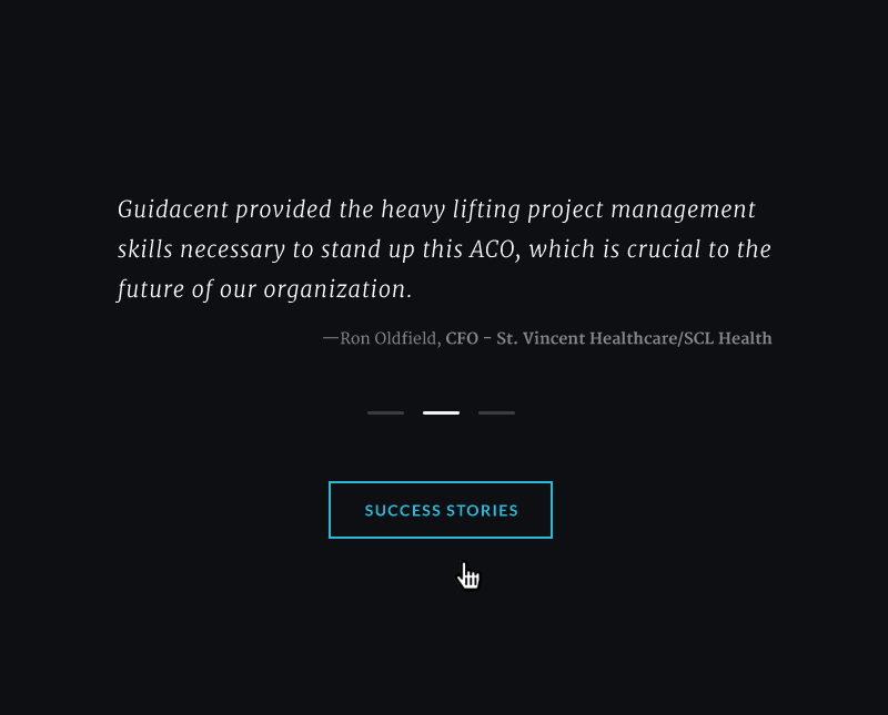
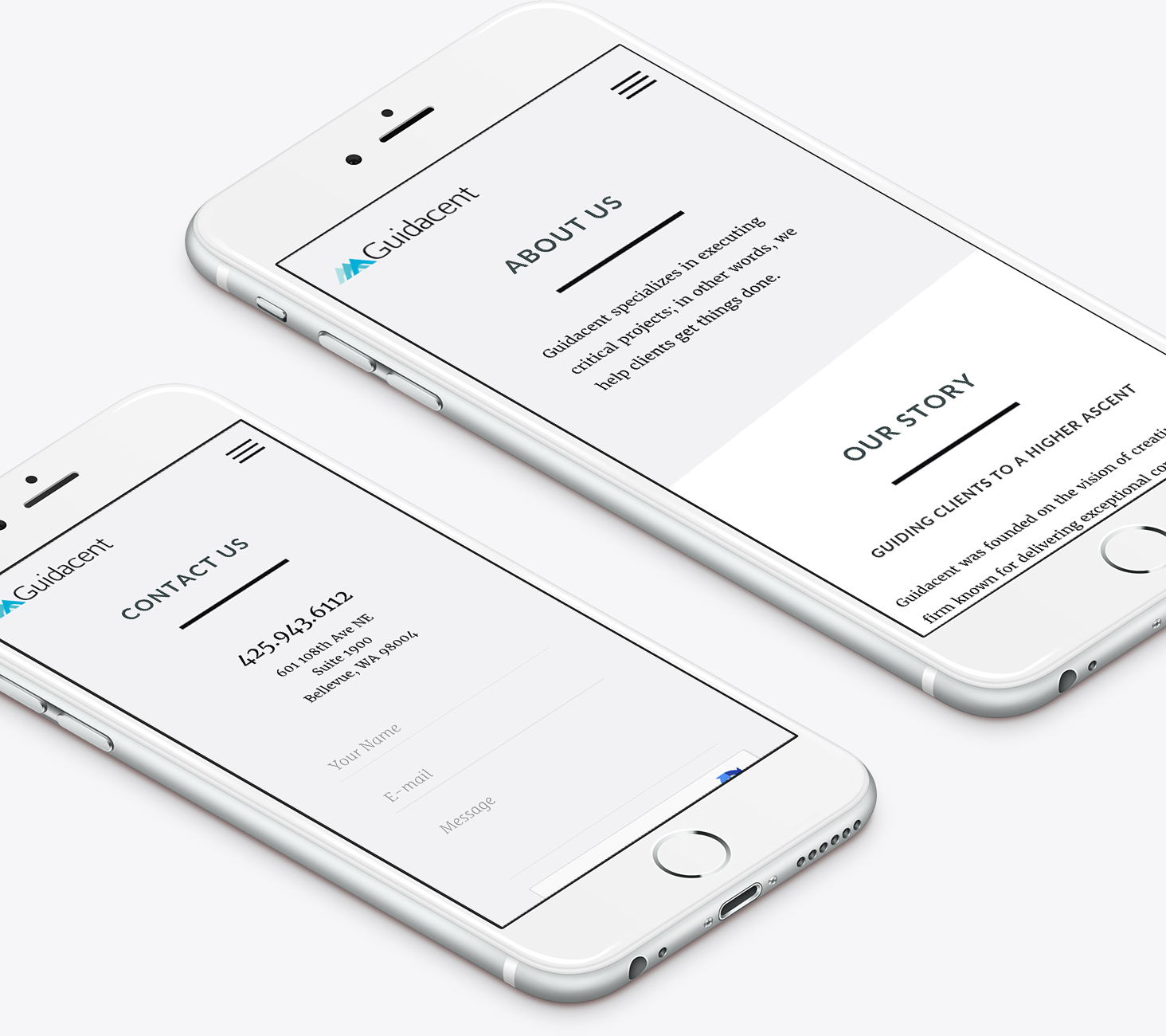
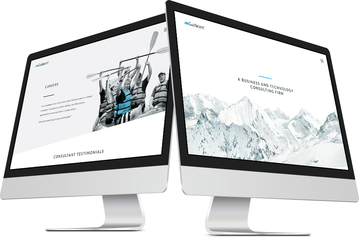
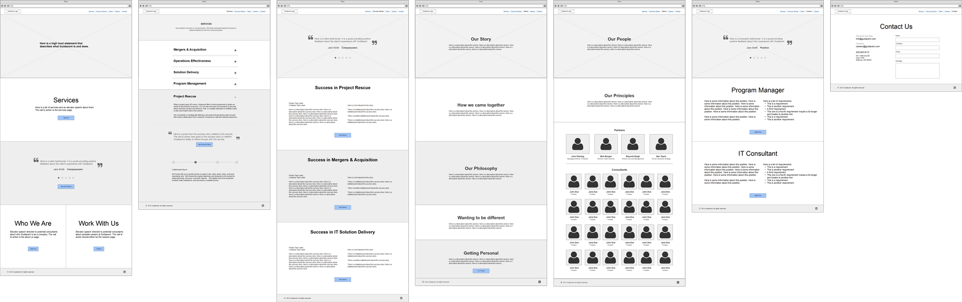
I restructured their content to focus on business outcome, connecting each service to a success story and vice versa and using testimonial quotes liberally to build trust backed by real examples. To address amiguity with what the company does, I decided to be very candid and use the home page hero to explicity state it, while prioritizing services and being straightforward with messaging throughout the site. Using About to go in depth about the company’s story and principles, I ended up splitting People into its own page to highlight the qualities of their consultants and drive potential new hires to the Careers page.
05Branding Research
brainstorming
Starting with a mind mapping exercise, I narrowed down the targets to the following primary key words:
- forward-thinking
- sophisticated
- crisp
- personable
Some accessory targets included: professional, experienced, mature, modest, fresh, simple, light+fun, and trendy.
moodboards
I presented Guidacent with 3 design directions. The first had a crisp, wintery feel with a high contrast black & white theme accented by either blue or green, ample white space, arctic mountains, and a strong focus on typography. The second option aimed for a “team success” narrative and explored metaphors for execution through imagery, using geometric elements, overlays and/or soft gradients, and a palette focused on corals and teals. My last one was the “safe” option using light blues, greys, and white palette, flat and simple theme with vector imagery, and light weights of typefaces.
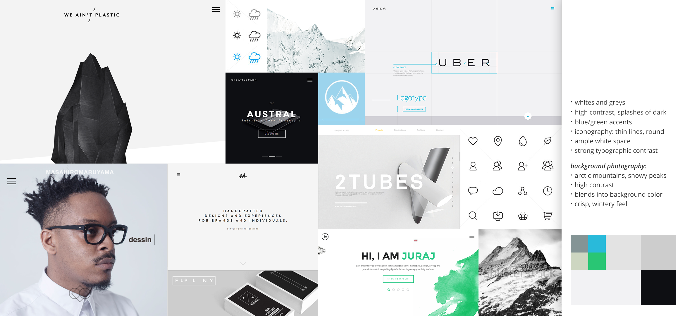
Guidacent was most drawn to the confident and refined feel of the first moodboard that felt more high-end, as well as the openness of the minimalism and general feeling of clarity. They felt this direction was like “a breath of fresh mountain air” which best supported the message they were trying to send to clients. And while they gained success as a value brand, they liked the idea of reorienting themselves into more of a top tier consulting agency.
06Visual Design
In order to achieve a high-end feel, I used paradigms of high contrast, minimalism, thin lines, and looked for a serif font that had a diagonal stress as a notion to calligraphy. I chose Merriweather as the main typeface due to its elegant letterforms as well as the large x-height that makes it highly legible at more diverse sizes. In order to not come off as too formal, I accented this with Lato for headers and calls to action. With classical proportions, Lato pairs well with Merriweather, but the semi-rounded details add warmth and hand-drawn structure makes it seem personable.
parallax scrolling
Guidacent wanted to “do something cool” to set themselves apart but in a modest way; for example, they felt that full-page hero background videos were too intrusive and wanted a more subtle approach to their visual design language. I suggested parallax scrolling effects could add motion and due to its interactive nature, come off as friendly and engaging instead of pompous. This was also a great way of introducing the mountain motif on the home page.
Since they also wanted a fresh, clean, and crisp feeling, I avoided drop shadows and opted for even edges, sharp corners, ample white space, and uncluttered layouts that focused on white thing at a time. I also introduced a motif of angled section dividers that resembled the slicing of a guillotine as you scrolled the page, and carried that motif through in hover effects like the button animations. The overall effect was pragmatic minimalism with a crisp, wintery feel.