Problem
Every advertiser who creates a campaign in Microsoft Ads starts in the same place—a workflow with a list of goals used to funnel them into the right setup. After years of one-offs by different teams, this critical entry point became a cluttered, inconsistent UX that no longer reflected how advertisers think or how the product needed to scale. Scoping for Pmax, I didn't want to inherit the same problems, so what started as a blocker for one campaign type became an opportunity to modernize the foundation of Microsoft Advertising.
Role & Team
Design lead — myself, 3 product teams, content, engineering
Focus areas
Design Strategy, System‑level UX, Interaction Models, UXR, Architecture, Motion, Visual Redesign, Design System
01Problem
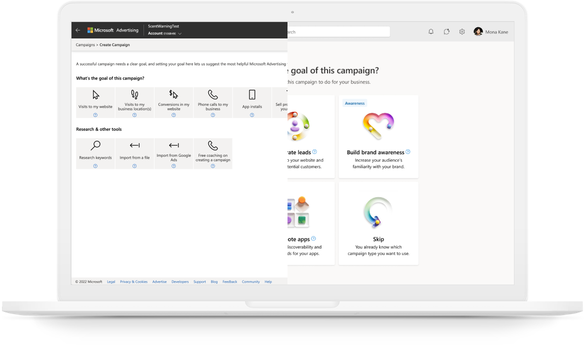
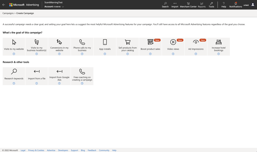
When customers navigate to create a new campaign in the UI, they are directed first to a goals flow that helps them select the right campaign, which at this time was 12 different campaign types (soon to be 13 with Netflix). Over the years, incremental changes from different teams created chaos instead of clarity. For example, you had “sell products from your catalog” next to “boost product sales” with different paths that were unclear to users, but existed because a product team needed an entry point to their feature. The issues with the legacy UI became a blocker when I was designing the framework for Performance Max.
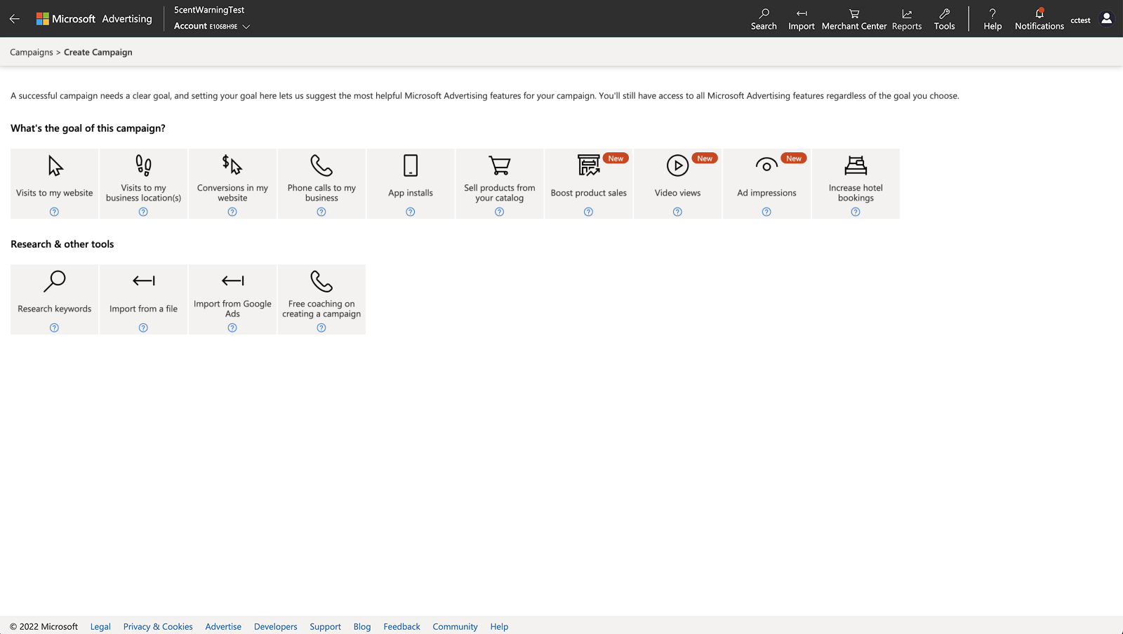
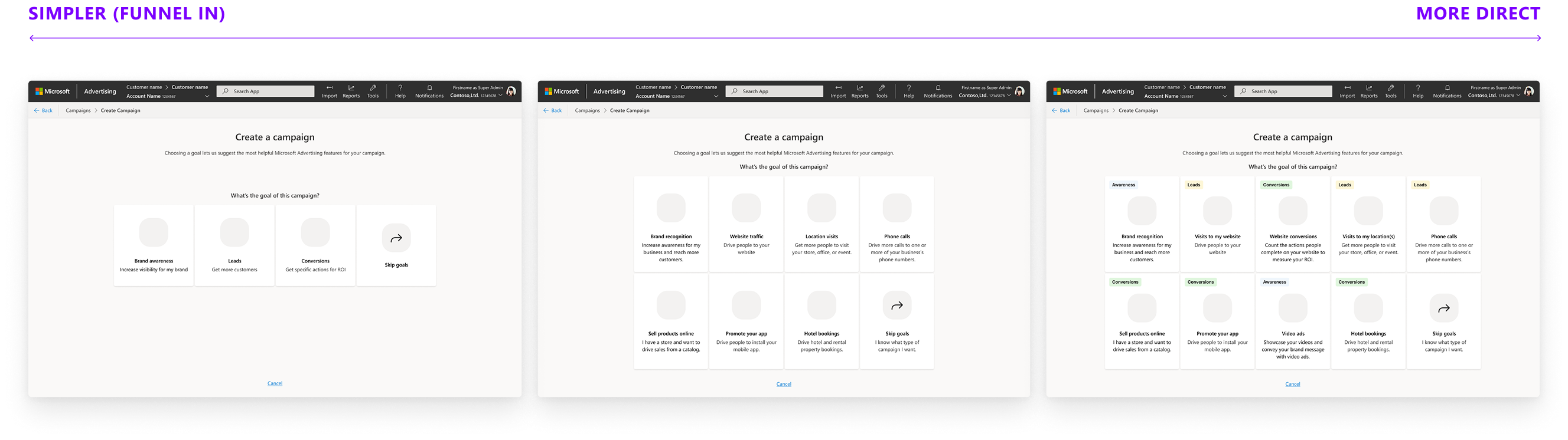
Original Goals when creating a new campaign
- Visually outdated
- Inconsistent: hyper‑specific goals next to general ones
- Unclear mapping from goals to outcomes: users selected goals without understanding how they affected campaign setup
- Inconsistent downstream behavior: similar goals led to different setups depending on user interpretation
- Direct customer feedback that we have too many goals to offer and it is already confusing to pick what goal matches theirs
- No obvious path for Performance Max: forcing Pmax into this was awkward

path for pmax in original goals workflow
Campaign creation is the foundational workflow for Microsoft Advertising revenue, and it felt fragile at the very beginning—where confidence mattered the most. This wasn’t just a UI refresh but a complete redesign of the architecture.
02Discovery
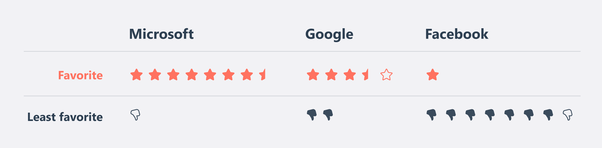
To understand how advertisers currently approach campaigns, I led a competitive research study comparing Microsoft Ads, Google Ads, and Facebook Ads.
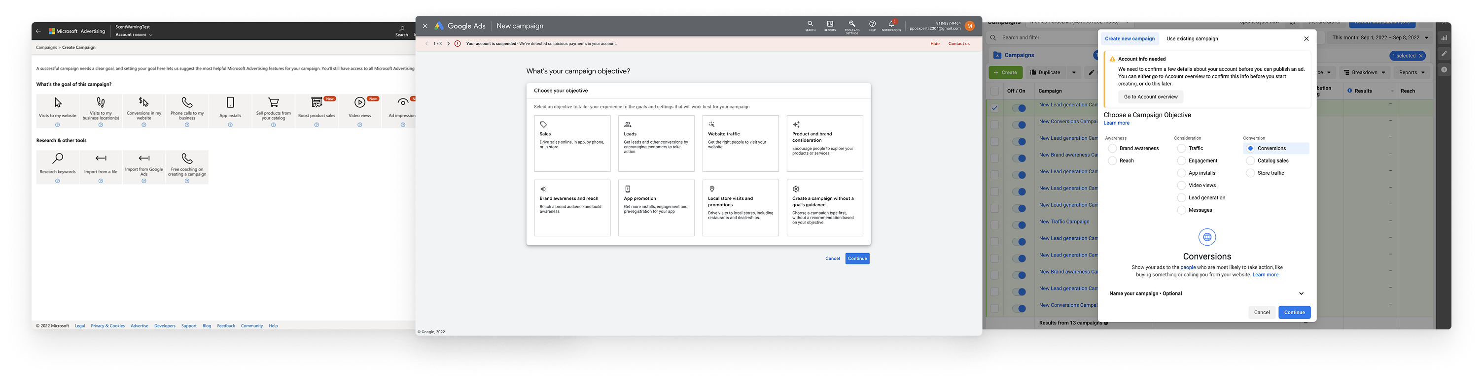
I confirmed that the advertiser mental model consistently begin with goals, not campaign types. Many described thinking in terms of the sales funnel—awareness, engagement, conversions—before selecting formats. Participants mostly preferred Google for its guided flow that “feels like each Q/A builds to create a story” while experts preferred Facebook’s direct flow. Nobody preferred Microsoft’s UX.
core competitive insights
- Microsoft’s mix of overly general and overly specific goals was confusing
- We had way too much white space—participants called it “empty,” “lacking,” and “functional but not fulfilling”
- Conversion goals matter to measure ROI and guide campaign setup
- A progressive approach that funnels into a campaign resonated well
- Experienced users often want to skip directly to a known campaign type
- Advertisers wanted to see what ads would look like—previews help decisions
I like Google's. It feels like each question and answer builds to create a story.
—Participant in study03Design Goals & Success criteria
step by step workflow
More clicks is not only ok but preferable. A more progressive and informative approach that starts with goals and ends with the campaign type provides more confidence they’re doing the right thing.
better goal grouping
Leads goals aren’t clear enough, and the mix of super general and super specific goals next to each other is confusing. Finding the right balance and logical path of goals selection would help make the UI seem “easy to use.”
accommodate the experts
Many customers are pretty familiar with advertising on our platform and looking for the quickest way to start creating a specific type of campaign they have in mind.
Success will be measured through goal selection completion, reduced backtracking, campaign setup completion rates, and qualitative confidence signals.
04initial iterations
I collected this information to explore a wide range of conceptual directions for a better workflow. Since participants praised Google’s “story‑like” flow so much, I looked at ways to bring a narrative structure to Microsoft.
Tell us your goal → Compare options → Preview outcome → Start campaign
Some iterations started with more specific actions/results a business wants from customers with follow up questions about goals to recommend outcomes. Some options incorporated conversion goals into this decision tree, while others decoupled that due to the complexity of setting them up. I played with different ways of categorizing options when there were a lot at one time—tags, layout options to separate into the sales funnel, or progressive disclosure. Other options optimized for making simple choices even if it was more steps, similar to Typeform.
Options for remapping the goals to campaigns
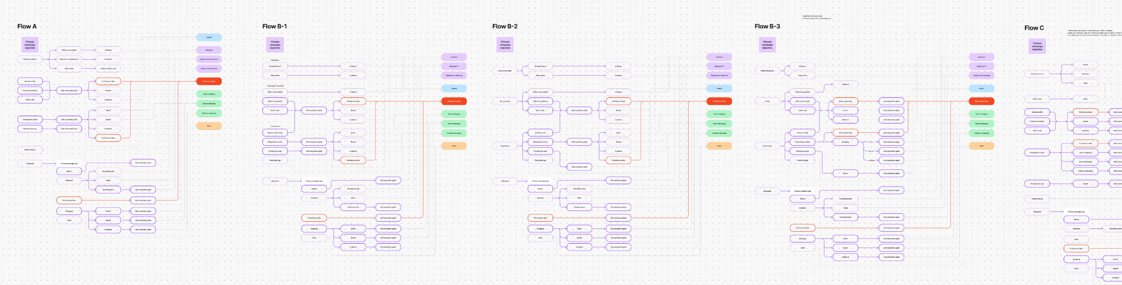
Converging these explorations, I tested 3 wireframe prototypes with varying degrees of progressive funneling in order to evaluate advertiser mental models.
prototype 1: highly guided funnel
A step‑by‑step, narrative flow that progressively narrowed options
prototype 2: hybrid approach
A moderately guided funnel with clear goal categories and labeled campaign types
prototype 3: shorter, more direct funnel
A broad layout showing more options to get you to a campaign quickly
what worked well
- A progressive, narrative flow (similar to Google) made the process feel more guided and intentional.
- Showing options upfront increased confidence for some
- Clear labels and explanations helped make choices
what didn't work
- Too many options makes it hard to make a choice
- Wide funnels increase anxiety about unknown options, seems tedious to click around to find out
- Nobody liked the “middle of the road” solution
The results were split evenly between the super wide funnel and showing more options upfront, while the hybrid solution felt indecisive. The consistent theme I saw though was that number of clicks was irrelevant and the progressive step-by-step guide resonated well. Participants wanted the “why” behind campaign types we recommend for their goals, and previews were strongly desired.
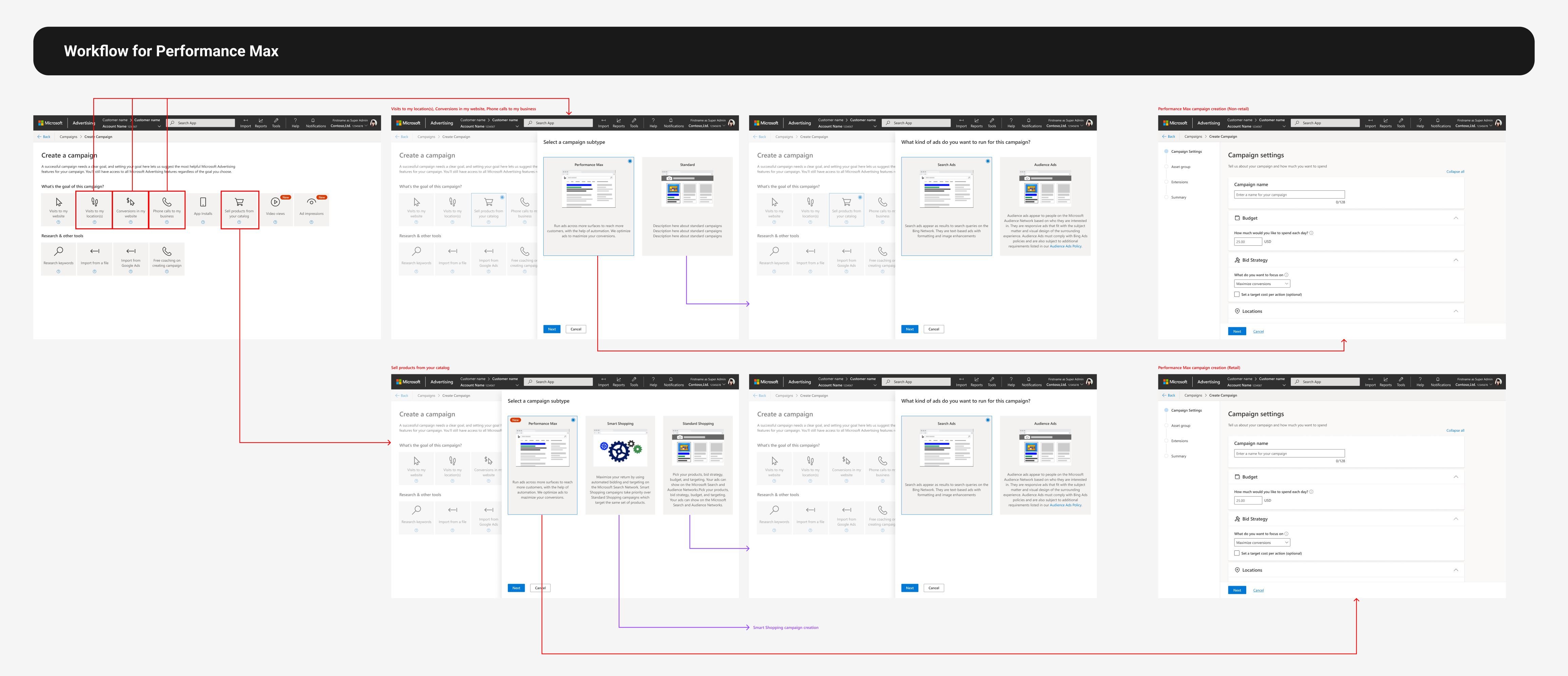
05decision tree & taxonomy
Since there wasn’t a business or technical reason to pick either direction, I explored options for both the super wide and narrow funnels, working closely with product LT on the taxonomy and structure.

path we aligned on for incorporating conversion goals
Initially I was favoring a decision tree model that optimized for quickness of the short funnel with tags and color themes to categorize the many options so that we could have structure without decision paralysis.
hi-fi prototyping
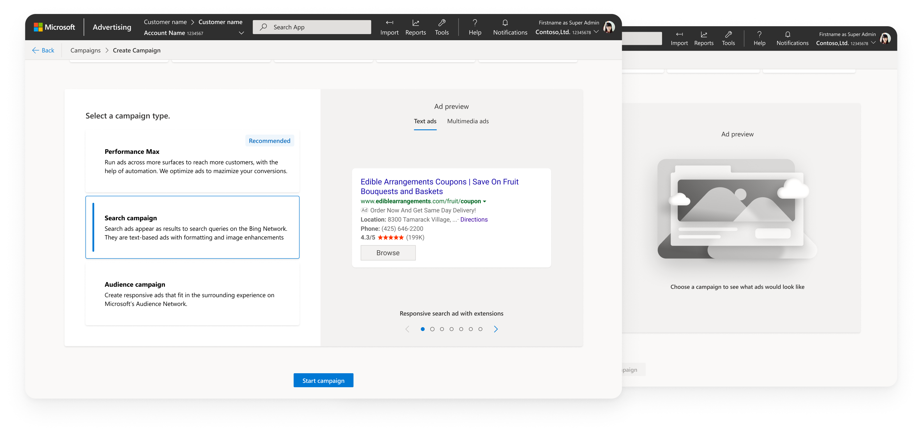
incorporatins ad previews
integrating product strategy
As the design direction solidified, product leadership introduced a new strategic framework for Microsoft Advertising — four pillars meant to guide how we position and scale our campaign offerings:
- Awareness: native impressions in Audience campaigns, Display, Video
- Performance: audience campaigns optimized for conversions, Performance Max
- Search: most of our revenue comes from search results pages like Bing
- Context Marketplace: deals and premium inventory from the Invest platform
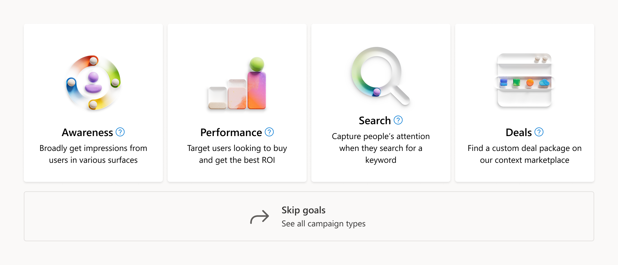
4 pillars as initial goals
My POV was that using these pillars directly as goals would create more confusion, not less. From both stages of discovery research, advertisers consistently described their objectives in marketing‑funnel terms, not internal product categories — “I want to build awareness” or “I want more traffic.” Terms like “deals” or “performance” were meaningful internally, but they weren’t actionable or intuitive to advertisers. They didn’t map to mental models, and they didn’t help advertisers make confident decisions. I pushed back on LT with:
- competitive research (Google and Facebook both use funnel‑aligned goals)
- user quotes from both discovery studies
- the split preference between guided and short sales funnel goals
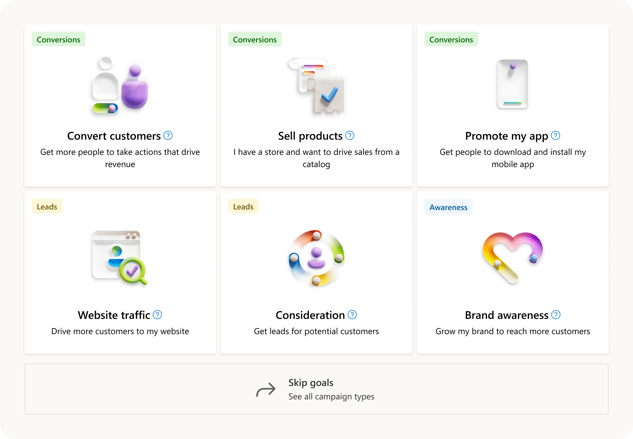
Goals that mapped better to advertiser mindsets
I also addressed the assumption that we should “push deals” because it was new, as this was exactly the mentality that created the original chaos. If we want to promote Deals, we should do it through education, recommendations, or placement — not by forcing it into the goals taxonomy where it doesn’t make sense.
I suggested a structure that still mapped to the 4 pillars in function but laid out in typical advertiser goals. It ensured the goals system would be built around advertiser mental models, not internal org structures.

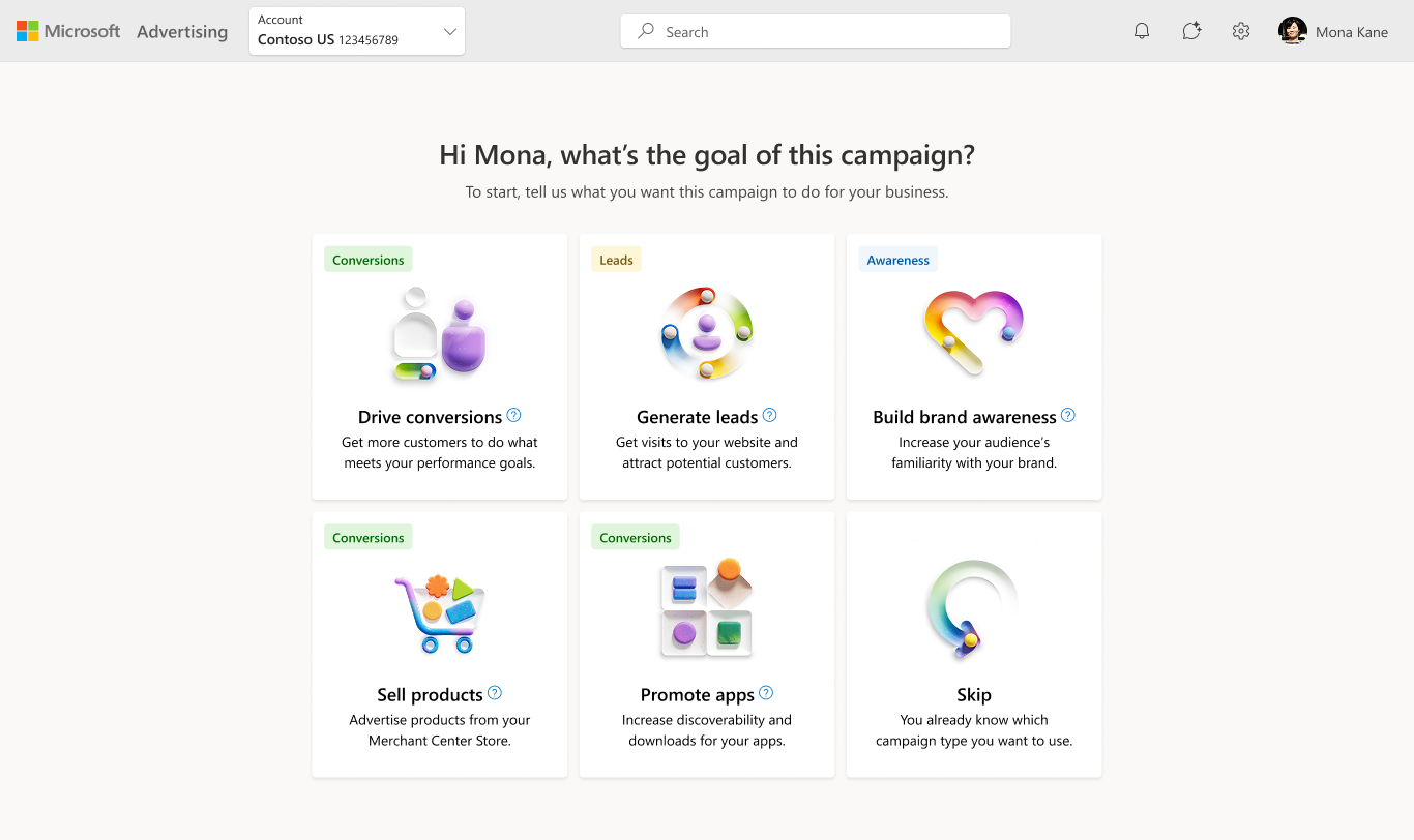
final mapping from goals to campaigns
06Visual Design
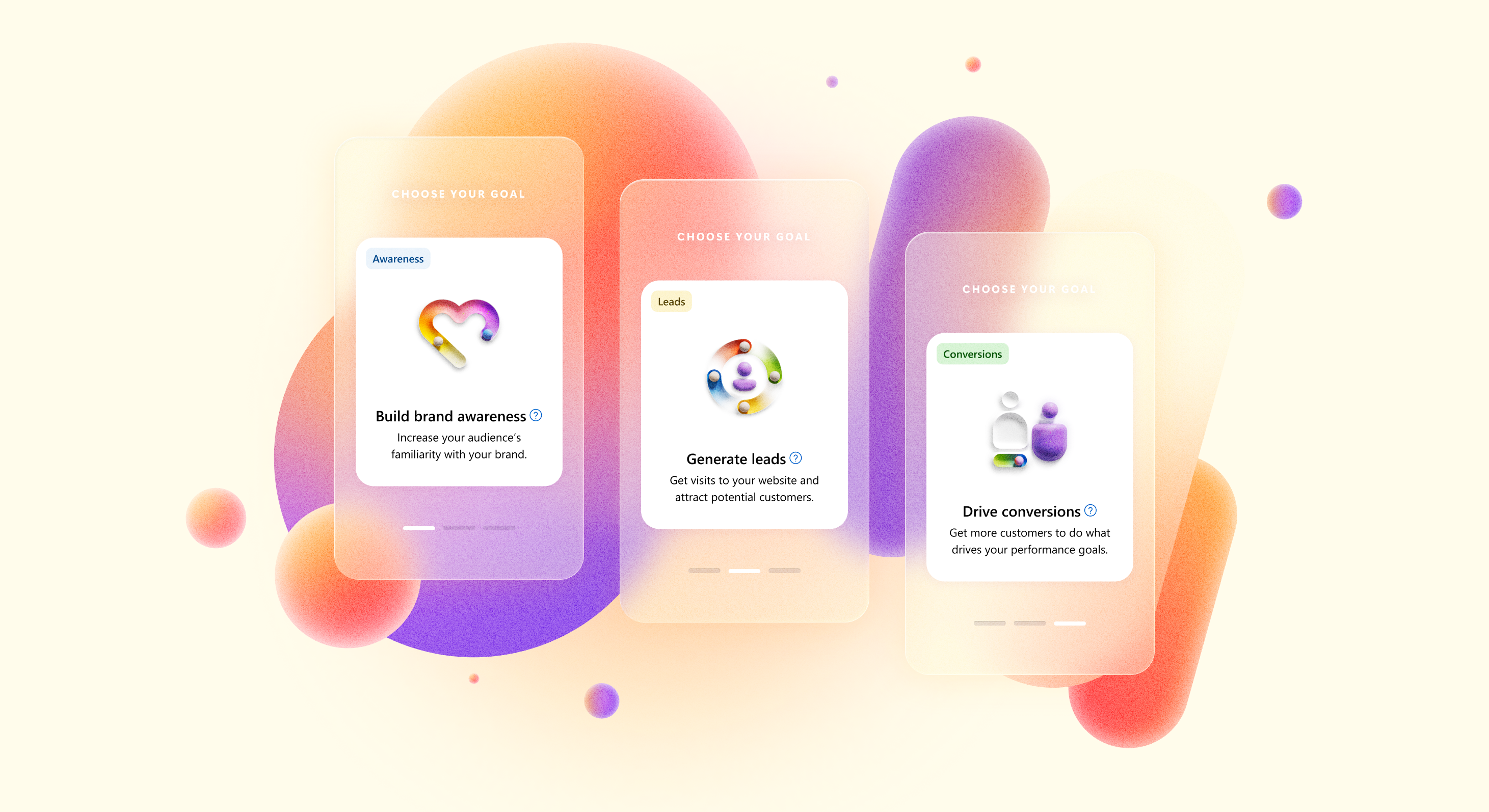
Creating a new visual system to support the new architecture was equally important for how advertisers understood their choices. The old UI had so much dead white space, with tiles that didn’t effectively use space while looking dated. My goal was to create a new language that was approachable, modern, and scalable, while still fitting into the Microsoft Fluent design system.
exploring illustration styles
I began by exploring multiple illustration directions for the card system. Goals needed to feel distinct, memorable, and quickly scannable, but not overly literal or distracting. Microsoft’s base Fluent icon library was expansive and supported scale, but the flat geometric icons were designed for smaller components like buttons and felt too small and underpowered in my card system, leading to visual design that felt clean but really text heavy.
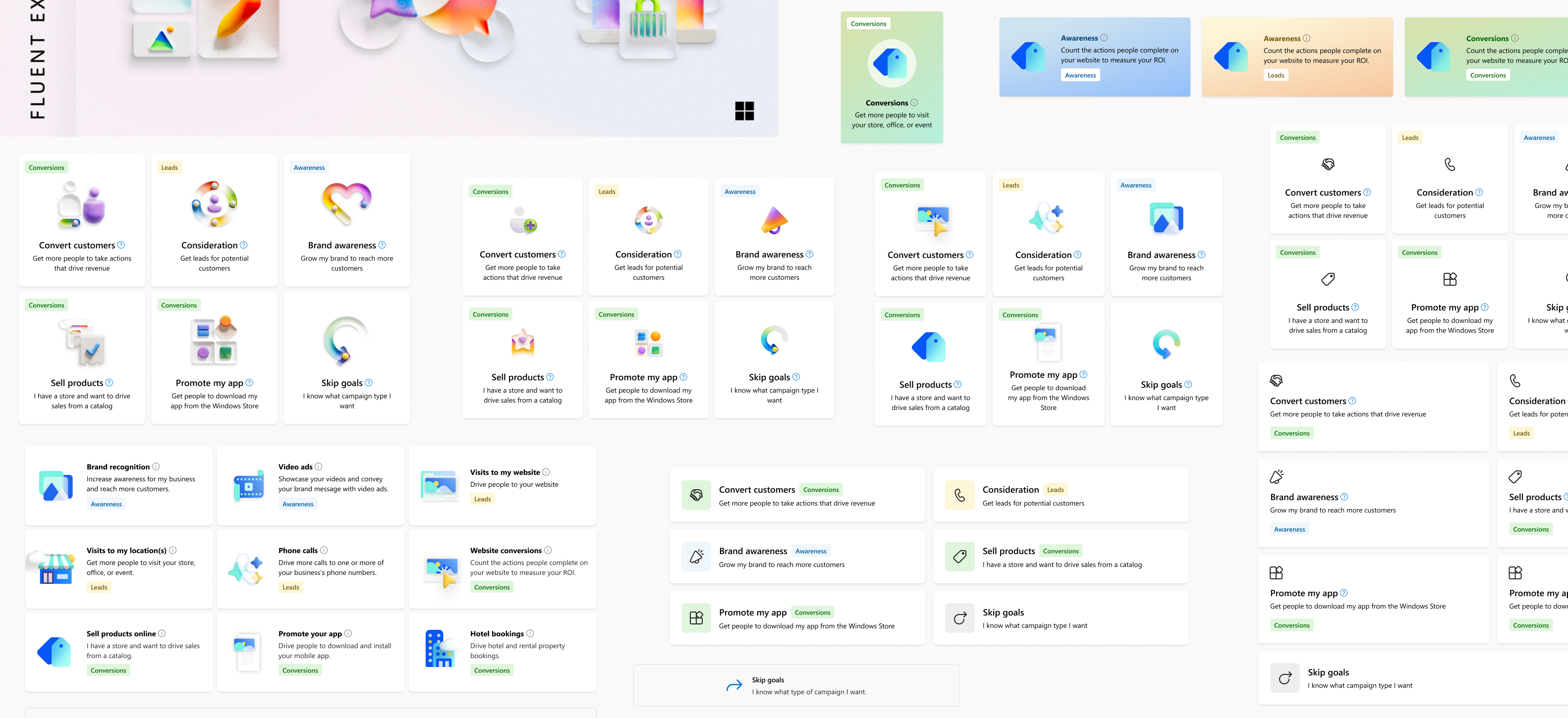
illustration explorations
Microsoft Ads had just deprecated its illustration system and the Fluent team hadn’t released any replacements. I began exploring custom illustration styles that tested well in early research since it added much needed color to the UI. When I caught wind of the Musea illustration library coming out, I tried both direct and indirect applications of it. While I loved the color and unique style, I was worried that the metaphors might be too abstract for the utility of out UI. So I decided to test it.
fidelity of ad previews
Advertisers repeatedly told us they wanted to see what their ads would look like before committing to a campaign type. I explored several directions:
- High‑fidelity mock ads: too literal and risked implying exact creative requirements
- Low‑fidelity wireframe‑style previews: clear but too utilitarian
- Stylized, abstracted previews: balanced clarity with flexibility, but lacked context
I ultimately chose a lightweight, stylized preview that conveyed what the ad looks like with a general feel of where it lives, without implying any constraints — enough information to make confident decisions while keeping the system flexible across markets, formats, and future ad types.
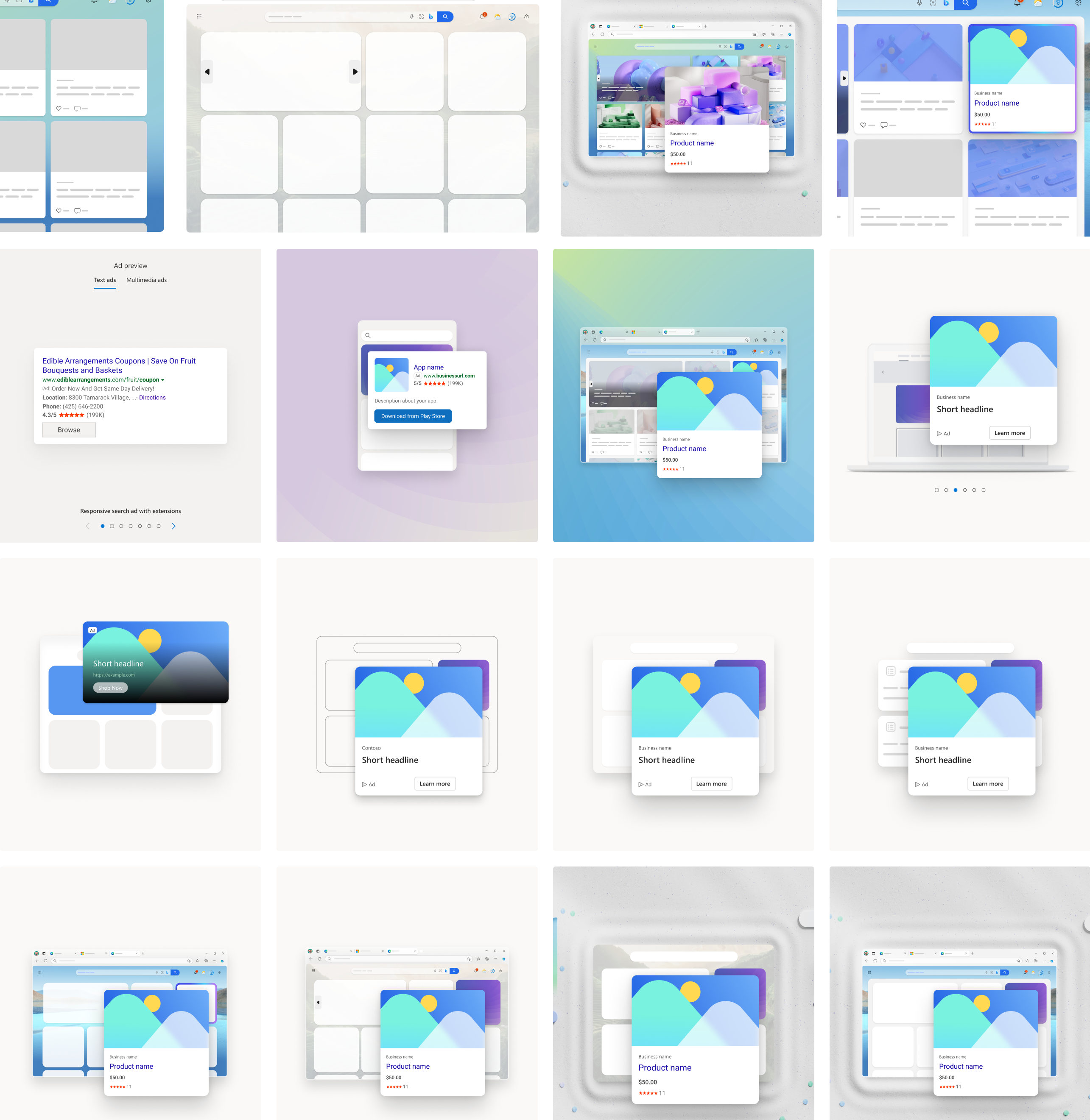
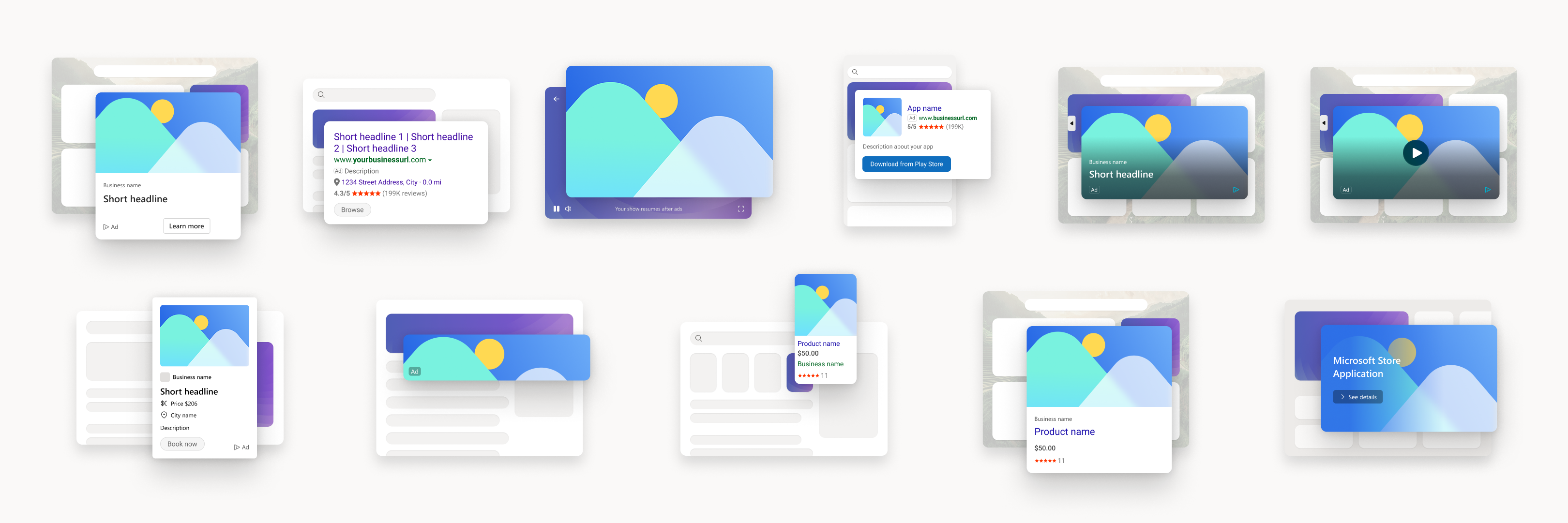
final ad previews for different formats
creating a scalable card system
To promote the “guided” feel I designed a scrolling system of choices that build off previous choices with a modular system of card components supporting scrollable layouts, responsive behavior, and clear comparison between options. The final visual system:
- modernized the entire onboarding experience
- made goals and campaign types instantly scannable
- helped advertisers understand differences at a glance
- supported both guided and exploratory workflows
- created a foundation that can scale for years
07validating the new UX
Once I felt confident with the new system and visual design, I ran a high‑fidelity usability study with 13 participants to validate the new goals to campaign mapping as well as the use of Musea illustrations. The results were clear:
- Ease of use: 4.7/5
- Usefulness of ad previews: 4.3/5
- Interest in using the new flow: 4.5/5
New competitive comparison
Microsoft Ads became the new favorite among participants, surpassing Google and Facebook’s experiences—“Microsoft one looks prettier, more visually appealing, looks easier”—They loved the new visuals, simplicity, layout, and organization. The goals matched really well with advertiser mental models.
I love this animation. It really adds life to the site. Truly seemed kind of dead before, so this really adds some life.
— Participant in studytakeaways
08Principles for use
Designers on the Ads team often have questions about whether we should collect information from advertisers before or during the campaign wizard—conversion goals became a hot topic as we went back and forth on where that belonged. As I now owned this redesign, I set principles so that going forward we would be consistent with how inputs are handled.
if it changes the structure of the wizard, it should be with the goals flow
Example: a choice affects the number of or order of steps—We want the steps to be consistent while in the wizard.
if there is context to other things in the wizard, it should be in the wizard
if it can be edited after the wizard is completed, it should probably be in the wizard
Anything that can be considered “metadata” of a campaign should logically be in the wizard, only making exceptions for other principles.

decision tree
To ground these principles in real advertiser workflows, I applied the decision tree to some key scenarios to model their use. This became extremely helpful to address edge cases like product ads store selection, where engineering constraints potentially limited the ability to edit store information inside the wizard, so our team had consistent principles to fall back on to help with these decisions.

examples to show how principles apply
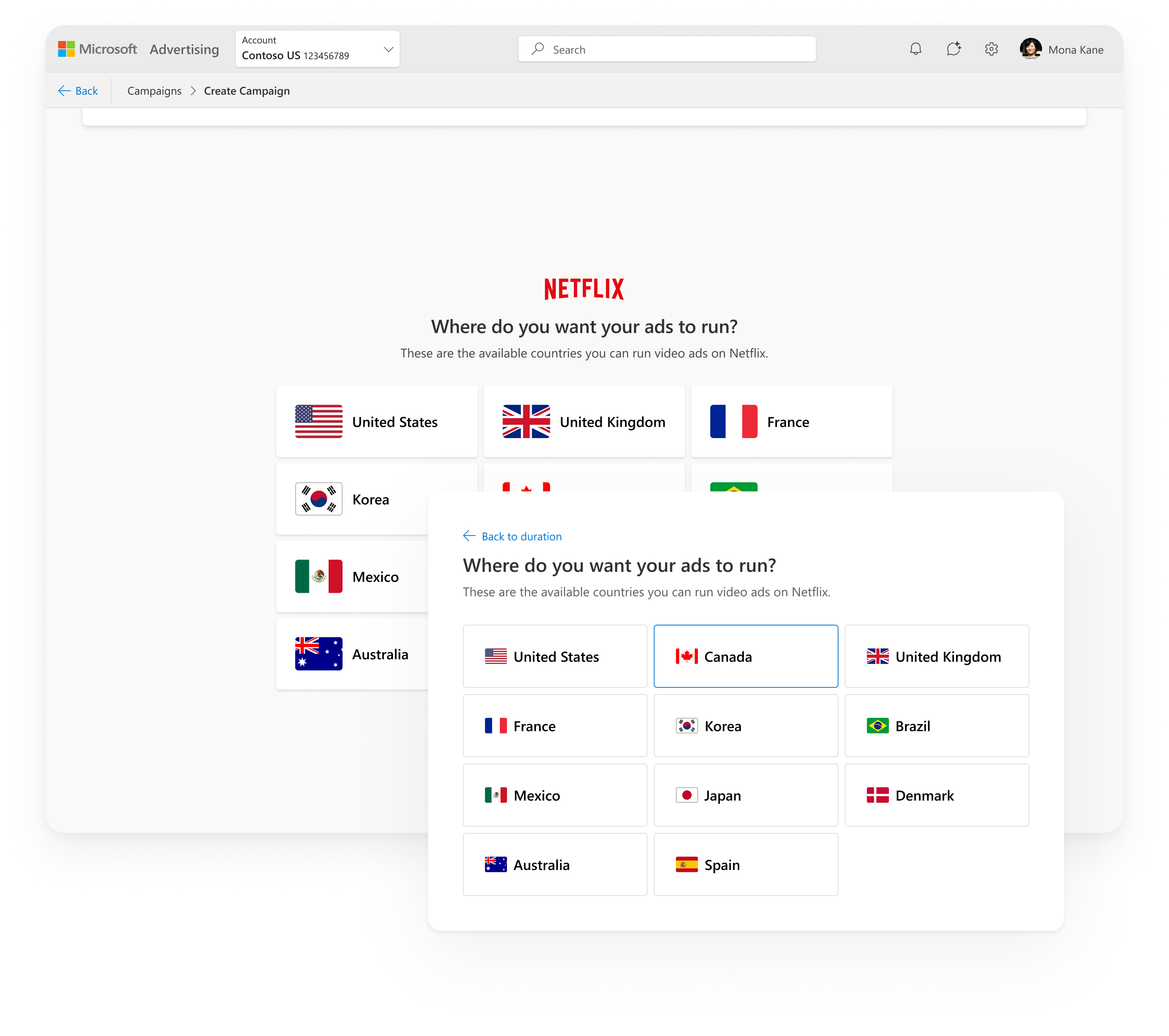
09Final Design
Pmax with product ads

selecting a netflix deal
10Impact
During the pilot, the feedback we got was overwhelmingly positive:
“Really nice.”
“Magical.”
“Delightful experience.”
“Much clearer than before.”
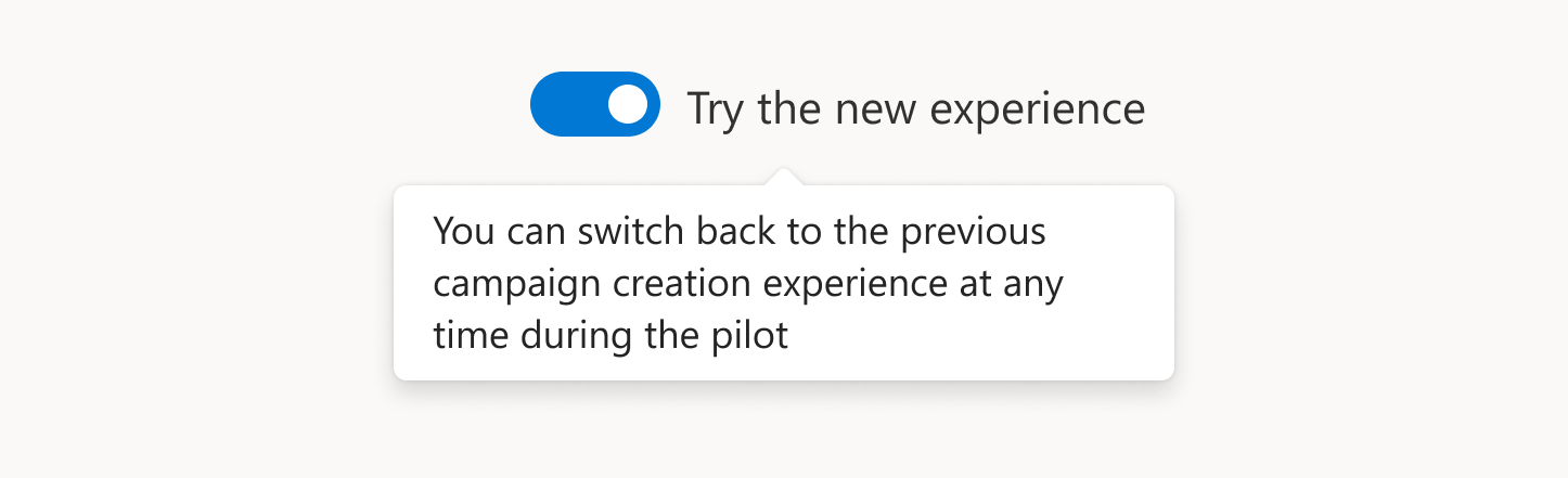
We added a toggle during the pilot to allow users to test the new UX or switch back to the old version, and the number of users who chose the new UX greatly exceeded our expectations—users who chose to keep the old version noted reasons like “I need more time to adapt to the new layout but it looks so beautiful.”
Benchmark Criteria
Users choosing new UX
regressions
We moved quickly into GA with almost no issue, making some minor changes to the structure, mostly to address customer feedback with shopping campaigns. Product stakeholders expressed enthusiasm about the simplified, guided experience and early signals of improved usability. Customer feedback was almost unanimously positive with the final release, making this one of the most successful releases in the history of Microsoft Advertising.
I like the clarity, the distinct goals and the tags that indicates the type. The goals listed match up well with goals we typically have. A clean experience.
— Customer quotewhat i’m most proud of
- Holding the line on the taxonomy — I built my case around the research data that supported advertisers over internal org structure
- Aligning on goals that mapped to advertiser mindsets — if those didn't make sense, nothing downstream would recover
- Developing heuristics for broad use — it gave the team something durable, a shared framework that outlasted the project itself and kept future decisions consistent without needing me in the room.
And it all began with noticing that something didn’t fit right, then deciding to fix the system to reshape how advertisers start campaigns.