
Problem
Initially nicknamed “Project Impossible,” Performance Max aimed to replace traditional ad campaigns with a simplified experience that uses automation to drive more conversions for customers. While powerful, early research revealed a foundational issue: advertisers wanted the benefits of AI without the black box. My work focused on transforming fragmented, opaque workflows into a scalable foundation that empowered users while highlighting the benefits of AI
Role & Team
Design lead — 5 designers, product manager, engineering
Focus areas
System‑level UX, AI Strategy, Horizontal Patterns, UXR, Visual Design, Design System, Architecture
54% of shoppers use 5 or more channels to shop over a 2 day period.
01Problem
Our immediate problem was closing a competitive gap when Google announced their version of Performance Max, and considering that 60–80% of smart shopping and local campaigns were being imported from Google, we needed to prevent major loss of revenue to handle the campaign types being replaced by Pmax.
Meanwhile recent data showed how the customer journey is evolving with online shoppers engaging across multiple channels like video and social before making a decision, presenting a huge opportunity for Microsoft Advertising: automation helps advertisers to engage with their customers effectively at scale. Think about all the difference surfaces you see ads on every day and imagine one ad campaign for an advertiser to connect with you across all those surfaces.
define value prop for AI
Advertisers—ranging from SMBs to enterprise agencies—struggled with lack of transparency, low trust in AI-gen content, and didn’t want to give up control with their dollars at stake.
simplify campaign creation
Anxiety about AI created friction at the most critical moment for confidence: starting and shaping a campaign. Optimize UX for minimal input from users without breaking trust.
design for scalability
The existing architecture for Microsoft Ads was fragmented, built in different ways by different teams. This made it difficult and expensive to add new features or improve existing patterns.
02Discovery
I kicked this off by running a qualitative research study, interviewing businesses that have run Performance Max campaigns on Google as well as several of our internal account managers that optimize campaigns for our bigger spenders. To understand the value prop from a customer perspective, I asked about their experience using Pmax on Google—how they’re structuring their campaigns, what their goals and expectations were, level of success and pain points.
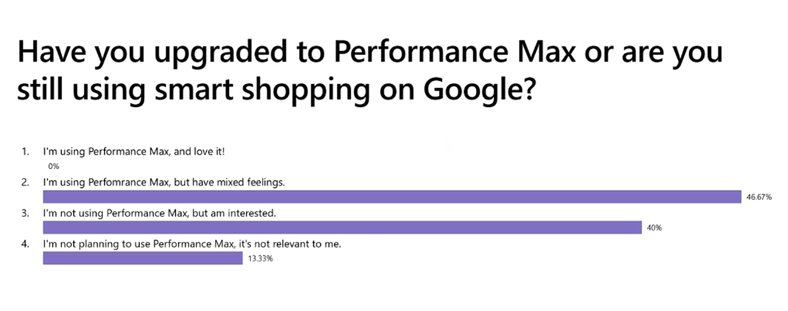
initial survey results showing reservations
less control = more reporting️
In order to convince advertisers to relinquish control, we need to validate their trust by offering them a rich reporting experience for the variations of ads we’re generating from their content preview experience that gives clear insight towards how their content will be used, so they can make decisions about which content to provide.
they know their audience
Customers with a good understanding of the target audience for their products will set up asset groups around that audience. The structure of their asset groups reflects the structure of their offerings targeted to different audiences.
research insights
- Quality beats quantity. Advertisers cared less about adding “more assets” and more about whether their assets were good enough to perform.
- Automation without explanation erodes trust.
- Advertisers wanted reassurance that AI grounds decisions in their inputs.
- Recommendations are top of mind for customers—Inline help, feedback on effectiveness of choices, and actionable insights on running campaigns.
- Most customers know their audience well, and want to make sure they’re effectively targeting them, but look forward to AI finding more audiences they didn’t know about.

value prop for consumers
- Right ads on the right surfaces at the right time can help make faster purchase decisions
- Interactive ads with proper call to action
- Consistent omi-channel experience (both offline & online)
value prop for advertisers
- Multiple platforms from one campaign means managing fewer campaigns
- Connecting surfaces allows targeting users in multiple places to create a customer journey
- AI can optimize for you—easier & saves time
- Embracing machine learning and automation leads to better ROI
value prop for microsoft
- Closes feature gap to allow for importing campaigns
- Increase in ad spend from better ROI
- Equal opportunity for Search and Audience workflows due to automation
03Design Approach
When I first talked to the PM for this, the ask was for a turnaround of ~30 days, but as I looked at the existing architecture and considered the impact of this initiative for the overall advertising landscape, my POV was that this was an opportunity to completely revamp campaign creation for Microsoft Advertising. I pushed back with a plan that allowed design to work in parallel with engineering in multiple phases to still reach our Sept deadline for the revenue concerns while addressing long ignored tech debt to create a seamless experience, scalable for the future of advertising.
designing for scale
Instead of treating Pmax as another one-off UX, I looked at everything as reusable patterns, flexible layouts, and a foundation for shared components and future asset types. No more re-solving the same problems.
asset-centered workflow
I shifted the experience from managing a bunch of settings to focusing on creative quality. Let’s start with your assets, automate from what you already have, and give you real-time feedback to show the right ads to the right audience.
build confidence in AI
Reframing AI as guidance, not commands, I designed recommendations that felt actionable without pressure, reduced ambiguity with contextual explanations, and added guardrails like brand controls to enable trust.
04Workflow Architecture
I started with the foundational aspects for success: designing a new framework that engineering can start building while I work on the components to fit in, first getting alignment on the overall architecture and what we need to build from the ground up rather than trying to reuse. A lot of the existing patterns in the UI were outdated or just not scalable as I looked at the future of new asset types for scenarios like video ads becoming more popular. My vision was to use Pmax as the new standard for campaigns.
Campaign structure

Closely collaborating with engineering and the product team, I balanced the technical feasibility of updating components, some with older architecture that was significantly more expensive to update, with improvements benefiting users most. I set principles that we all agreed to for when it was okay to reuse what we have vs. when we needed a net new framework. I strived to avoid future tech debt as much as possible. In certain cases, I came up with temporary solutions to unblock us while still working towards our north star vision for reusable, scalable components.
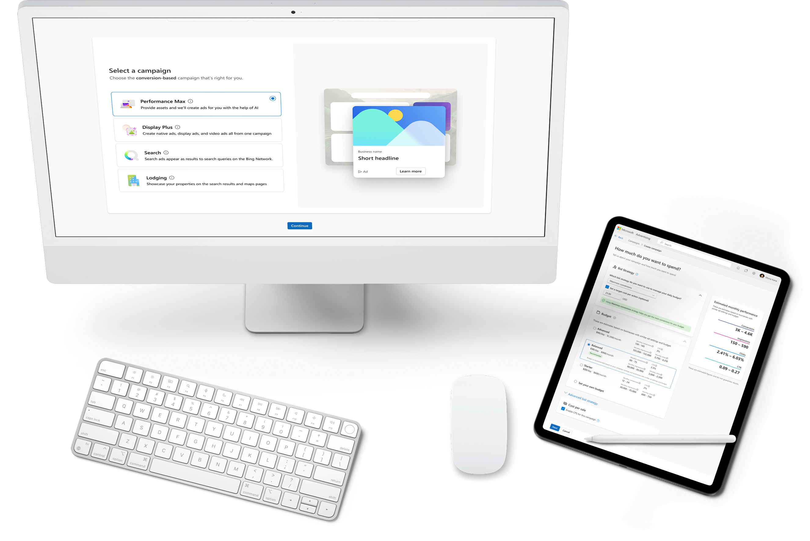
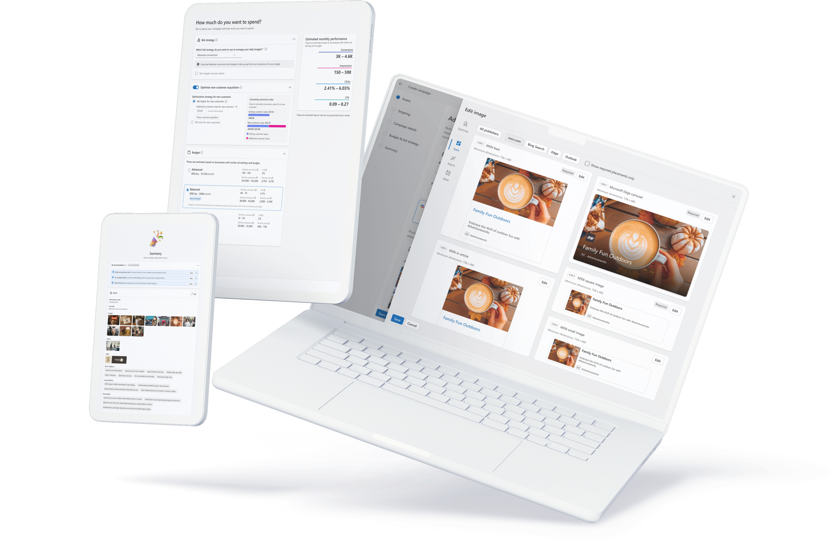
Creating a new Pmax Campaign

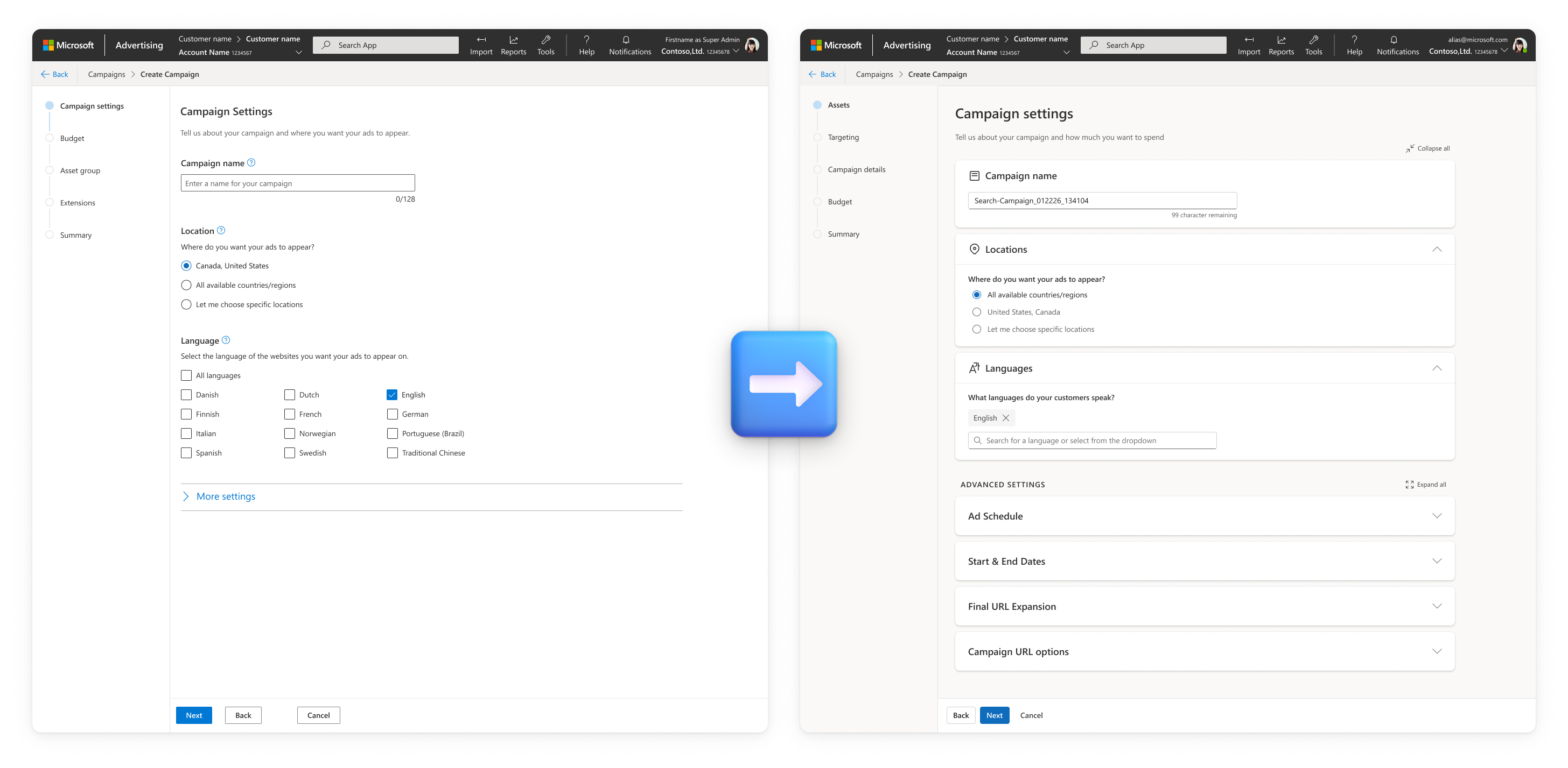
Since we were building many components from the ground up and setting new standards, I leveraged this as an opportunity to push for a complete visual redesign of the wizards we use for creating ad campaigns. Historically, each campaign type was designed and implemented in a silo, resulting in many different inconsistencies —everything from interaction patterns for selecting locations to visual design of the wizard itself. Some campaigns were not even a wizard but one single, extremely long page full of stacked inputs.
I designed a new expandable card system using progressive disclosure to highlight the most important inputs at each step. Each card was a component added to a new global design kit for Microsoft Advertising, ensuring everything we were building could be easily ported over to new campaign types or refresh the older ones.
This phase involved a lot of competitive research, not just Google Ads’ Performance Max but similar structures for a simplified creation UX, like Snapchat’s “Instant Create,” that we referenced to understand the evolving competitive landscape. I combined that with a survey of all of Microsoft Advertising’s varying workflows, the user research study I ran, and data from several metrics dashboards we have in order to ideate through options for visual design treatments, the ideal order of steps in the wizard, and organizing all the inputs.
05Entry Point
When customers navigate to create a new campaign in the UI, they are directed first to a goals flow that helps them select the right campaign, which at this time was 12 different campaign types (soon to be 13 with Netflix). All this effort would have been wasted if Performance Max got lost in this mess, which was the result of—you guessed it—one-offs from different teams adding to it. So I again pushed to have this UX changed in order to not just support Pmax but future campaign types.
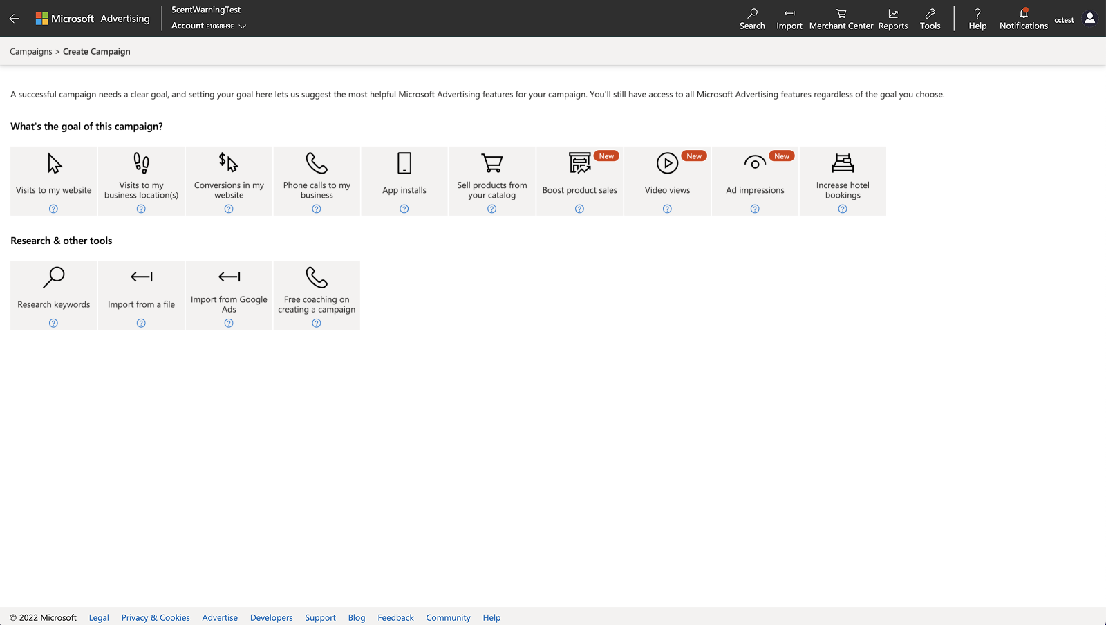
Original Goals when creating a new campaign
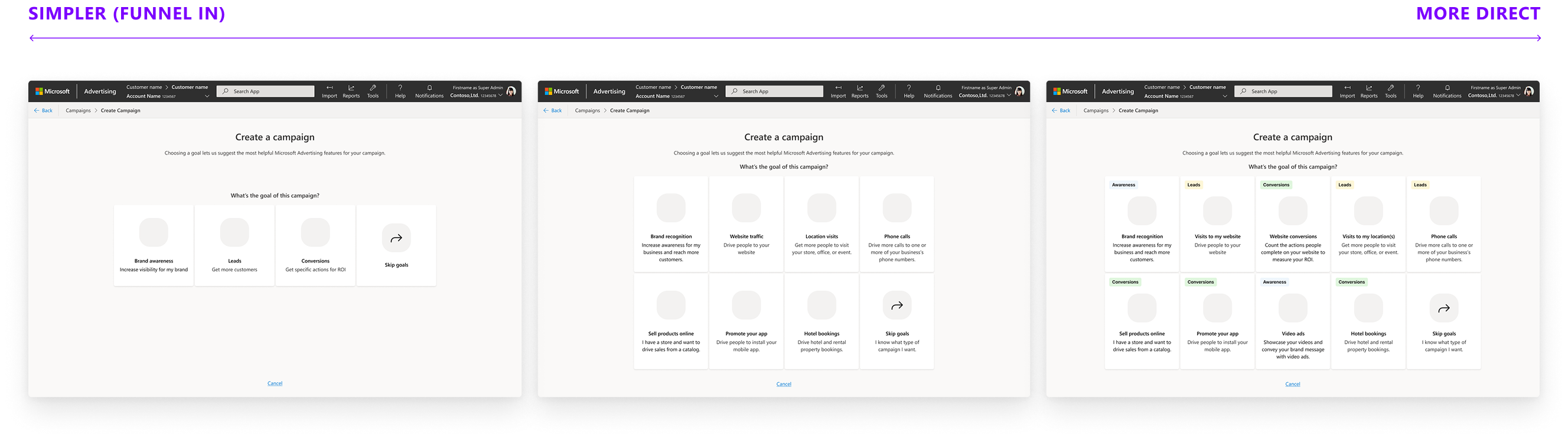
I first conducted a two‑stage research study to understand how advertisers approach campaigns, beginning with a competitive analysis of Google Ads, Microsoft Ads, and Facebook Ads.
I confirmed that advertisers consistently begin with goals, not campaign types. Many described thinking in terms of the sales funnel—awareness, engagement, conversions—before selecting formats. Participants mostly preferred Google for its guided flow that “feels like each Q/A builds to create a story” while experts preferred Facebook’s direct flow. Nobody preferred Microsoft’s UX.
core competitive insights
- Microsoft’s mix of overly general and overly specific goals was confusing
- Conversion goals matter to measure ROI and guide campaign setup
- A progressive approach that funnels into a campaign resonated well
- Experienced users often want to skip directly to a known campaign type
I collected this information to ideate through some ideas for a better workflow, then tested 3 wireframe prototypes with varying degrees of progressive funneling in order to evaluate advertiser mental models.
what worked well
- A progressive, narrative flow (similar to Google) made the process feel more guided and intentional.
- Showing options upfront increased confidence for some
- Clear labels and explanations helped make choices
what didn't work
- Too many options makes it hard to make a choice
- Wide funnels increase anxiety about unknown options, seems tedious to click around to find out
- Nobody liked the “middle of the road” solution
The results were split evenly between the super wide funnel and showing more options upfront, and there wasn’t a business or technical reason to pick either direction. The consistent theme I saw though was that number of clicks was irrelevant and the progressive step-by-step guide resonated well. So I created a high fidelity prototype combining the learnings so far to evaluate in a follow-up study.
I love this animation. It really adds life to the website. It truly seemed kind of dead before, so this really adds some life.
— Participant in studyIt was a massive success. The new goals strongly aligned with real advertiser intent, and first impressions of the updated layout, clarity, and visual design were unanimously positive. Participants found the guided flow easy to use, informative, and confidence‑building, with ad previews adding meaningful value. The only real friction point was that the “Skip goals” path wasn’t discoverable, which I addressed in the final design. Overall, the new experience outperformed Google & Meta, with 8 of the 13 participants choosing Microsoft’s new UX as their preferred option.
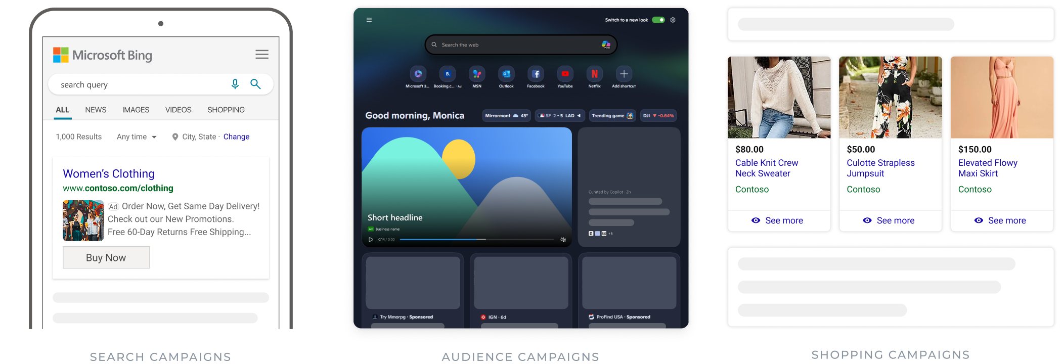
06Assets & audience
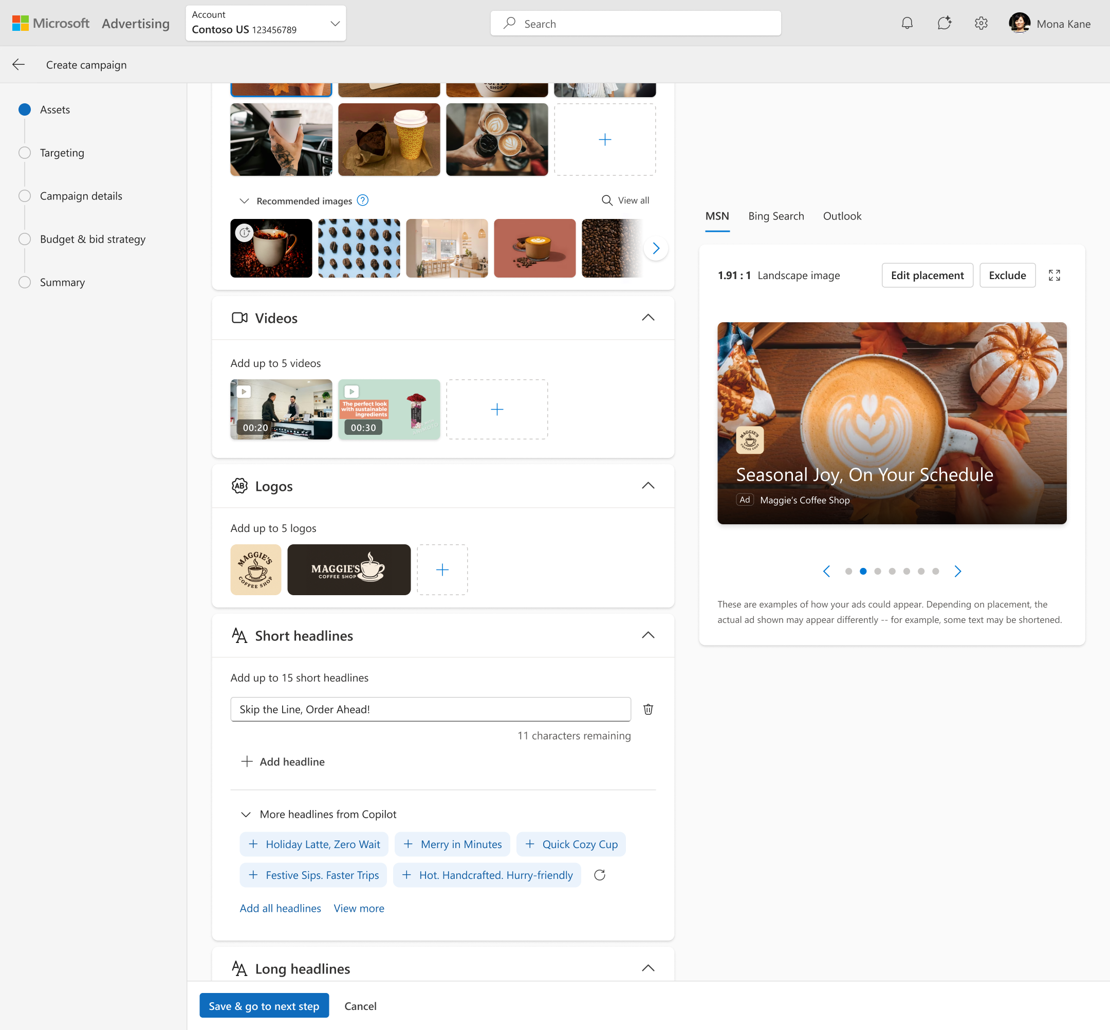
The next major milestone was “asset groups” which was a new concept to replace the traditional structure of ads, containing the creative assets intended to target an audience. Asset groups are the foundation of Pmax, the main signals advertisers give us in order for AI to automate their ads.
learnings from initial research
Using Google’s Pmax as a reference, I saw these key themes from their UX:
- Straightforward: Nobody struggled with the process of adding content
- Top pain point was audience signals: the way Google organized the inputs for defining the target audience as well as the term “signals” was confusing
- Most expert customers have a good idea of their target audience
- Recommendations: Top thing everyone wants is help with is choosing which assets work for which audience
The biggest problem to solve for asset groups was how to connect the assets and audience. Pmax, optimized for performance, functions in a way where AI will use the advertiser’s input for audience as a signal rather than a strict definition for targeting. AI will even create assets for you if you have that feature enabled, but audiences will always expand to show ads to consumers likely to convert.
the challenge
- How do we communicate “signals” so we don’t lose trust downstream?
- How do we create confidence that the creatives match the intended consumer?
- What interaction pattern will address the usability concerns I revealed?
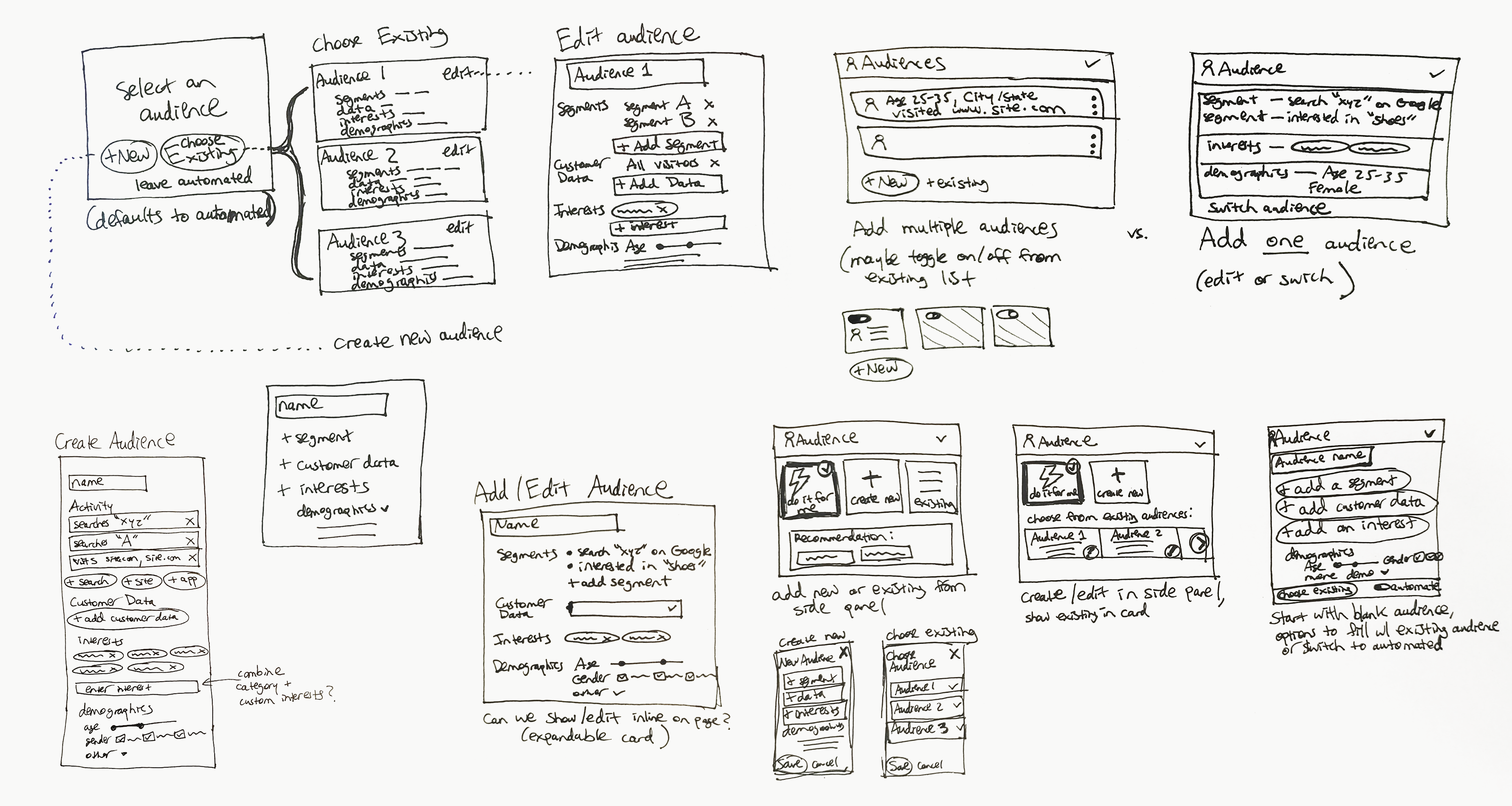
I explored design options for a framework of adding multiple simple audiences vs. single complex ones, and interaction patterns that compared the audience inputs directly in the page vs a side experience. While the inline versions were more discoverable and easier to add/edit, it felt too heavy in the page and added too much complexity for the requirement of saving these inputs in a library of audience. I ended up deciding on a framework of one “audience” made up of several segments that can be created and edited in a side panel.

My point of view at this stage was that since customers were very confident about their audience, let’s start with that. We should use these audience signals for asset recommendations, which addresses our core challenges. My next step was to A/B test two prototypes to validate this hypothesis as well as understand which model I had best matched the advertiser’s mental model.
research takeaways
Almost unanimously, participants prefer the single-page flow. It feels more compact + concise and thus simplified and less scattered. It seems like there are less steps when combined on one page. Most importantly, if we want audience signals to help with asset selection, having them together provides context for choices.
It’s like going in blind. You know where you want to go, but not sure if the vehicle you’re in will get you there.
— Participant in studythey know their audience
Confirmed, from small businesses to expert advertisers at corporations, our customers have a very good idea of who their customers are and very confident who they want to target.
positive about automation
They talk about how AI is the future of advertising, a big time-saver, and a positive impact to ROI. They’re receptive to the idea of automating their ads.
not sure about assets
The process of adding content is easy, but the choices of which images/text to add is still difficult. They talk about what will work for their desired target in mind.
My hypothesis confirmed, I devoted a design sprint to optimizing the workflow so we can use the customer’s URL to suggest audiences, then use the audience selection to suggest assets, showing samples of what the ads would look like. This aligned with what the participants in the study told us and made for a streamlined flow that automated most of the process of creating the asset group for them.
Suggestions based on audience
However, while reviewing with the leadership team, I got severe pushback about the prominence of audience signals. LT’s point of view was very strongly that PMax should seem smart, and asking advertisers for their audience might downplay the strength of automation from a marketing perspective. As I pushed back on that with the UXR, the engineering team also provided an estimate for the new pipeline of data we would need in order to actually make asset recommendations for a specific audience. It was insanely expensive, with a timeline that wouldn’t be feasible for our pilot anyway.
Update based on feedback
We moved towards the pilot and then GA with audience signals under the assets, but interestingly enough, I have heard a lot of feedback after the launch about the order of this that continues to confirm my original hypothesis. As the world of AI has evolved, our leadership team is now discussing switching the order of steps in Pmax so that we start with targeting, then move to assets. My main takeaway from this: I picked my battle too soon.
07Product Launch
Performance Max had multiple launch phases—pilot/open beta in May 2023, global GA in 2024, and feature launches through 2025–2026.
I orchestrated the strategy, decision framework, and cross‑functional alignment for multiple milestones that were needed for the MVP of our pilot—ad extensions, product ads, and reporting—while other milestones we planned to work on as we collected the pilot data.
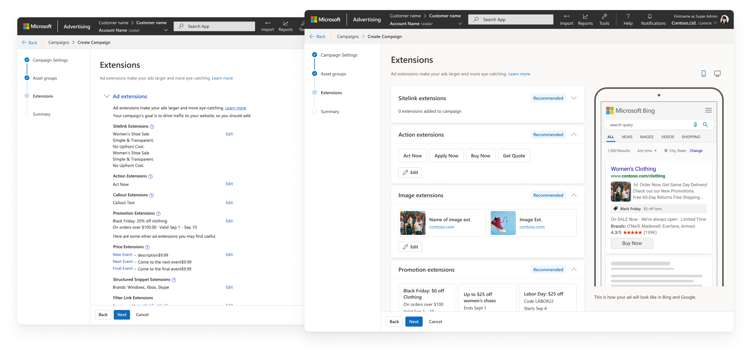
ad extensions
Extensions are IMO the most complicated part of managing assets for a campaign. These are types of assets added at the account-level that append useful data to text ads, like a location, phone number, or reviews. I fully expected the existing UX to be confusing for advertisers, but as I ran a user study to get more insight on the pain points, I was surprised to find that the overall impression is our current UI is straightforward and easy to use. A few important insights:
- Rarely do customers interact with extensions while creating a campaign
- Advertisers will manage their extensions before starting the campaign
- Mostly advertisers are editing ones they already have, not creating new ones
- Perceived value of extensions is really high
- There was a very strong positive reception to adding a preview

I didn’t make any major structural changes, since advertisers were happy with the existing workflow, but I did address the major visual design flaws that existed, making it easier to leverage those extensions that they already created. I also focused on adding value with the ad preview. At the time this was a source of major ambiguity for advertisers since they had no idea where extensions even go in ads. This was a huge win for both the advertiser that wants to see how their assets are used, as well as for Microsoft since it encourages more assets to be added to ads, thus more assets for AI to work with when the ad serves.
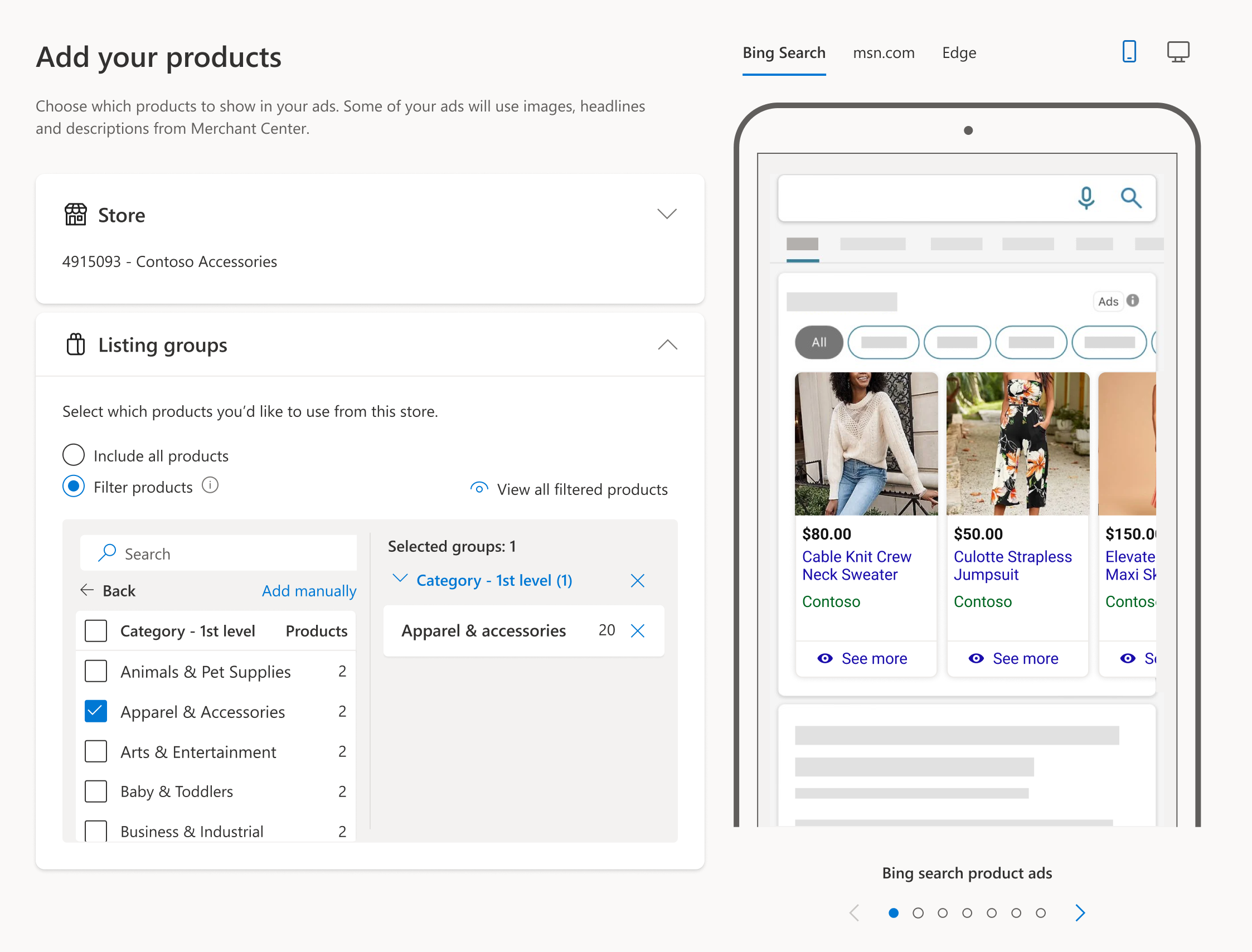
product ads
As part of my work on Pmax, I worked with design team leadership to borrow designers from other projects in order to meet the tight deadlines we faced. Product ads was one of the more important areas I collaborated with another designer. While I set the end-to-end vision, I had her run research and iterate on the design components and core workflows for adding and editing products to the campaign.
I leveraged the research to drive key architectural decisions, such as whether product ads should exist as a standalone step or be integrated into the asset building workflow. The technical aspects became really relevant to the design decisions at this point, including old backend architecture imposing severe limitations, and I worked closely with engineering to negotiate tradeoffs for UX and tech. Cross-functional alignment was difficult but we landed on a multiple-phase solution that met both user and business needs.
pilot results
The pilot successfully validated that Microsoft’s Performance Max experience could deliver automated, omnichannel optimization. Our initial pilot was small, reporting $10.7K total revenue across 114 accounts, which by the end of the month we expanded to 8,020 accounts/$277K, meeting our goals for revenue as an indicator of success. Feedback from customers also showed we addressed the transparency and control gaps advertisers consistently reported with Google Ad’s version.
Advertisers responded positively to the automated creation flow, clearer asset requirements, and the introduction of asset‑level reporting and previews—features that directly addressed the “black box” concerns surfaced in early research. But we still had work to do to get to GA.
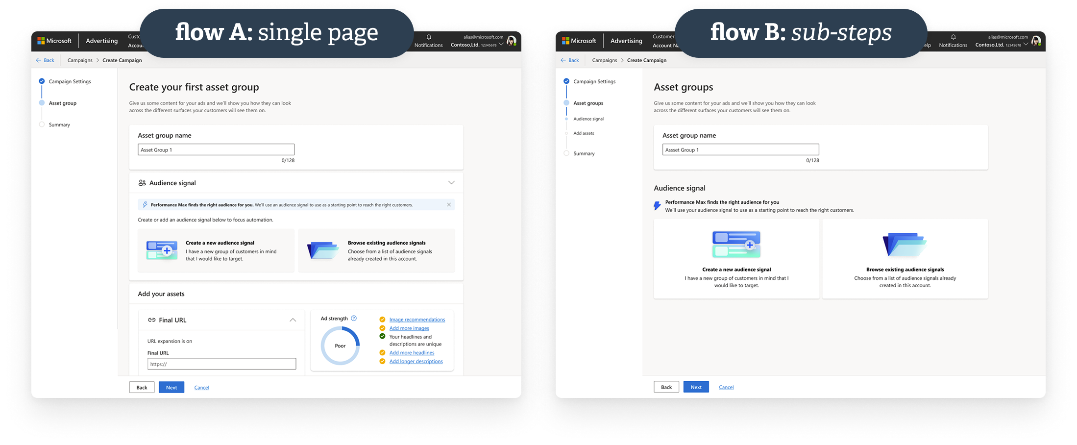
smaller chunks
Reorganize flow into sub-steps so users focus on less at one time. Our pilot was just 3 steps, scaled down to reduce cost and time to market. I wanted to plan for cognitive overload.
recommendations
In addition to providing more helpful context and suggestions for assets, I wanted to optimize the order of steps to so that we can use the info they give us for better recommendations.
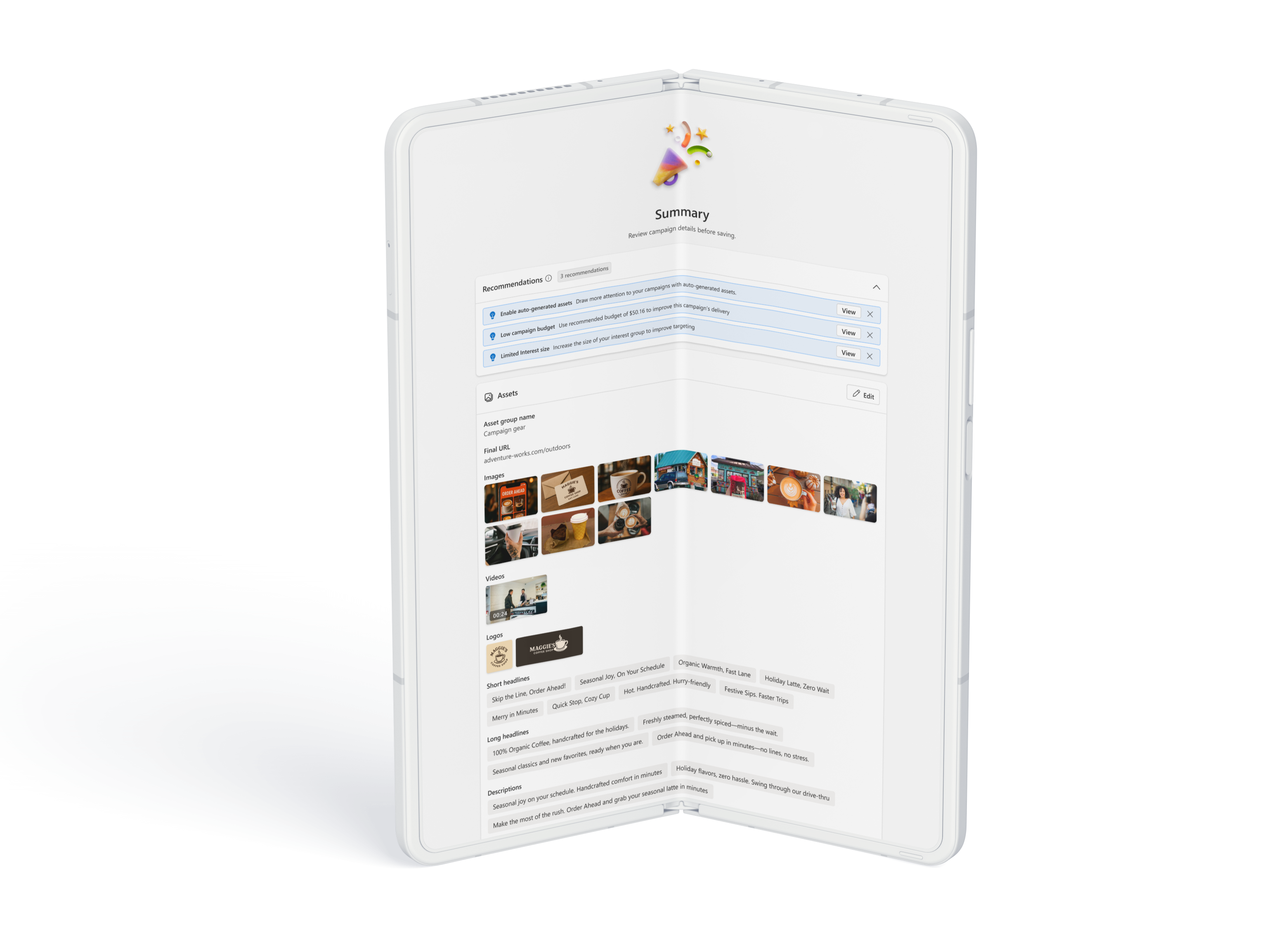
adding features
We added features based on customer feedback, like a summary page with recommendations for what to edit. Also areas like conversion goals potentially affected the overall flow.
08Scaling the UX
navigation
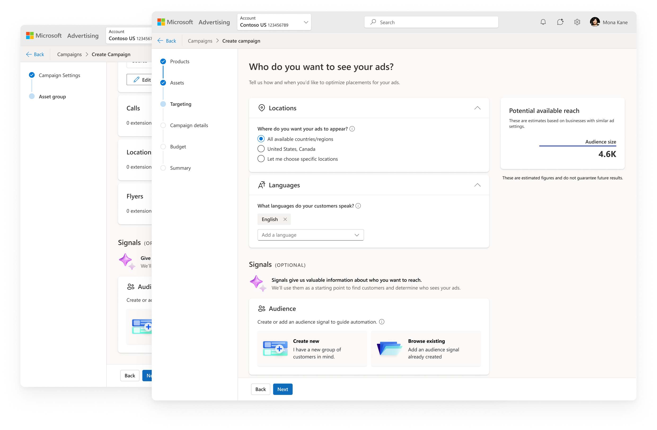
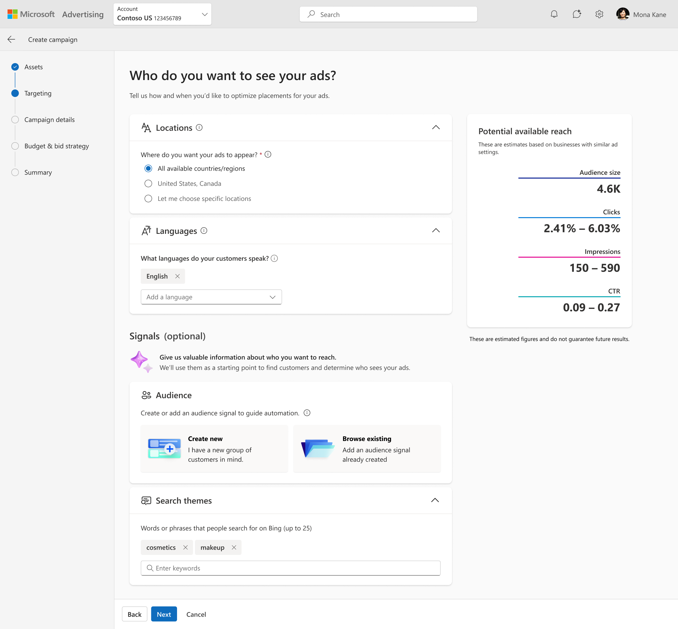
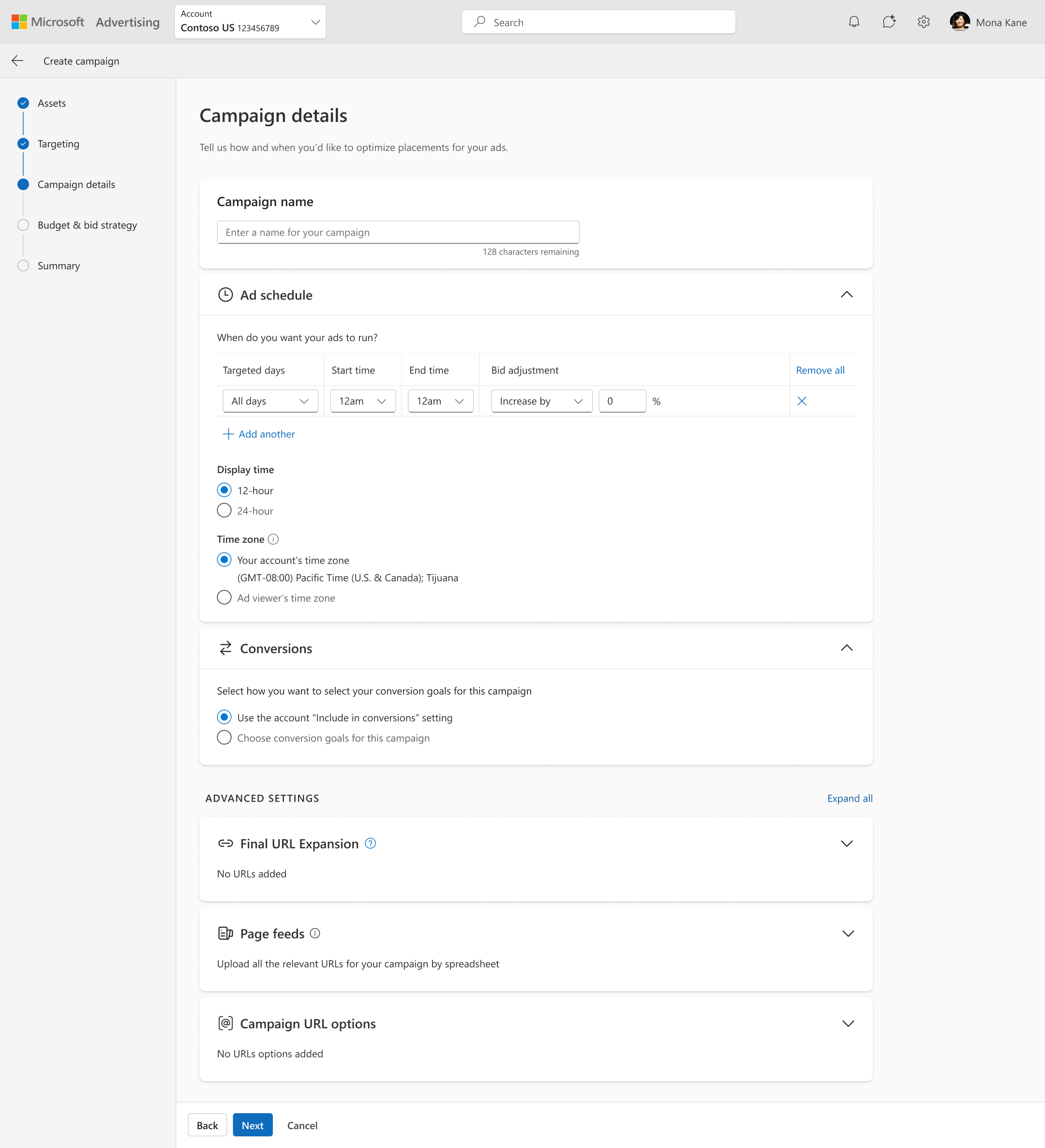
The starting point was a simple 2-step flow that compressed large, cognitively heavy tasks into broad steps, largely due to our timelines for reaching our pilot. Advertisers had to configure bidding, shopping settings, URL expansion, conversion goals, and scheduling all within a single “Campaign Settings” step. Dense screens created friction and increased error rates. Asset creation and targeting were also bundled together, creating long, scroll‑heavy screens. Early testing confirmed advertisers felt overwhelmed and unsure where to focus.
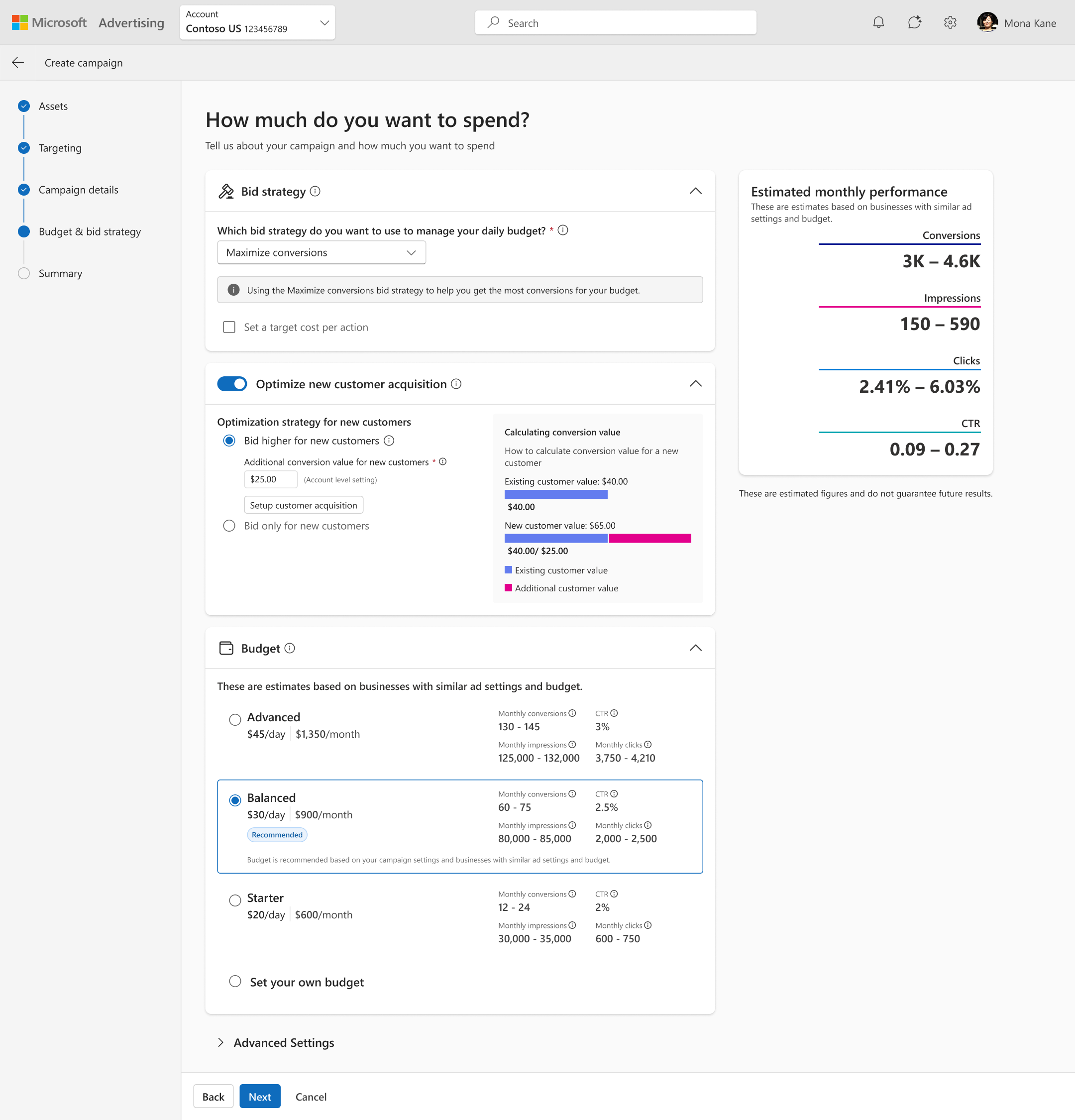
I moved the most complex areas into their own navigable sections (Budget, Shopping settings for retail flows, Targeting) and added a Summary step to provide context for all their choices.
This reduced cognitive load and sharpened each decision point. Additionally, this aligned with my vision for a modular, scalable nav system. I sequenced the steps intentionally so earlier inputs could power smarter recommendations later in the journey.
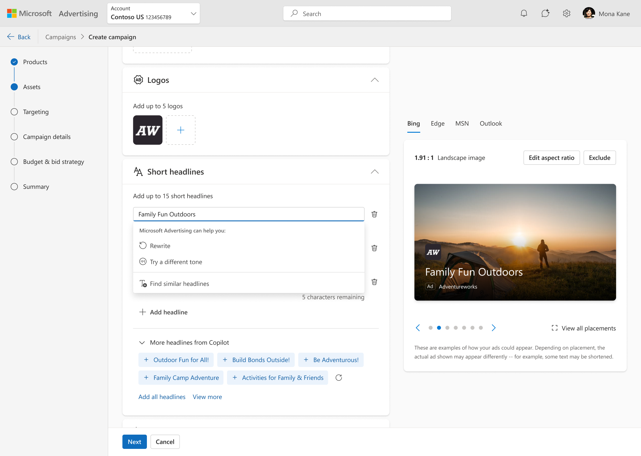
recommendations
Probably the most significant area for improvement was our recommendations UX. Advertisers told us they want feedback throughout the flow, from the effectiveness of their goals and assets to dialing in their budget. During the pilot, we had isolated hints surfaced at the end of campaign creation. I evolved this into a context‑aware guidance system by restructuring the flow so that key inputs were collected earlier with intentional sequencing to allow us to generate meaningful, data‑driven recommendations later in the flow, such as suggesting an appropriate daily budget based on audience size or prompting additional assets when coverage was low.
I designed the recommendation patterns to feel advisory rather than prescriptive, with clear rationale, lightweight explanations, and inline placement that reduced cognitive load. Over multiple iterations, recommendations shifted from static, generic tips to dynamic, personalized guidance that made the UX feel smarter, more supportive, and more transparent — directly addressing advertiser feedback about wanting automation that “makes sense in context” rather than a black box.
Read the full case study09Final Product
With my work on Pmax, I created the foundation for guided campaign creation that now powers consistent, explainable AI across the product—driving adoption, confidence, and measurable business impact.
End to end creation flow
10Impact
Pmax became the standard internally for campaign creation UX and for our customers as a model for the new world of AI-powered advertising experiences — 36k campaigns were created shortly after the GA and has sinced scaled to become Microsoft's leading ad campaign type.
Auto-gen Text Assets
Spend Growth (WoW)
Revenue after 1 Year
cross-product adoption of scalable patterns
After Pmax, every campaign type was updated to use the new framework and components from the new UI kit we created.
org alignment on AI patterns
From defined principles to workflow patterns, every campaign type in Microsoft Ads is now using the new framework for recommendations.
creative quality improved
Asset completeness and ad quality improved significantly, as well as adoption of AI-generated assets.
stronger user confidence
“This feels simpler.”
”I understand what the system wants from me.”
”I know why this matters now.”
“As a small business, every dollar counts for us. With Google I always felt in the dark — with Microsoft’s Performance Max, I can finally see what my money’s doing.
— Customer quotewhat i’m most proud of
- Shifting the org from “add more AI” to “make AI feel earned and trustworthy”
- Designing systems, not screens, that scaled across multiple products
- Advocating for quality and clarity as performance levers
- Creating a foundation for future AI-assisted workflows.