
Problem
With the shift towards AI powering ads, the most effective thing advertisers can do for their ROI is improve their assets when creating campaigns. Recommendations are the most helpful here when they add their images, headlines, etc. but the existing system was generic and under-utilized. Exploring solutions, I shifted the conversation from how do we add more AI to how do we make AI feel earned and trustworthy to reshape the org’s strategy for AI and recommendations.
Role & Team
Design lead — myself, product manager, engineering
Focus areas
Human–AI Interaction, System‑level UX, Visual Design, UXR, Cross-functional leadership, Architecture, Design Strategy
01problem
PMax introduced a world of AI‑driven advertising for Microsoft, which relies heavily on the images, headlines, and other content that advertisers give us. The more assets that AI has to work with, the more possible combinations and the more likely we can create the most appealing ad that gets clicked on. But many advertisers don’t add enough assets or the ones they provide are poor quality. Recommendations are supposed to help with this, but adoption was almost nonexistent.
Only 3-5% of recommendations that we generated for advertisers were being added to campaigns and served in ads.
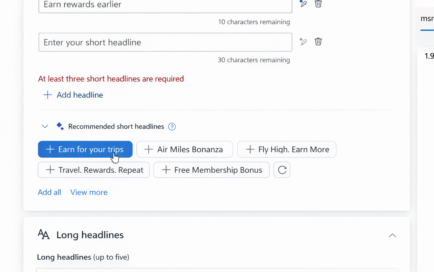
The recommendations in Microsoft Ads were generated simply by scanning the website advertisers give us and pulling in text from that URL, which resulted in suggestions that were often irrelevant and lacked explanation or context. And they weren’t even there if the advertiser scrolled past the URL to enter their text first.

advertiser needs
business needs
engineering drivers
02Unblocking pmax
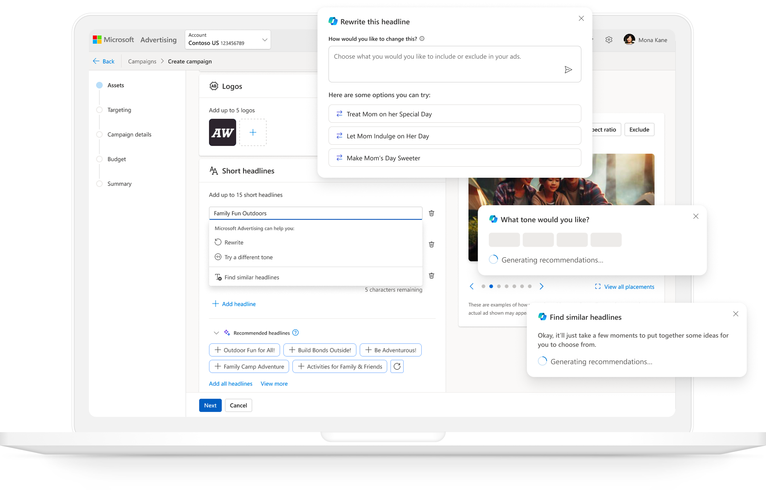
Before moving into deeper conceptual explorations, I first evaluated whether the existing recommendations experience could be improved through interaction‑level changes rather than structural redesign. My goal was to understand how far we could push the current system without disrupting the PMax pilot timeline.

leveraging existing components & patterns
I explored a wide range of UI patterns and Copilot‑aligned treatments, including:
- Accordions to surface recommendations without overwhelming the form
- Inline banners that expanded to reveal options or opened a side panel
- Subtle text links that triggered lightweight popovers
- Copilot cards that could expand inline or open a sidecar
- Embedding recommendations in the Ad Strength card for contextual guidance
- Emerging Microsoft‑wide Copilot patterns like the “nudge” component
- Visual treatments to clearly signal AI involvement
- Inline & embedded variants that blended Copilot actions directly into the form
Through internal design reviews and cross‑team alignment, it became clear that while these patterns improved visibility and usability, they couldn’t fully address the deeper structural issues around capturing intent from advertisers for relevancy.
I ultimately landed on an optimized inline flow as the short‑term solution — incorporating improved visual design, clearer Copilot affordances, and more discoverable entry points — while committing to a north star vision that would require structural changes beyond the pilot timeline. This approach allowed us to support the PMax pilot immediately without compromising the long‑term direction for AI‑powered recommendations.
03evaluating new models
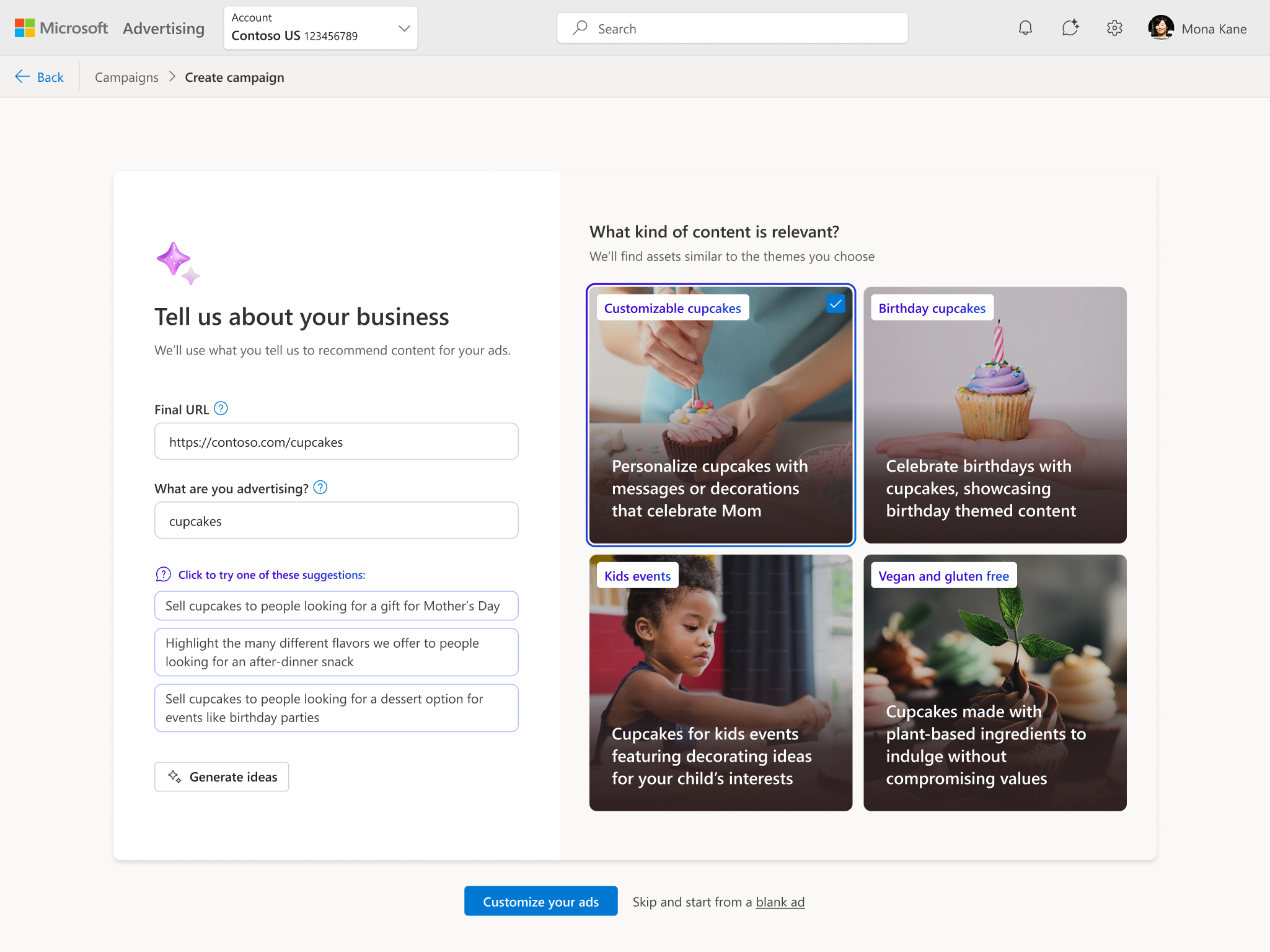
What would an ideal experience look like for how AI could help advertisers fill out an ad campaign? I explored this fundamental question to tailor our recommendations based off their intent: should AI enter the campaign creation flow at the beginning, or in context?
prompt‑first models
These captured advertiser intent before entering the form. Each option tested a different philosophy of AI interaction: direct, conversational, hybrid, or inferred. The major risk was that partners are always hesitant to add any steps to the flow, so we would need to validate the usefulness of this.
- URL + prompt → ad previews → form
- URL → side‑by‑side conversation + preview → form
- sticky prompt at top → ideas → form
- URL → ideas → prefilled form + Copilot sidecar

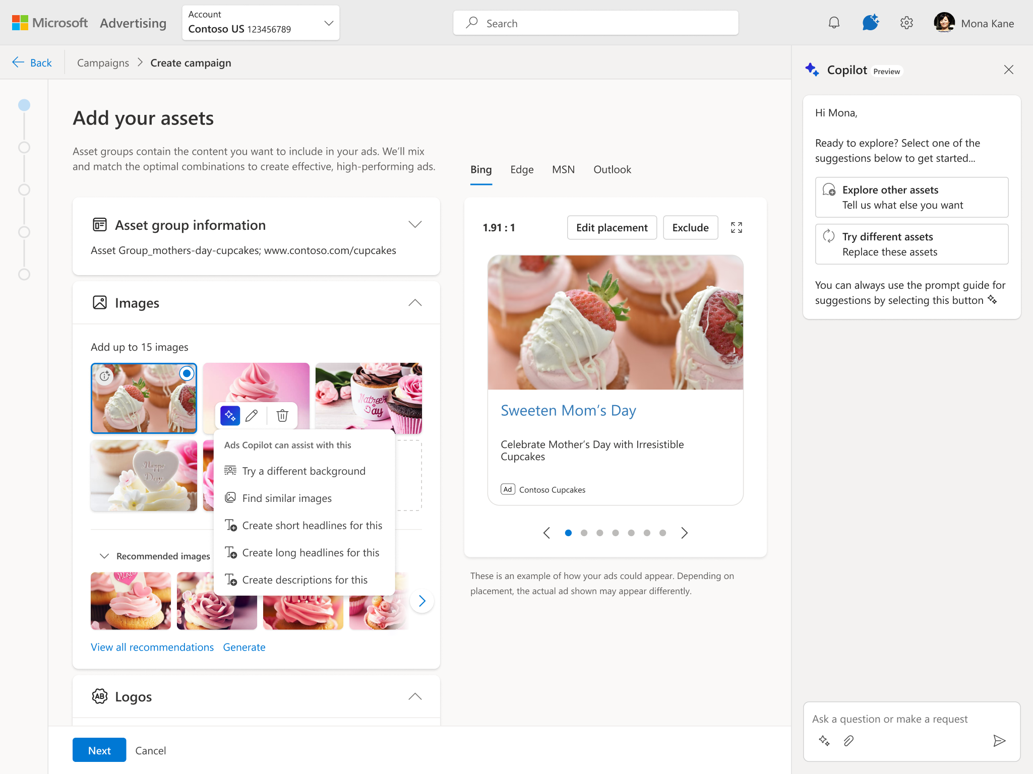
inline models
These embedded Copilot directly inside the form, exploring how to bring AI into the workflow without disrupting it.
- inline components
- floating components
- sidecar variations
- contextual triggers
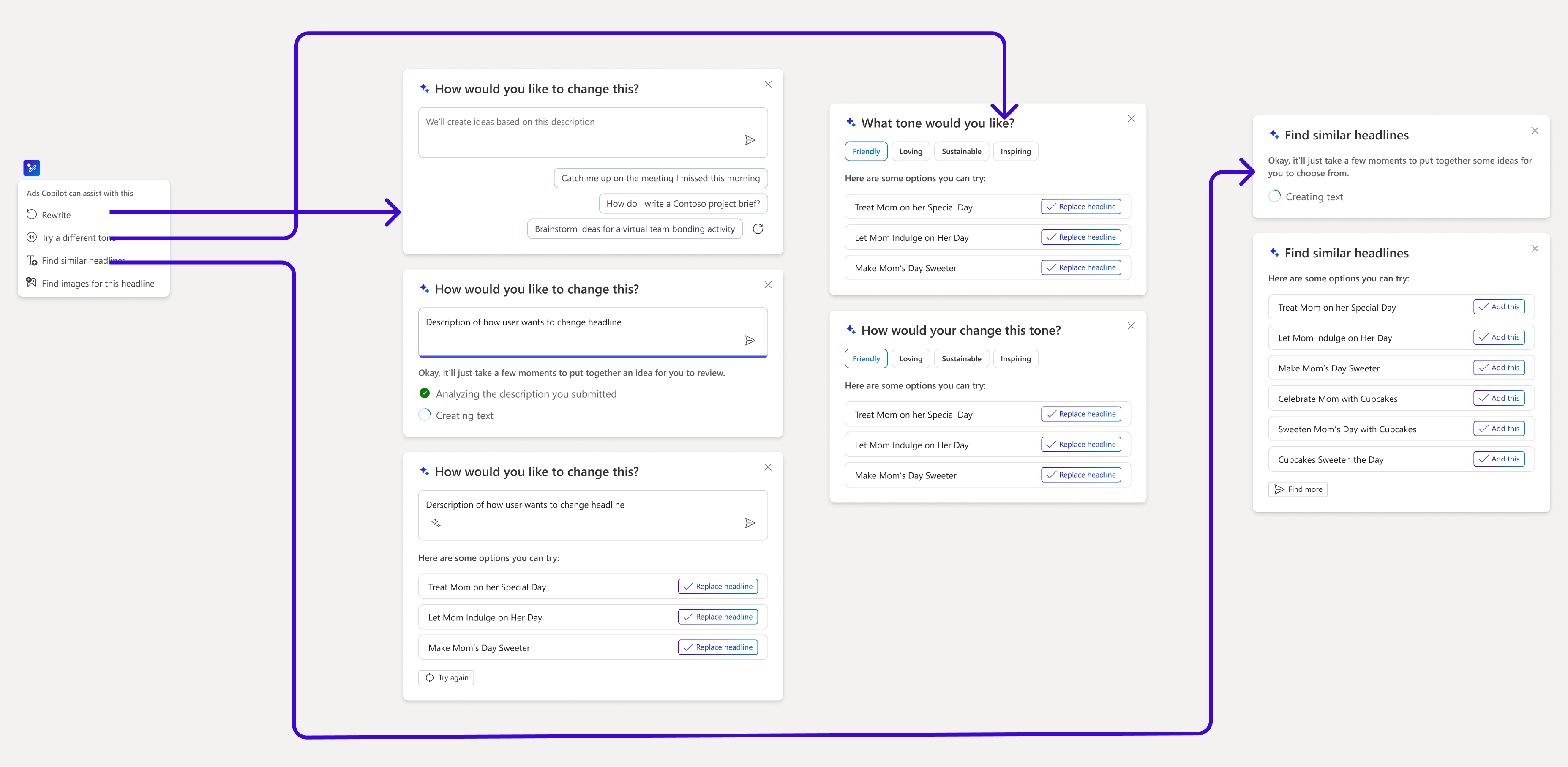
- actions where the advertiser would need it (change tone/rewrite/find similar)
The major downside would be the risk advertisers don’t interact with it since it’s secondary to the main flow, so designing for discoverability would be key. I also really wanted to avoid continuing the current experience of taking advertisers to an empty form that feels like work to fill out.
leadership alignment
Some of these ideas incorporated a copilot sidecar or other conversational UX. Early in the exploration phase, product leadership strongly advocated for a conversational Copilot experience modeled after Copilot in Edge, where clicking an element opens a side‑chat. They saw this as the most “Copilot‑forward” way to showcase AI inside the Ads wizard and pushed to replicate that pattern directly.
I intentionally pushed back —not because the sidecar was off the table, but because committing to any specific model this early risked locking us into the wrong paradigm before we understood advertiser needs. Instead, I acknowledged their desire to highlight Copilot, incorporated conversational elements into explorations, and evaluated them alongside non‑conversational patterns. User validation would be critical before converging on a final solution.
04user research
From the early explorations, I distilled the design space into three coherent prototypes so that I could answer these questions:
- What is the right balance of input/output for AI interaction?
- How much help with assets needs to be conversational?
- How and when is a prompt vs a sidecar helpful to provide input?
- Is general inspiration helpful? (prompt starters)
- How does the URL play into what an advertiser expects from recommendations?
- How helpful is using a prompt to select themes?
- Once in the form, how embedded does copilot need to be?
akita: Direct, Goal‑First
beagle: guided Conversation
corgi: hybrid
This is really cool—it immediately started shaping the campaign in the right direction.
— Participant in studyresearch insights
- Advertiser expertise determines preferred model, not UI preference
- Experts preferred Akita since it was fast and direct. They already know their campaign goals and want Copilot to execute quickly
- Infrequent or less confident advertisers preferred Beagle due to the extra context that helped them think through goals and feel supported
- Conversational UX is not the right default — felt slow and unnecessary, adding too much friction for experienced users who already know what they want
- Conversational flows are useful for providing guidance when confidence is low or when users were exploring ideas with a more flexible plan
- Speed and clarity outweigh “AI richness” — Users valued Copilot most when it reduced steps, not when it asked more questions
- Hybrid model lacked a clear advantage — didn’t deliver the speed experts wanted or the support novices needed
lead with direct input
Start with a simple prompt and expand into more guided help when there’s uncertainty.
optimize for efficiency
Copilot should accelerate campaign creation, not add steps unless it reduces work later.
goals are important
Advertisers have specific plans and relying on just their URL is too generic for AI suggestions.
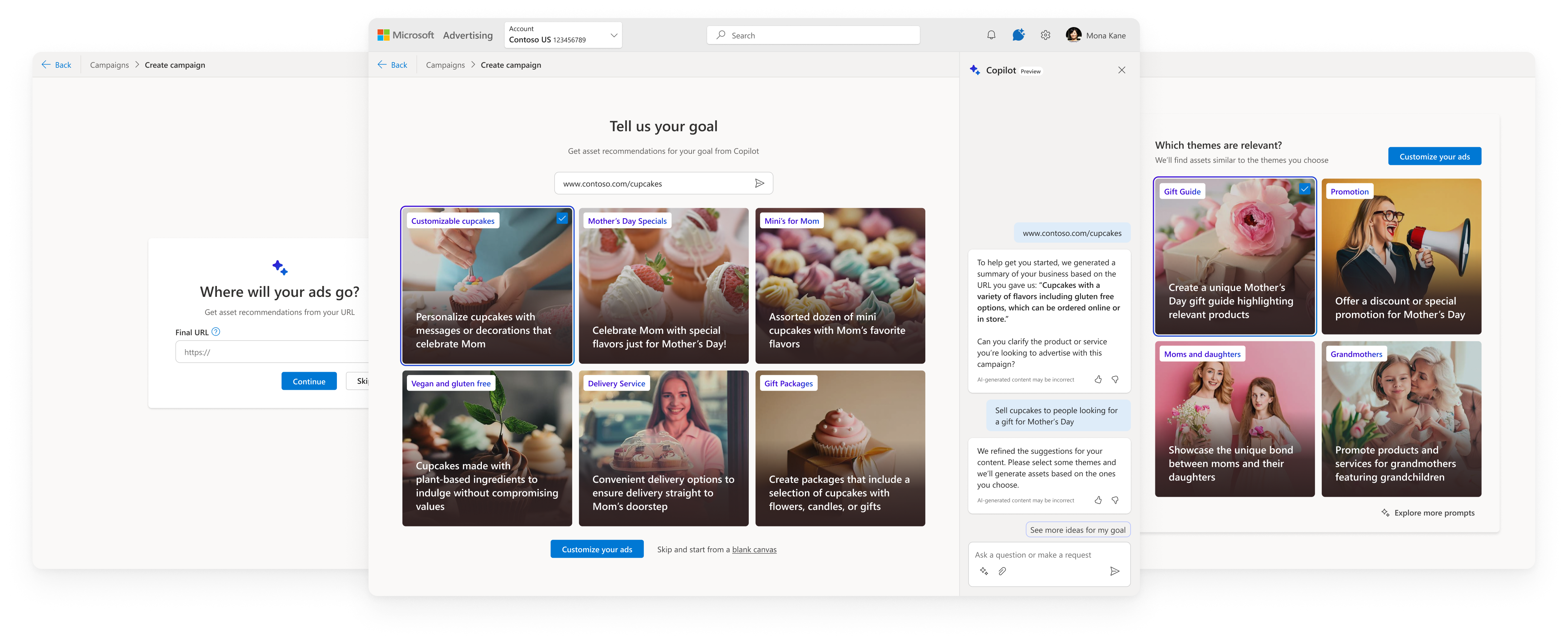
05North Star vision
Based on research, I aligned with the product team on a North Star that balanced speed, control, and guidance. This vision captured intent early, explained AI decisions, and accelerated the workflow.
- URL required, prompt optional (auto‑generated if empty)
- marketing‑trends inspiration panel
- themes generated from URL + prompt
- vague prompts replaced with specific suggestions
- form prefilled with assets
- sidecar for adding/refining assets
- inline Copilot actions(change background, tone, rewrite, find similar, etc.)
AI-assisted ad generation
06MVP We Had to Ship
For Microsoft’s Accelerate event that the product team wanted to showcase this in, engineering told us the North Star was not feasible in time, even if we would pull resources together. Partners were now advocating for an MVP that:
- reuses the existing form experience
- avoided new frameworks or entry points
- auto-filled assets in the form solely from the URL
This created a major risk: without user input, recommendations would be generic and low‑quality.
The MVP the product team was asking for
I pushed on this, advocating for at least the basic minimum to allow for modifying the assets that copilot provides as recommendations. I offered some suggestions:
- a “replace assets” flow or another way to refresh recommendations
- a prompt modification dialog
- an inline prompt component that was much lighter than the north star flow
Creating temporary components though would have been throwaway work if we still wanted to move towards the north star vision.
lightweight banner flow to customize recommendations
the compromise
A “copilot” style banner explaining what Copilot was doing, a lightweight dialog to collect prompt input, and theme modification inside the dialog. This preserved user control without derailing the roadmap.
07Initial Pilot & Research
After the MVP launched, adoption was much lower than the product team expected. Customers in the pilot weren’t interacting with the copilot banner and metrics had not improved. I didn’t find it surprising due to the fact our compromise solution was not proactive in gathering intent for the campaign, and the automatic LLM prompt we were collecting from the URL was no different than just using the URL.
Product team partners were convinced this was a discoverability problem, but the purple banner was visually LOUD so my hypothesis was that this was more about intrinsic value. I decided to run a user study to understand what customers value and don’t value from the pilot experience, revealing any paint points.
At this point all I’ve done is named it and given it a URL. I haven’t even said what the content is yet...it might need more to go on before it recommends assets.
— participant in studyoverall takeaways
Advertisers across SMB, mid‑market, and enterprise see strong potential in Copilot for accelerating asset selection, generating new creative, and inspiring alternative copy—but only when they can provide input first, maintain control over approved assets, and avoid unnecessary back‑and‑forth. The pilot’s low adoption stems from lack of relevancy, mismatched expectations, and workflows that don’t align with how advertisers actually prepare campaigns.
- Confirmed: URL-only recommendations are too generic and users see value in providing input before seeing recommendations
- Banner placement felt premature — users hadn’t added content yet
- Inline, contextual suggestions align better with “edit” mental models
- SMBs struggle most with starting from scratch and welcome AI for inspiration
- Themes seemed irrelevant as users expected to see a preview of actual assets
- AI image generation was consistently described as “game‑changing,” since the output was unique and without licensing
- Even SMB users want to check with their team before adding new images
- Participants almost always typed their own headlines first, then used AI to refine
- the dialog → close → refresh loop was tedious and users wanted to see the effect of their prompt input in order to know if they were setting the right context
- Edge browser adds popups over our recommendations dropdowns
browser blocking inline recommendations
approval-bound workflows
Many teams come with pre‑approved images and copy ready to paste in—enterprise teams rely on strict brand libraries and legal review. New assets would need to go through approval cycles before creating a campaign.
mismatched expectations
Most participants misinterpreted the purple banner. Some thought it would open a new tab with guidance—others expected an asset library. Themes also looked like assets so users did not understand how they worked.
editing > creating
Many participants ignored the purple banner since the first thing they did was add their assets, then scroll past it. Existing workflows starts with their content—users are more receptive to layering suggestions for editing.
recommendations were applied above, getting cut off
what users expect from Copilot
- Provide side‑by‑side recommendations that gives context for choices
- Use their assets and their copy as the primary signal
- Offer quick inspiration, not long prompt cycles
- Generate unique, high‑quality images when needed (before starting campaign)
- Help with editing, not just creating from scratch
what users DO NOT want
- Auto‑fill everything before they add their own content
- Require multiple rounds of prompt refinement
- Surface irrelevant content as a suggestion
08Revised North Star
The pilot feedback confirmed what I had suspected and gave us strong signals that without user input, AI can't earn trust. Collecting input— their goals or assets—before showing suggestions resonated well if it was simple and streamlined. But hearing the feedback about wanting to add their assets first, I had the idea to pivot around this—let’s find a way to add their assets quickly, then recommend more assets and edits around those. As I talked to engineering about a new flow like this, I got similar pushback about feasibility, since we didn’t have a way to understand user intent from content without gathering more input about their intent.
My solution aimed to streamline inline recommendations through existing workflows and introduce a way to connect advertiser goals to make them relevant.
adding assets
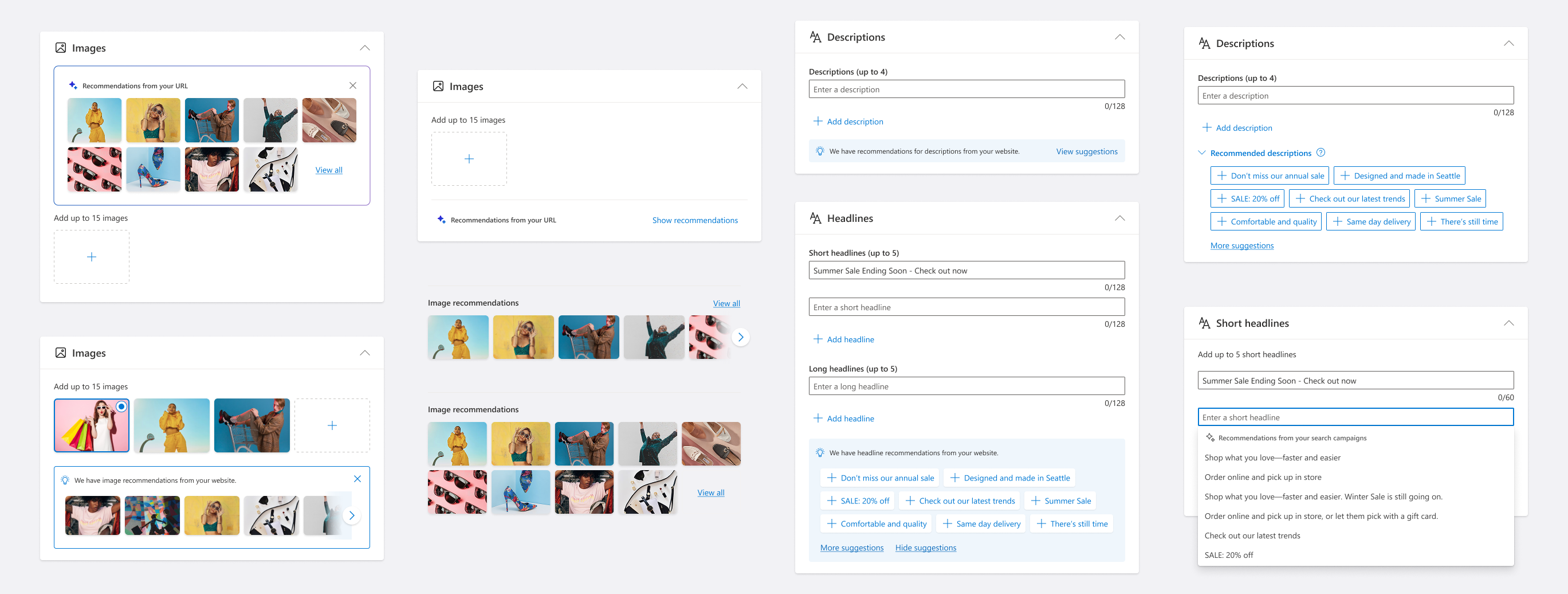
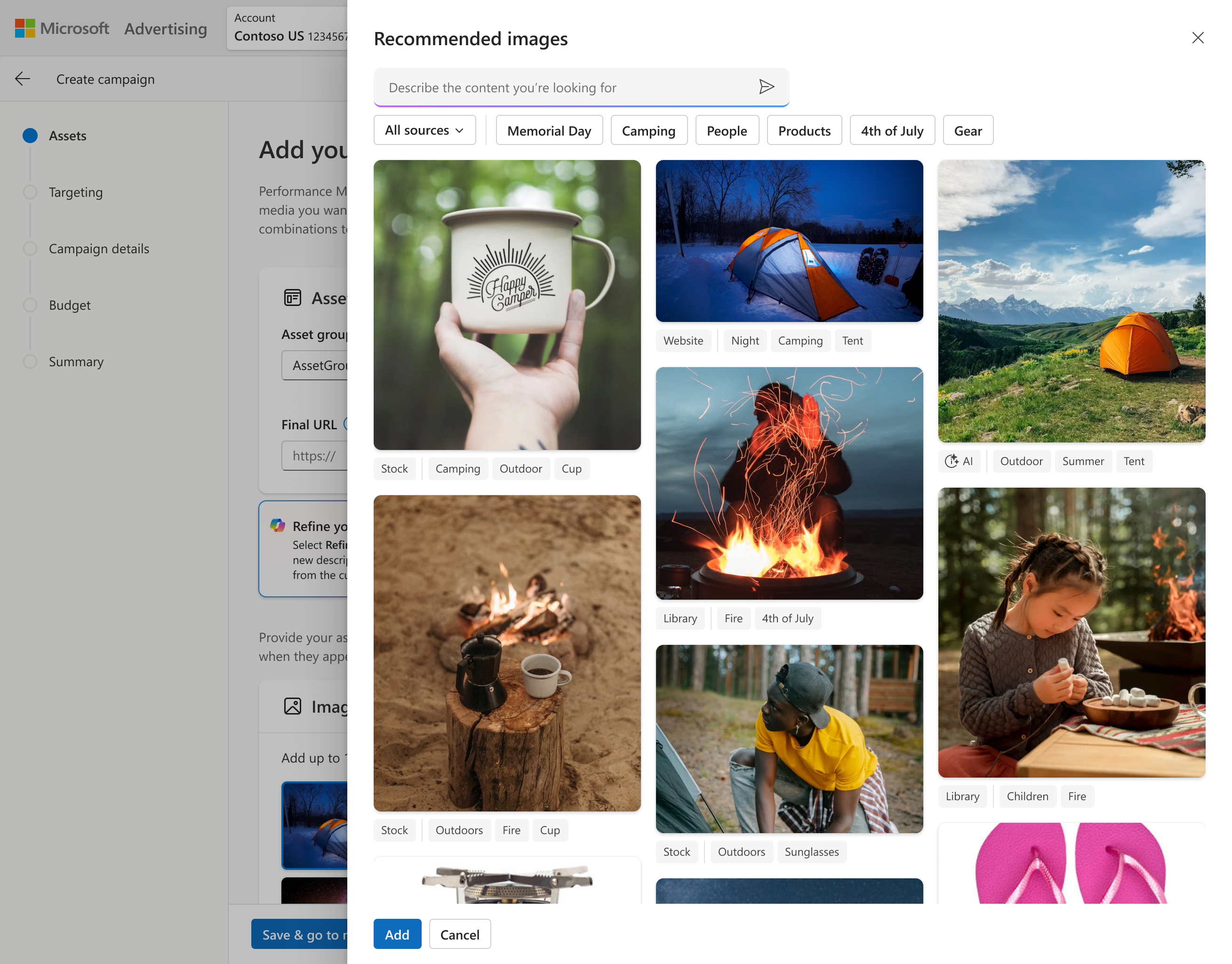
Our UX for adding assets used old side panels that required the customer to manually sort through folders to find what they’re looking for. I wanted to bring in recommendations to help find the right content for the campaign they’re creating, from sources where they already store their own approved content for ads. I ended up redefining this side workflow while creating a scalable system for all asset types, expanding sources of content to include social sites as well, and enabling adding assets in bulk to address the most monotonous part of campaign setup.
editing assets
To support advertisers with content they already have, I looked at AI-assisted editing that is contextual and feels lightweight and supportive. In addition to the inline text editing features, I designed new workflows for editing images to make them more usable for ads.
- Replacing image backgrounds using AI — this was tested in the pilot and validated as especially valuable for advertisers who lacked studio‑quality photos but wanted more polished, on‑brand visuals
- One‑click variations that let advertisers compare alternatives without losing their original content
- Clear “undo” & “restore original” paths to maintain trust and reduce risk
intent-driven workflow
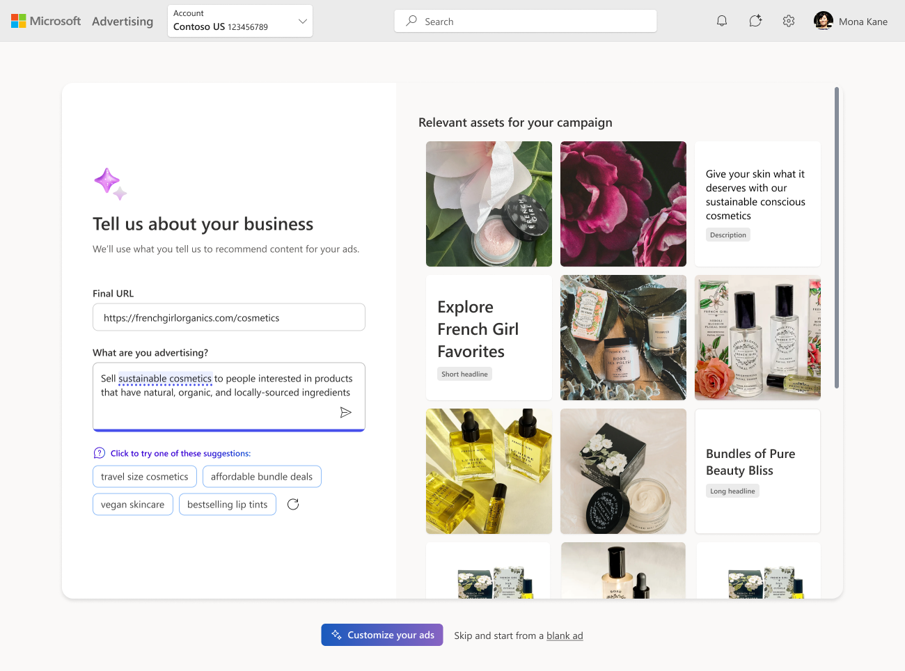
I redesigned the north star around intent → output → refinement:
- Unified view for AI input/output—user sees a preview of assets as they tell us what their campaign is for
- Replaced themes as a separate step—integrated with prompt as suggestions that update with user input and categorized output from prompt
- Simple prompt that’s easier to understand & refine with contextual suggestions
- Flexible prompt that can collect their goals and/or their assets
- Asset preview becomes the feedback loop—users see right away if we don’t understand their intent
- Form becomes a confirmation step—users enter the form confident in the direction with assets that reflect their goals
inline recommendations
I looked at how AI surfaces contextual suggestions in the moment that offer help editing those existing assets that advertisers provide
- Sources for recommendations prioritize existing content like their asset library or social
- Help advertisers improve their headlines by adjusting the tone, aligning to their brand, or rewriting it entirely with a prompt
- Rewrite to stay within character limits to meet ad surface constraints (most time consuming part of editing text for users)
- Adding similar text assets or ones they wouldn't have thought of
- Auto fill assets for them but allow to remove all in case they didn't meet expectations, adjusting the prompt to try again
09Impact
This work wasn’t just about recommendations — it was about redefining how advertisers and AI collaborate. The result was a clear, principled vision for AI‑powered campaign creation that balanced business goals with user needs and set the direction for Microsoft Advertising’s future creative strategy.
influenced the org’s AI strategy
I shifted the conversation from “AI everywhere” to AI where it helps — contextual, clear + transparent, and user‑controlled, at a pivotal moment for Microsoft Ads.
shaped the foundation for brand‑aligned assets
My work here directly led to the Brand Guidelines initiative, which uses brand inputs to improve recommendation relevancy.
improved advertiser trust
By grounding AI in user intent and clear communication, I helped reduce the “black box” feeling of PMax and other automated campaign types.
provided a roadmap for future AI guidance
My revised North Star became the reference point for future work on human–AI interaction across Ads Studio and campaign creation.
Recommendations in Pmax
Asset coverage (Pmax + Search)
Bg-swap vs. single image
what i’m most proud of
- Seeing low pilot adoption as a value problem, not a discoverability problem — I validated my hypothesis with a study rather than deferring to the loudest voice in the room, which gave us the evidence needed to iterate productively
- Strengthened cross‑functional alignment — In the midst of internal chaos, I navigated PM pressure, engineering constraints, and leadership expectations while keeping the user at the center
- Reorienting direction with AI around advertiser workflows rather than technical capability — I pushed back on designs that would have harmed user trust and used research to steer the team toward a model that met advertisers where they are
- Scalable foundations — I created the groundwork for future AI‑powered guidance and demonstrated system‑level thinking, not just UI design
makes my job a lot easier, so anything that makes my job easier I’m happy with.
— ad manager for american airlines